Showing posts with label Bulgaria. Show all posts

Sunday, January 8, 2017

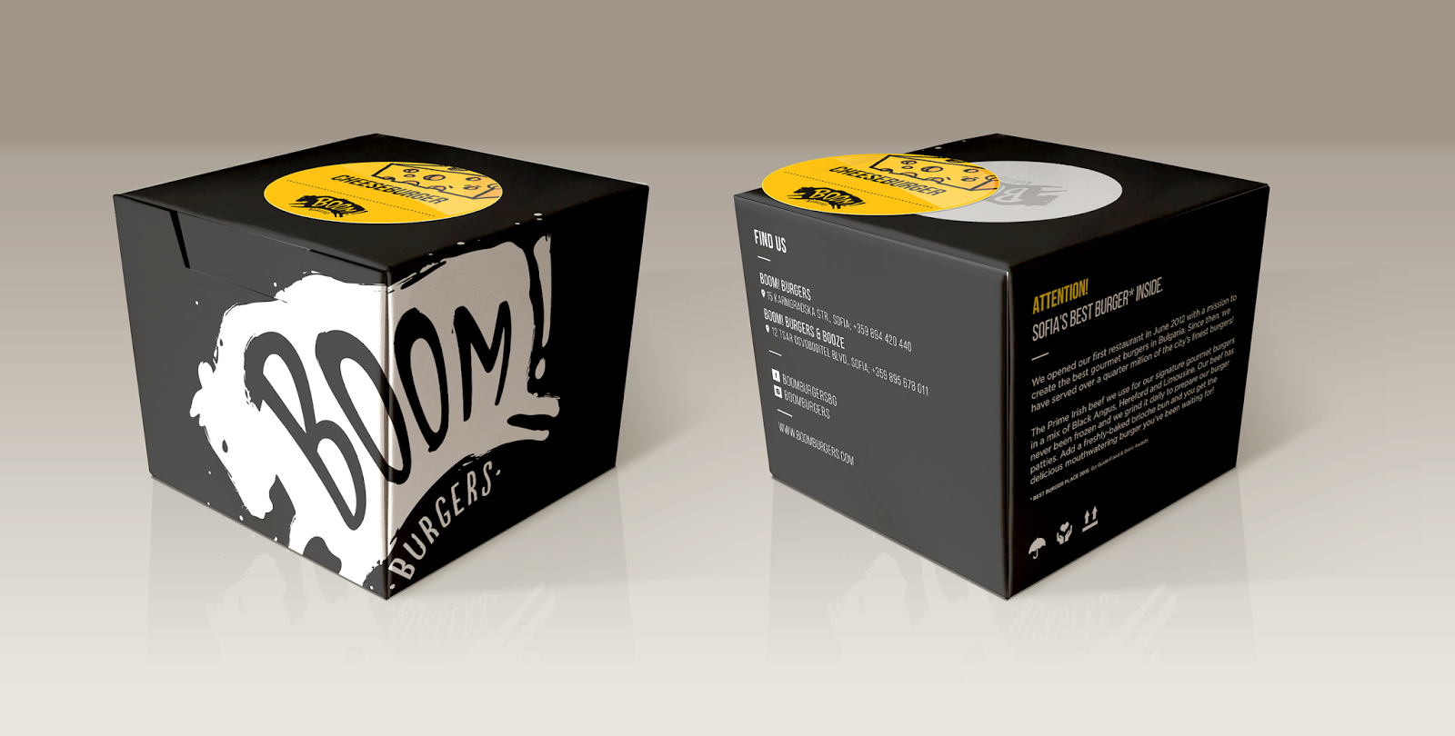
Boom! Burger Box


Company: Boom! Burgers
Designer: Dimitar Chikakchiev
Project Type: Produced, Commercial Work
Location: Bulgaria
Packaging Contents: Burgers
Packaging Substrate / Materials: Paper
Printing Process: Digital printing

In order to deliver gourmet burgers the best possible way, Boom! Burgers needed a nice and functional burger box. The box design is created so the burgers don't get wet, but it keeps them warm. When you open the box it can easily be used as a dish and you can eat your burger without getting dirty.

Thursday, November 3, 2016

A for Avocado


Designer: Gergana Stankova
Project Type: Produced, Commercial Work
Client: A for Avocado
Location: Sofia, Bulgaria
Packaging Contents: Cosmetics
Packaging Materials: Paper and plastic

A for Avocado is a new natural cosmetics brand, made in Bulgaria with high quality avocado oil, imported from California.

The brief of the project was simple - to develop brand identity and packaging.

The first four products of the brand (day cream, night cream, power serum and pure avocado oil) come in a face-care series that inspired my design approach. The background of the paper boxes is an avocado vector pattern that seamlessly transitions from one product to the next, thus creating a design unity and integration. Furthermore, the seamless pattern helps make the boxes more noticeable when put one next to another on the shelf.

In addition, I inverted the colours of the night cream as the simples and most logical way to colour code its usage.

Read more

Tuesday, October 18, 2016

Z Wine Labels


Creative Agency: the Labelmaker
Designer: Jordan Jelev
Typography: Ropa Soft Pro by Lettersoup
Photo: Jordan Jelev
Bottle: Agape by Saverglass
Paper: Jade Raster by Mante
Project Type: Produced, Commercial Work
Location: Bulgaria
Packaging Contents: Wine
Packaging Materials: Glass, paper, cork, aluminium

Z wine labels are exclusively designed for the premium wine range of Zelanos Winery. This is where the big Z comes from.

We did this label in 2014 and it was real fun we will never forget. Honestly we are very proud of this wine label design because it is fully based on typography and the play of positive and negative spaces. In aspects of typography Z letter is very simple yet very interesting as it is a combination of two parallel lines connected with a diagonal stroke. In other aspects these are two symmetrical rectangles with a solid space between them. We decided to use these different ways of human perception and practically cut a serif Z letter off the surface of the rectangular self adhesive stripe. Simple and effective – the result amazed even us! The dieline of the label was very strange because the wide diagonal stroke separated the rectangle into two parts creating the feeling for the human eye that this gap between is the letter Z and you are able to touch the glass bottle through the label. Then we decided to keep the label as clean and simple as possible and leave maximum attention to the large Z in the middle. We also wanted to have a premium paper and we picked our favorite Jade Raster by Manter. Additionally we decided to print a pattern at the bottom part of the label with small Z letters using blind embossing. The result was beyond what we expected because we achieved very fine details which made the overall look of this typographic label even more attractive. The soft pearl finish and the fine grains of the paper surface are the first impression when you have the bottle in your hands. Left and right side of the labels are reserved for texts in English and Bulgarian, alcohols etc. We also printed the calligraphic Zelanos logo with copper hot foil. Classic cork closure is used. Capsules are branded with the Zelanos logo.

We really enjoyed this typographic wine label design where we had once-in-a-lifetime chance to express our love to letterforms and, as we believe, create a timeless piece of art.

Read more

Wednesday, October 12, 2016

Exclusive Interview with Jordan Jelev


Jordan Jelev's wine labels first made appearance on Packaging of the World way back in 2008. Over the past 8 years, we have seen really amazing wine labels - from truly elegant calligraphy to really intricate typography, all of these beautifully crafted wine labels coming from the man who is nicknamed "the Labelmaker".

Read more

Wednesday, September 28, 2016

Rumelia Syrah Wine Label


Creative Agency: the Labelmaker
Photo: Jordan Jelev
Project Type: Produced, Commercial Work
Client: Rumelia Wine Cellar
Location: Bulgaria
Packaging Contents: Red wine syrah
Packaging Materials: Glass, self adhesive label, paper, sealing wax, cork cap

Rumelia Syrah wine label – the gold arena of Reds

Rumelia Syrah wine took its name from the name of the Cellar – Rumelia Wine Cellar. Based near Panagiyrishte, Bulgaria, this boutique winery is right in the center of the heart of Bulgaria’s best red wines. Rumelia is winery’s top premium brand and this it’s actually the birth of a new high level wine range. The word “red” has special and even sacred meaning here speaking of wine and especially speaking of this particular wine cellar. We were honored to design a label for their best wines.

Picking a bottle was not difficult – though it took us some time back and forth, we have finally decided to use the amazing burgundy style bottle Agape by Saverglass. Premium cork was used for sealing and we were really at the crossroad whether to choose tin capsule or wax – wax dominated at last but the initial images have versions with capsule too.

We picked one of our favorite wine papers – Velmart by UPM Raflatac and we used it the best way. Its original color is white, but when print solid heavy color – like black for example – the texture of the paper wakes for a new life. It somehow becomes more visible and in some viewing angles it looks even like a skin of an animal.

The Rumelia Syrah wine label features an abstract image of ancient roman arena (amphitheater) because the whole region is closely related with Thrace and later with Roman Culture. It is printed with matt rich gold hot-foil and the same motif could be seen overprinted against black background with transparent raised varnish. As a result we made very contrast classy label where gold effects and natural textures are almost everything for its attractive premium look.

Releasing the Rumelia Syrah wine label was a great success and challenging design adventure. We believe that the range will soon expand with other great red wines by Rumelia Wine Cellar.

Read more

Gaetan Rose Wine Label


Creative Agency: the Labelmaker
Brand Naming: Jordan Jelev
Gaetan Rose Lettering: Jordan Jelev
Photo: Jordan Jelev
Project Type: Produced, Commercial Work
Client: Oriachovitza Winery
Location: Bulgaria, EU
Packaging Contents: Rose Wine
Packaging Materials: Glass, aluminium cap, cork cap, self adhesive label, paper label, raised varnish, silver hot foil

Gaetan Rose wine label is part of the Gaetan brand but we decided to do a little bit different label. Rose wines have always been a special canvas for design ideas and creativity – not only in this particular case. As a first step we decided to change the bottle. The new one is produced by Saverglass and has very gentle and elegant feminine look – perfect for rose wine. Our second step was to change the paper from Manter’s Jade Raster (which we love to bits) to the amazing Velmart by our favorite producer UPM Raflatac. Velmart has very fresh white finish. The paper is thicker than usual and it is produced with unique random texture – if you like watercolors, then maybe this is the best paper for them. Speaking of watercolors – this time we did not use the original Gaetan image with hot foil, different colors etc. – we decided to redraw it with ….. watercolors! We used same pieces of blank Velmart paper and after several attempts, the new Gaetan rose artwork was ready! The colors vary from pale pink to light ruby red – just like the color of the wine in different light conditions. To make it even more attractive and catchy, we decided to overprinted with transparent raised varnish mixed with tiny glittering metal particles….. wow, when you get the bottle in your hands and you will see it shining! As a final touch of our work Jordan Jelev took his Wacom Cintiq and wrote with his own hand the Gaetan Rose name. These are the steps we’ve made for our Gaetan Rose transformation.

Read more

Sunday, September 25, 2016

Vera Terra Wine


Creative Agency: the Labelmaker
Photo: Jordan Jelev
Typography The Fontmaker
Project Type: Produced, Commercial Work
Client: Black Sea Gold Winery
Location: Bulgaria
Packaging Contents: Wine
Packaging Materials: Bottle "Maxima" by Saverglass, paper Jade Raster by Manter Arconvert

Vera Terra is the name of the latest exclusive rose wine we created for one of the most iconic wine producers in Bulgaria – the Black Sea Gold winery.

The name comes from Latin and means ‘true land’. It tells the audience that this wine is special and that it comes from one of the best regions in Bulgaria for white and rose wines – the Black Sea area. The label is a logical connection between the existing award-winning design for Salty Hills wines, the Vera Terra project and the sea. It features abstract illustration of sea waves and currents printed with elegant gold and copper hot foil. We used one of our favorite papers here – Jade Raster by Manter Arconvert because of its fine grainy texture and amazing pearl shine finish. Vera Terra wine label carries the warmth and freshness of sunny summer days and the amazing smell of sea breeze. The bottle here is another treasure that adds more value and quality to the whole project – Maxima by Saverglass. Elegant and unique it perfectly complements the overall look of the packaging.

A gentle satin pale beige capsule was the final touch of our work here – elegantly branded with Vera Terra name. The top of the capsule features a detail of the waves image from the front label.

Read more

Saturday, June 25, 2011

Kamenitza Redesigned


Kamenitza, leader of the Bulgarian beer market,
with Adrián Pierini’s view


The well-known Argentinean designer, who successfully updated the image of the world famous beer Beck’s, is now responsible for the visual transformation of Kamenitza, the most important Bulgarian beer.

For many reasons, his agency, Pierini Partners, has grown to currently become one of the most important branding and packaging design studios in Argentina. However, their projects are still surprising, not only for the geographic range of his clients (located in countries such as Thailand, Colombia, England, Turkey, United States, Bolivia, Belgium, Paraguay, Peru and Bulgaria), but also for the ability of handling the global aesthetic codes in a relatively easy way.

Kamenitza is a new example of this. It’s not only a brand, it’s “The Bulgarian brand”, and it has been connected with the life of the people in that beautiful European town for 130 years.

The new design process started with a preliminary study of the situation, to proceed later to a designing stage that was based in strong and steady argumentative reasons. The conclusion of this analysis was that the aesthetic of the brand was outdated. Consumers have renewed, so an updating was extremely important to the brand. This was not a minor issue; the existing layout had a basic side band, which functioned as a support of an extremely rigid logotype, and there was no integration between the shield, the brand, the medals and all the complementary information.
With this diagnosis, the prestigious Argentinean designer decided to generate a much more personal, attractive and memorable identity. To achieve these important objectives, the first step was to update the shield, making it more stylized, elegant and attractive, and magnifying its most emblematic figure: the lion. Then, he gave the logotype the value it deserves by improving the aesthetic of the base (adding contention lines and twirls) and incorporating personal features in the font with rounded and friendly shapes, as an effective way of giving more personality and recognition.

The hardness was turned into proximity, and the coldness and composition mistakes of the current icon into attractive and appropriate elements for the target.
Regarding to the color palette, he decided to maintain the original green because of its important historical value. Therefore, the background was visually improved with the incorporation of sub-tones in the typographical scheme, combined with an amplified reference of the lion.

Last but not least, the medals show how much the brand knows about beer, so their presence was strengthened by using them in an accurate way in the upright white band, adding twirls and shadows.

Kamenitza is now 130 years old, and celebrates its birthday with a new identity and an updated packaging that will face to the new century, communicating with their consumers on equal terms, taking into account their needs and becoming a real accomplice of their best moments.
Read more

Wednesday, June 22, 2011

Hedera Wines


Designed by the Labelmaker, Bulgaria.

Hedera is one of our newest and most exciting design for Domain Marash. It is a brand new winery in Bulgaria full with enthusiasm and exciting perspectives. We all have been inspired by the fresh and young spirit of the whole project. Our main goal was to create a unique label, based on attractive even crazy idea. We decided to use the QR code as a main image of modern vision and then blend it with classic artistic calligraphy for the Hedera brand.

All these incorporated in nearly classic label form, delicately touched by our contemporary approach. As part of our design tradition, we wanted to improve the label effect so we put some transparent puff-up varnish on the QR code and on the Hedera calligraphy. We used the same QR code pattern on bottle capsule and it really turned out the whole vision into something very attractive and elegant at the same time.
The wines will be out for sale in late autumn of 2011.
Read more

Wednesday, June 1, 2011

GP Wines


Designed by the Labelmaker (Jordan Jelev), Bulgaria.

The GP wines are positioned at the top-premium wines of national market and my brand new design replaces the existing one created over 5 years ago. The brand name GP comes from Grand Prix and it is solely used only for the top wines of the cellar which have turned into wine icons of Bulgaria.