Showing posts with label Food. Show all posts

Tuesday, January 17, 2017

G Gourmet Label


Creative Agency: Load Comunicación
G Gourmet Label Creative Director: Alberto Jaspe
Project Type: Produced, Commercial Work
Client: G Gourmet
Location: Salamanca, Spain
Packaging Contents: Iberian Ham Products
Packaging Substrate / Materials: Plastic - Polypropylene

Labels created for the brand G Gourmet, plastic material 200 g. gloss and matte print.

What's Unique?
The label has been created to be placed on the product without any type of adhesive. We have tried to simulate the labels of hotels "Do not disturb"

Read more

Monday, January 16, 2017

Fresh Thyme Organic Premium Spice Range


Creative Agency: The Creative Pack
Creative Director: Danielle Beal
Designers: Heather Storie, Paola Ip, Corey Czer, Emma Tung, Mark Whyte
Project Manager: Fern Serna
Project Type: Produced, Commercial Work
Client: Fresh Thyme
Location: United States
Packaging Contents: Spices
Packaging Substrate / Materials: Glass
Printing Process: Web to Print

Fresh Thyme is a Midwest grocery food retailer that launched its private label in 2015 with now over 900 SKUs with new innovative products rolling out in stores each month. Fresh Thyme products have become the #1 brand in its stores proving the authenticity and quality of Fresh Thyme as a brand as well as its impactful unique farm inspired design. As part of their private label, Fresh Thyme asked us to design its organic premium spice range.

Read more

Acai Pop (Concept)


Designer: Kelsey Layne
Project Type: Concept
Location: London
Packaging Contents: Acai Bowl
Packaging Substrate / Materials: Plastic
Printing Process: Digital printing

Acai Pop was created for those, who like myself are always on the move whilst constantly striving to find the perfect work life balance without neglecting nutrition or health. With the Acai Pop tag line 'Add a pop of colour to brighten an early morning' in mind, the design reflects the vibrancy of each ingredient.

The hand drawn logo uses elements from the illustration of the Acai berries to create its form, whilst also looking as though it will pop itself.

Read more

Melatta


Creative Agency: scd
Project Type: Produced, Commercial Work
Client: Melatta
Location: Bogotá / Colombia
Packaging Contents: Jams
Packaging Substrate / Materials: Glass Jars
Printing Process: Labels in Digital Printing

Melatta is a small company in Bogotá. They produce delicious jams with new and exotic flavors. They wanted to show the content of the jar and to have a clean and joyful design.


Read more

Sunday, January 15, 2017

Domaine des 15 lots


Creative Agency: Bzoing Design & Créativité
Creative Director: Jean-Philippe Berthiaume
Artistic Director & Designer: Victoria Di Valerio
Photographer: Véronique Duplain
Printer Impression Québec
Project Type: Produced, Commercial Work
Client: Domaine des 15 lots
Location: Montréal, Canada
Packaging Contents: Maple Syrup
Packaging Substrate / Materials: Paper
Printing Process: Offset

This packaging was created for Domaine des 15 lots, a Quebec based artisanal maple syrup brand. They approached us to conceive the packaging for their new collection of three different maple syrups: amber, light and medium .

In their brief, the client challenged us to bundle the three 250ml bottles without using any type of glue. In order to respect their request we created a custom die-line which when assembled holds together the three bottles while creating a handle for convenient transportation. The design also incorporates delicate die-cut maple trees with a spile and bucket referencing where and how the syrup is collected.

Read more

Thursday, January 12, 2017

Lyle’s Golden Syrup Flippin’ Good Pancakes Seasonal Tin


Creative Agency: Design Bridge
Project Type: Produced, Commercial Work
Client: Lyle’s Golden Syrup
Location: London, UK
Packaging Contents: Golden Syrup

Make it pancake day, every day: Design Bridge create Flippin’ Good Pancakes seasonal tin for Lyle’s Golden Syrup®

New packaging designs capture the energy and excitement of pancake making and guide consumers towards extending pancake day into a longer ‘pancake season’.

Independent brand design agency Design Bridge are delighted to reveal their latest work for Lyle’s Golden Syrup®, creating new packaging that captures the fun and festivities of pancake making season. The playful designs have been created to encourage consumers to ‘make it Pancake Day, every day' and will appear on all tins and squeezy bottles for a three-month stretch, the first time Lyle’s® have replaced their iconic Golden Syrup packaging for this length of time.

Read more
Forage Cereal


Creative Agency: Tyson Sheean Creative
Photographer: Lachlan Moore
Project Type: Produced, Commercial Work
Client: Forage cereal
Location: Melbourne, Australia
Packaging Contents: Breakfast cereal
Packaging Substrate / Materials: Cardboard
Printing Process: Offset

The team at Forage cereal took on the initiative to develop a smaller, convenience style pack to compliment their existing range, which offers premium quality ingredients for the ever growing paleo and gluten free markets.

Forage needed a refresh to launch its new offering that reflected their honesty and passion for creating nutritionally balanced and naturally sourced breakfast cereals.

Creative Director Tyson Sheean said: “The aim of the update was to convey Forage’s quality and nutritionally developed ingredients, without losing its natural look and feel. The convention in the category is to cut away at the packaging so the consumer can see the product, this is detrimental as it lets light in and damages the seeds and nuts inside. We opted for mouth watering product photography instead to showcase the ingredients.”

Since the refresh, Forage has continued to build sales growth with its core audience by distributing into more specialty supermarkets across Australia and New Zealand.

Read more
Wednesday, January 11, 2017

Pepejo el labrador


Creative Agency: [rowelt]
Project Type: Produced, Commercial Work
Client: Pepeno el labrador
Location: El Raal, Murcia, Spain
Packaging Contents: Canned vegetables and jams
Packaging Substrate / Materials: Glass and plastic
Printing Process: Digital printing

Packaging design, website renewal and product photography for Pepejo el Labrador, artisan canning factory in El Raal, Murcia.

In addition to looking for a label that could be easily adapted to any new reference, the objective was to highlight the ingredients used for preserves, all natural and without preservatives or additives.

Read more

Paiva Premium Cheese


Creative Agency: Baga, Lda.
Project Type: Produced, Commercial Work
Client: Lacticínios do Paiva
Location: Portugal
Packaging Contents: Cheese
Packaging Substrate / Materials: Paper
Printing Process: Offset printing, Foil Stamping

There are actually products that are different. This difference can be in the product itself or just at the moment of consumption.

To be special, you have to show yourself as special. A different packaging, unique details and really Premium finishes.

Read more

Hungericum Taste Hungary! (Student Project)


Designer: Katona Barbara
Project Type: Student Project
School: Eszterházy Károly University
Course: Graphic design
Tutor: Dr. Süli-Zakar Szabolcs
Location: Eger, Hungary
Packaging Contents: Traditional Hungarian food
Packaging Substrate / Materials: Paper
Printing Process: Digital printing

The word „Hungericum” is composed of two words: “Hunger” (referring that it contains food) & “Hungaricum” (as a traditional Hungarian value)

The first feature was that I wanted to acquaint traditional Hungarian brands with foreign people. The Hungarian foods can be real specialties to the foreigners: they can experience a whole new world of flavors. There’s a dozen of web pages where you can get packages from other countires, but for a certain amount of money. In Hungary it’s not a popular matter, so my mind came to that it would be a good idea to make a new brand. Next to the Hungarian there is also an English product information, so it’s exportable. The whole identity amalgamates the typical Hungarian motives and colors with a modern execution.

The package itself looks like a present. You don’t have to buy the products one by one, if you want to gift your relatives or friends some Hungarian snacks. The packing offers you the Hungaricums on a „platter”, forming an aesthetic appearance. All of the products are wrapped individually. A tiny sticker indicates what it contains. I attached a booklet to the package, where you can find the product infromations: so the foreigners can orintate about the products itself, too.

Read more

Tuesday, January 10, 2017

Salame Christmas Limited Edition 2016


Creative Agency: Weagroup
Project Type: Produced, Commercial Work
Client: Levoni S.p.A
Location: Castelfranco Veneto, Italy
Packaging Contents: Cold cuts
Packaging Substrate / Materials: Paper
Printing Process: Digital printing

“Best gifts” is the name project realized by Weagroup for Levoni Christmas Limited Edition 2016, who created an exclusive packaging for Salame Agerolino and Salame del Po, which keep the products as unique pieces into real "jewel" caskets.

The design pack is inspired by slice of salame characterized by precious and meticolous details giving an explosion of elegance, refinement and prestigious color to the project.

The introducing of new products has been structured in activities such the creation of butchers PoP material, media relations, PR, digital PR and social network management.

Read more

Kekava Marinaded Chicken


Creative Agency: Juicy Square
Design: Ingrida KIrkliauskaitė and Paulius Budrikis
Illustrations: Ingrida Kirkliauskaitė
Photography Kernius Pauliukonis
Post production: Robertas Gaudiešius
Project Type: Produced, Commercial Work
Client: AS "Putnu fabrika Ķekava"
Location: Vilnius, Lithuania
Packaging Contents: Marinaded chicken
Packaging Substrate / Materials: Plastic, paper
Printing Process: Flexography, foil stamping

“Kekava" is a new name of poultry company which has ambitions to become one of the leaders of its business in the Baltics. It has very high quality standards in order to bring only the best and safe production to the market. That’s why when they decided to break into the market, they knew that they have to work with the trendsetters of food making in Lithuania. When they brought a new product which introduced them – healthy marinated chicken, they have asked Kitchen Myth Busters (VMG) for help with the recipes. Naturally, this product needed packaging that would lead them as well.

Read more

PAK’D


Creative Agency: Anthem
Project Type: Produced, Commercial Work
Packaging Contents: Food
Location: New York, USA

PAK’D WITH EXCITEMENT!
The popularity of on-demand food and ingredient delivery sites, like seamless and Blue Apron, has signaled a shift in the way consumers approach mealtime. Time crunched consumers turn to these services for convenience, however often at the expense of nutrition. Pak'd was born from a passion to provide kids with well-balanced school lunch meals. The Chicago start-up makes lunch easy for busy families by delivering fresh and nutritious lunches directly to doorstops.

Anthem partnered with Pak’d to develop custom structural packaging for their official launch in 2016. First and foremost, functionality of the packaging was of key importance in order to cater to lunches that are fully customized. The packaging also needed to reflect the brand personality and add excitement to kids lunch experience.

Anthem audited e-commerce channels, grocery stores and reviewed trends to identify key design opportunities for Pak’d. Anthem then ideated a range of structural design solutions that were modular, distinctive and designed to survive the ‘lunch journey’ from backpack to school lunchroom. The team conducted a customized Insight Workshop to test prototypes with parents and kids, and gain insights to optimize the packaging design.

Research found that the structural design for Pak’d has great potential to become the next buzz-worthy lunch item, with real kid-appeal! The modular packaging format allows for lunches to be created and assembled quickly by parents, and gets kids excited to expand the variety of foods they will eat.

Read more

Monday, January 9, 2017

Jenny Lee Swirl Bread


Creative Agency: Hampton Hargreaves
Project Type: Produced, Commercial Work
Client: 5 Generation Bakers
Location: Pittsburgh, PA, USA
Packaging Contents: Bread
Packaging Substrate / Materials: Plastic
Printing Process: Flexography

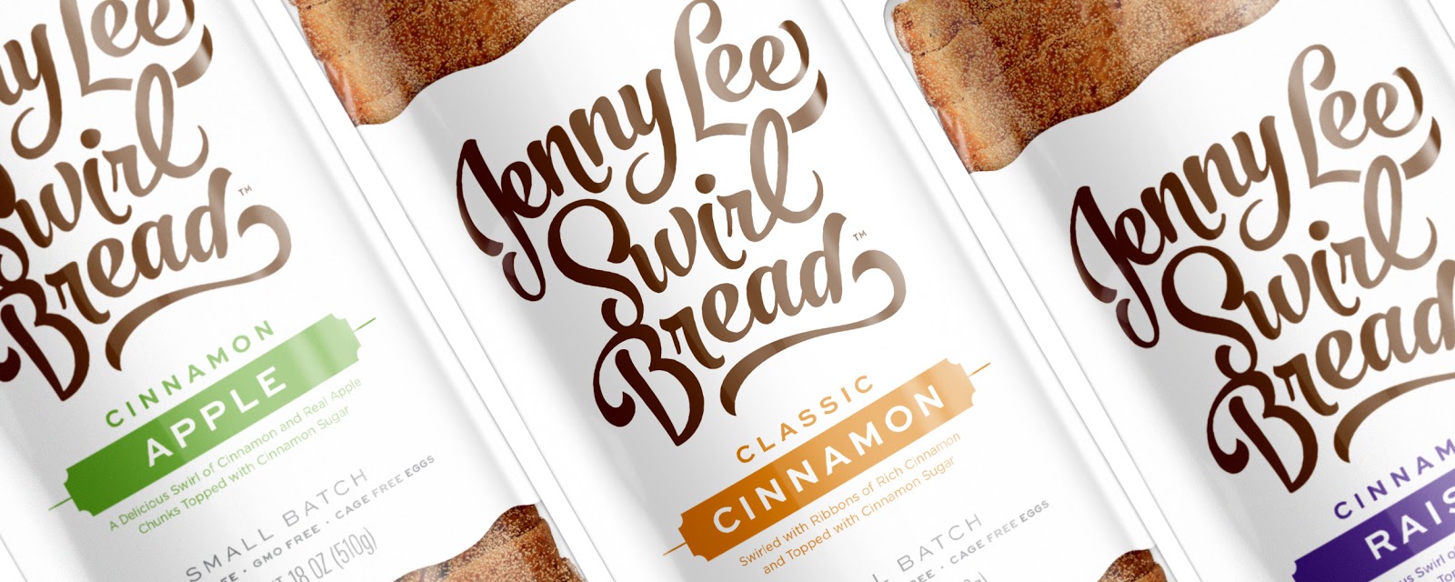
Jenny Lee Swirl Bread has been a Pittsburgh favorite since 1941, but the brand's image wasn't keeping up with its competitors. Hampton Hargreaves developed a new identity and packaging system to revitalize the product line and create a design that would resonate with new audiences — all while maintaining a solid connection to the brand's storied past.

HH preserved Jenny Lee's original hand drawn script concept, but brought the mark into the 21st century. The forms were completely reworked to give them more presence and movement — suggestive of the bread’s rich cinnamon swirls — while simultaneously maintaining readability.

The new mark provided the anchor for a complete redesign of Jenny Lee's packaging. By using a simplified layout, generous white space and a restrained color palette, the brand is once again the hero. The new design also improved flavor recognition by stripping away unnecessary noise.

From flavor descriptions to call-outs, every inch of the bag was reworked to better communicate the Jenny Lee's quality and history. Typography reminiscent of the early 1900s gives the design a nostalgic feel. A nod to the past can also be found on the bag's tail which features the Jenny Lee silhouette.

HH also improved the package's shelf performance by adding a printed bottom, ensuring brand visibility at all times. The dramatic redesign gave Jenny Lee a fresh look and the functionality needed to attract new generations of cinnamon bread fans.

Read more

Milda Yoghurt


Designer: Daniel Hauser
Project Type: Produced, Commercial Work
Client: Mlékárna Milda
Location: Czech Republic
Packaging Contents: Yoghurt
Packaging Substrate / Materials: Plastic, aluminium
Printing Process: Flexography

The goal was to create unique yoghurt package design by using print on whole packaging. It should reflect the place of origin and the beautiful nature of this place. So i use it on the package and make it very friendly. It has only two flavors. The colors for the package represent the flavor.

Read more

Sunday, January 8, 2017

The Color Of Confiture


Creative Agency: Latona Marketing Inc.
Project Type: Produced, Commercial Work
Client: Poco a Poco
Location: Shizuoka, Japan
Packaging Contents: Jam (confiture)
Packaging Substrate / Materials: Paper
Printing Process: Screen printing

A package design for handmade high quality jams (confiture), that uses carefully selected materials. The jams comes in more than 20 different varieties.

This multicolored lineup means you can pick jams by color, giving you a new way to enjoy them. It's like choosing the color of nail polish to paint your nails with, and can match your clothes or your mood. Just like a beautiful lineup of colorful nail polish, these jams provide a colorful display for your dining table.

Read more

Boom! Burger Box


Company: Boom! Burgers
Designer: Dimitar Chikakchiev
Project Type: Produced, Commercial Work
Location: Bulgaria
Packaging Contents: Burgers
Packaging Substrate / Materials: Paper
Printing Process: Digital printing

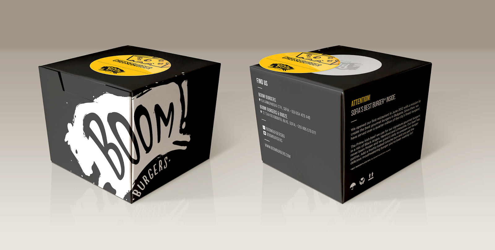
In order to deliver gourmet burgers the best possible way, Boom! Burgers needed a nice and functional burger box. The box design is created so the burgers don't get wet, but it keeps them warm. When you open the box it can easily be used as a dish and you can eat your burger without getting dirty.

Smoke House Deli Lunch Box Take Away


Creative Agency: Schmancy Pack Private Limited
Project Type: Produced, Commercial Work
Client: Smoke House Deli
Location: Bangalore, India
Packaging Contents: Seafood, Chicken, Rice, Cooked Food, Packed Meal
Packaging Substrate / Materials: Paper, Plastic
Printing Process: Offset Printing

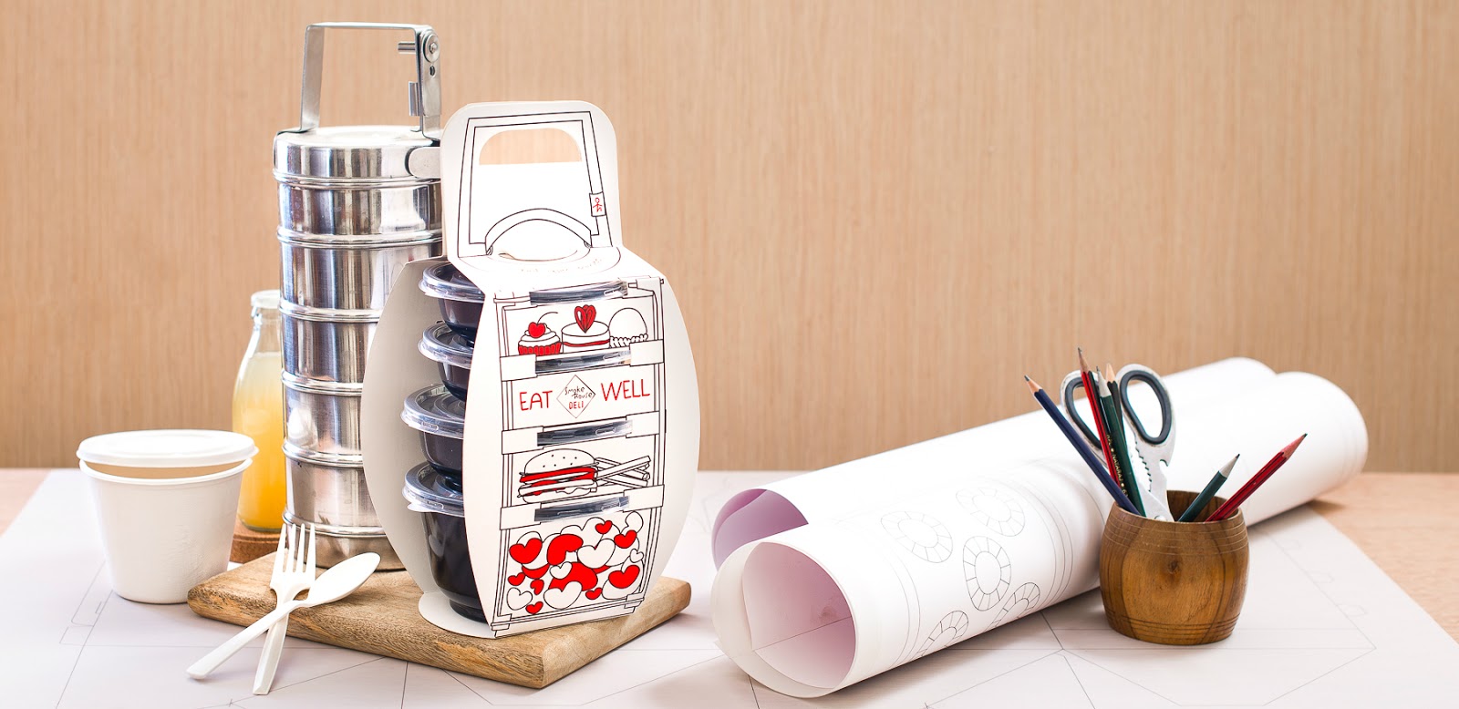
Smoke House Deli is an upmarket restaurant chain in India, located in most of the metro cities. They wanted a unique packaging design that would incorporate their quirky fun vibe. The target audience was mainly corporates.

As kids, Indian families use metal lunch boxes that would have about 3-4 individual compartments stacked one above the other containing individual food items. We wanted to recreate that same nostalgic feeling with our packaging and thus came up with this concept. There are 4 plastic containers that hold a 4 course meal and these are held together with a carrier designed out of paper. The attached image shows the traditional metal lunch box in the background and our product up front. The cutlery and paper napkins would slide in under the handle and these were perfect to take away as well.

What's Unique?
The unique concept and the nostalgia we were able to bring back while keeping the design practical and easy to assemble and use by the customer is what makes this stand out.


Wednesday, January 4, 2017

Refreshing Christmas Ration


Creative Agency: Panama
Project Type: Produced, Commercial Work
Location: Italy
Packaging Contents: Fruit

A perfect gift from Panama.

Christmas can be tough for your digestive skills. Too much food, millions of calories. So, in December 2016, we delivered the only exotic treats able to alleviate and refresh the heaviest holiday meals: pineapples from Panama.

The tin cans represent a limited edition gift for top-clients, managers and creative partners. All the pineapples have been harvested by hand in the flora of Panama, and packed with no additives and 100% natural fruit.

The design merges together minimal touch, lightness and a Christmas zest. The red stripe highlights the emergency packaging identity, to be opened in case of food overdose.

Read more

Tuesday, January 3, 2017

Cherub Baby Food


Creative Agency: Me + James Studio
Designer/Art Director Linda Baritski, James Stewart, Rob Key
Project Type: Produced, Commercial Work
Client: Cherub Food
Location: London
Packaging Contents: Baby Food
Packaging Substrate / Materials: Glass
Printing Process: Digital Printing

Creating the logo, branding, packaging design and advertisement campaign for the brand, Season of Victory (Linda Baritski) worked with Me + James Studio (James Stewart and Rob Key) on this project.


They wanted the branding to be an alternative to the overused "animal mascots" and "hand-drawn type" that are typical solutions for the baby food sector. By creating something clean and impactful, the brand stands out on shelf against its competitors.


Also, the simplicity of the design allows for flexibility across all items and also expresses the simplicity of the ingredients.


Read more