Showing posts with label Bath and Beauty. Show all posts

Monday, January 16, 2017

VOYAGES Extraordinaires Perfume (Concept)


Creative Agency: SOERENTIBOR Gbr
Project Type: Concept
Location: Hamburg, Germany
Packaging Contents: Perfume
Packaging Substrate / Materials: Paper, Glas, Aluminium

This concept is for those who love traveling. Each fragrance is dedicated to a particular city.

The flacon is inspired by a typical flask or travel bottle.

Read more

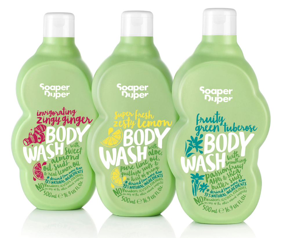
Soaper Duper


Creative Agency: B&B studio
Project Type: Produced, Commercial Work
Packaging Content: Bath and body
Location: UK

B&B studio creates green packaging for Soaper Duper which launched exclusively in Liberty
Soaper Duper, a new clean and green bath and body range founded by Marcia Kilgore – the entrepreneur behind Bliss Spa, Fit Flop and Soap & Glory – has launched in Liberty with environmentally friendly packaging by B&B studio.

The range uses the best naturally derived ingredients and is free from parabens, sulphates, phthalates, mineral oil and colourants, amongst others, as well as avoiding any ingredients that can cause ocean contamination. In a category more usually associated with style over substance, the Soaper Duper brand, product and packaging takes a unique approach, finding beauty within its commitment to naturalness, goodness and doing good.

Going green
A key requirement from the outset was to make the packaging as environmentally friendly as possible, so that it would live up to the brand positioning and design. B&B embraced this challenge and collaborated with the client and suppliers to develop packaging using high levels of recycled plastics, rather than virgin materials.

During the design process, a number of bottle colours were explored, but apple green, which had been used from the beginning, won through. The green reflects the products’ natural credentials and provides an ideal canvas for the vibrant graphics to communicate to the consumer. The Soaper Duper green is a bespoke colour and B&B worked with the suppliers to align the colour when printed across various print processes with the green of the physical packaging.

Good for the environment
The green HDPE bottles are made from 100 per cent post-consumer recycled plastic (PCR). Most of this material is made up from recycled milk bottles and recycled green bottle tops, which give the plastic a green tint.

Tubes have a maximum of 55 per cent recycled plastic content because any higher and the tube starts to crinkle and is harder to squeeze. Whilst the jars are currently virgin PP, they are currently all on test in PIR with the intention of phasing in PIR as soon as possible.

Graham Hawkins, Production Director, B&B studio, says: “This approach to packaging design leads to fewer plastics being sent to landfill, helps to support the recycling infrastructure and uses less energy, producing a lower carbon footprint than using virgin plastics. “As Soaper Duper is a natural and ethical brand, the packaging needed to reflect this. It leads the way with the growing trend in personal care for natural brands to reduce their impact on the environment and for ethical brands which enable consumers to give a little back by buying into them.”

The Soaper Duper range starts at £6.00 rrp. The brand supports Water Aid and Clean the World to bring soap and water to communities that need it.


Sunday, January 15, 2017

MTL Grooming (Student Project)


Designer: Jaskiran Kaur
Project Type: Student Project
School: Dawson College
Course: Packaging Design
Tutor: Suzanne Cote
Location: Montreal, Canada
Packaging Contents: Beard Grooming Kit

MTL Grooming is a company which provides beard grooming kits that contain beard oil and balm. They use natural and high-quality ingredients. When caring for a beard it is important for men to use the correct quantity of beard oil this is why the oil is packaged in pills that must be popped to apply the product onto their beards, this ensures the perfect amount of product.The packaging is designed using the different stages of beard growth: Grow this is when you have decided to grow a beard, Growing this is the stage where you are thinking of quitting and Grown this stage you have a full grown beard and plan on keeping it for as long as possible. The lines on the packaging represent hair growth they get longer and thicker as it reaches grown.

Read more

Thursday, January 12, 2017

Almay Cosmetics (Student Project)


Designer: Brittany Scannicchio
Project Type: Student Project
School: Chicago Portfolio School
Course: Design
Tutor: Katie Sprenkle
Location: Chicago, USA
Packaging Contents: Makeup
Packaging Substrate / Materials: Paper
Printing Process: Digital Printing

Almay Cosmetics is a hypoallergenic makeup brand dedicated to providing customers cosmetics with safe and natural ingredients. The goal of this redesign was to showcase Almay’s use of gentle and non-irritating ingredients that work for all complexions. Dynamic geo-patterns were used to represent the unique attributes of each woman’s skin as well as the color-coded shade system to position Almay as an all-inclusive brand.

Read more

Wednesday, January 11, 2017

Optiat


Creative Agency: Studio More
Account Director: Nikita Sun
Project Type: Produced, Commercial Work
Client: Optiat
Location: London, United Kingdom
Packaging Contents: Beauty, Coffee Scrub
Packaging Substrate / Materials: Plastic

The idea of Optiat, an upcycled coffee body scrub was first conceived in 2016, where the founder began to consider the different ways in which discarded coffee grounds could be utilised.

Optiat had an inspiring set of company values, but lacked clear definition as a brand. They needed a clear strategy to transform their identity from upcycled waste to trustworthy beauty brand.

We worked closely with Optiat on their brand strategy allowing them to differentiate themselves from other coffee scrubs. The identity has unlocked the brand’s potential to become the ‘Nature Friendly Beauty Company,’ with Coffee Scrubs being their first product to launch.

Read more

Elo Soaps | Greek Gods edition


Designer: Mike Karolos
Project Type: Produced, Commercial Work
Client: Elo soaps
Location: Athens, Greece
Packaging Contents: Soaps
Packaging Substrate / Materials: Paper

Elo soaps are 100% natural handmade soaps made from pure Greek olive oil . I was asked to make a series of illustrations of the Greek mythological gods and godesses for the soaps they provide to Greek gift shops mostly targeted to tourists visiting Greece. We made 6 of the 12 main Greek gods, Zeus, Athena, Aphrodite, Demeter, Poseidon & Hermes. Although the ancient God theme is a very used theme in the Greek gift shop industry, we attempted to make them more modern and fresh by using my geometric pop art style. So the result we believe is something different than the usual. The packaging is very simple made of wrapped paper, a one sided printed card and a colored rope holding it together.

Read more

Tuesday, January 10, 2017

Intense Limited Edition


Creative Agency: Weagroup
Project Type: Produced, Commercial Work
Client: Vagheggi S.p.A
Location: Castelfranco Veneto, Italy
Packaging Contents: Perfume
Packaging Substrate / Materials: Paper
Printing Process: Digital printing

Following the natural and floral tradition initiated by Vagheggi, Weagroup created the new “Intense” limited edition captures the elegance spirit of the peony with the essence of fresh petals in bloom and exalted the intensity, purity and refinement of them.

An exclusive and distinctive box-open petal which incorporates the colors of the flower embellished by silver, which defines an original, feminine, modern and extremely chic character.

Once again Weagroup, behind direction of Vagheggi, created the design of all marketing tools that have given rise to the new communications campaign “Intense Limited Edition”

Read more

Beutanics (Concept)


Creative Agency: Burg Design
Project Type: Concept
Location: South Africa
Packaging Contents: Body Lotion
Packaging Substrate / Materials: Plastic
Printing Process: Digital Printing

A body line developed with a delicious blend of flower, spice and fruit is topped with vanilla, resulting in an enchanting ‘Tea with Alice’ feeling.

Read more

Rasa Anti-age Cosmetic's Line


Creative Agency: Juicy Square
Design: Paulius Budrikis
Photography: Kernius Pauliukonis
Post production: Robertas Gaudiešius
Project Type: Produced, Commercial Work
Client: Biok Laboratorija
Location: Vilnius, Lithuania
Packaging Contents: Cream and serum
Packaging Substrate / Materials: Plastic, paper
Printing Process: Flexography, foil stamping, embossing

A new, innovative formula of treating the skin aging is something special BIOK laboratory has brought to the market. They came up with a natural active ingredient called LIFTONIN®-XPRESS. It makes fighting the wrinkles extraordinary effective and gives the elasticity and resilience for the skin.

Read more

I AM Christmas Limited Edition 2016


Creative Agency: Weagroup
Project Type: Produced, Commercial Work
Client: Vagheggi S.p.A
Location: Castelfranco veneto, Italy
Packaging Contents: Perfume
Packaging Substrate / Materials: Paper
Printing Process: Digital printing

Weagroup signed Christmas 2016 Vagheggi, with a new integrated strategy "I Am" Limited Edition.

The limited edition presents two elegant boxes with a choice of skin care creams. The packaging takes up the shape of a rose, one of the raw materials of the products, which are declined in holes and color combinations of metallic base giving brightness and preciousness of referrals.

A project developed with of a thorough study of the trends, new procurement processes and ended with the coordination of all communication materials.

Read more

Microme (Concept)


Creative Agency: Funky Business® Branding Agency
Creative Director: Mikhail Ankudinov
Art-director: Ilya Tumaikin
Designer: Sergey Ryadovoy
3D, retouch: Konstantin Simonov
Project manager: Anna Raskova
Project Type: Concept
Location: Russia, Yekaterinburg
Packaging Contents: Cosmetics

Branding agency Funky Business® created new brand line concept of premium cosmetics.

Microme Cosmetics are innovative solution in the field of molecular makeup. Natural ingredients and the latest scientific developments allowed to create safe and effective solution for rejuvenating and skin protection. Product line consists of three well-developed positions helping to get a full range of skin care products. Skin Protect — protection, Skin Care — Care, Skin Control — constant care.

The main objective was to reflect company's innovative approach to their products, natural ingredients, but not to make it in trivial way. We decided to look deeper and explore the basic ingredients of cosmetics under the microscope because its molecular properties give such effect. On the molecular level each object forms incredible patterns, so these patterns make up basis of packaging ideas.

As a result, the decision was to use a tactile pattern formed by main ingredient of the product. High-quality paper and special printing technology made it possible not only to see but also feel the contents of the box.

Read more

Monday, January 9, 2017

Estribor Baby Cosmetics


Designer: Mdbenito
Project Type: Produced, Commercial Work
Client: Estribor
Location: Spain
Packaging Contents: Cosmetics
Packaging Substrate / Materials: Plastic

Completion of the project in its entirety, choice of naming, logo design and packaging design.

"Estribor" is a brand of baby cosmetics, so it has been used a color and a design very appropriate for it. The target audience is moms and dads, so a paper boat was the best way to make a call to the past, to childhood, to beautiful memories. They are several products for the care of the babies, which differ by their stamping, always with the sky blue and white as the main colors.

Read more

Sunday, January 8, 2017

Miko No Yu (Student Project)


Designer: Chiun Hau You
Project Type: Student Project
Class: Package Design I @ Taiwan Tech
Professor: Ting Chien Lin
Technical supports: Jack Liu, Sheu Yong
Packaging Content: Hot spring bath powder
Location: Taipei, Taiwan

Design motivation
To re-design hot spring bath powder packaging to break off from the usual packaging that you can find in the market that are plastic and cheap looking. This is a hot spring powder packaging that can allow users to get the most pure and natural way to enjoy the hot spring.

design concept
Through the different combination of nature materials, creating a simple, natural atmosphere. In the selection of materials, Hau You used stones to represent the natural hot spring landscape, the wooden cap is a symbol of "Japanese bathing items" and by combining the two together it forms a new look and feel.

Read more

North Ice (Concept)


Designer: Iwona Przybyła
Project Type: Concept
Location: Poland
Packaging Contents: Cosmetics
Packaging Substrate / Materials: Ensocoat (Stora Enso)
Printing Process: Foil stamping

North Ice is a package set dedicated for high quality Scandinavian cosmetics. It’s made from Ensocoat cardboard . Standing out with elegance and consistent geometric forms.

Style of the packages refers to Scandinavian design, merging together minimalism and inspiration with the nature (waters of the north in this case). Link of white mat surfaces and black shining logo gives the feeling of freshness and accents that content is exclusive, but without unnecessary pomp.

Read more

OMG


Designer: Gadi Adar
Project Type: Produced, Commercial Work
Client: Sacara Cosmetics
Location: Rehovot, Israel
Packaging Contents: Body Lotion and Body mist
Packaging Substrate / Materials: Plastic and Glass
Printing Process: 4 color printing on plastic and digital printing

New line of cosmetics products for young girls, high response in the market.

What's Unique?
New graphic language in the cosmetics stores based on pop art.


Wednesday, January 4, 2017

Face Palm


Designer: Cristina Cazacu
Copywriter: Cristina Tupița
Project Type: Concept
Client:
Location: Bucharest, Romania
Packaging Contents: Make-up and Cosmetics

Makeup is there to cover you up when you go out into the world. It covers your imperfections, your insecurities and your questionable life choices.

Slogan: Make mistakes, look flawless

Read more

Paddys Bathroom


Creative Agency: Biles Hendry
Project Type: Produced, Commercial Work
Packaging Content: Toddler bath products
Location: UK

Toddler bath products, that are natural, gentle, easy-to- use and feature an octopus… now that’s handy!

Paul Lindley, the man behind Ella’s Kitchen, launched his range of bath products for young kids in 2015. Named after his son, Paddy’s Bathroom consists of five products designed specifically for the early years.
The original design borrowed heavily on the Ella’s Kitchen design language but didn’t observe kids’ bath category codes or allow this brand ‘to stand on its own two feet’. Biles Hendry was asked to redesign the packs to elevate their natural and gentle positioning, whilst firmly placing them in kids bathing and creating a stand-alone brand.

Young children are fascinated by the weird and wonderful animals that can be found in water, which gave rise to the inclusion of illustrations of a playful, bubbly, bathing octopus. While the baby tier creates some clear on-shelf differentiation by featuring a turtle .

Biles Hendry have kept the designs soft, gentle and honest and used category visual language to provide consumer reassurance that the products will be kind to their young ones’ skin. The overall delivery majors on seeing the world through the eyes of a child, with child-like lettering and drawings, creating a visual sense of fun that is familiar and appealing to little ones.

The logo has also been designed to be soft, playful and ownable, consisting of child-like writing surrounded by bubbles, with a hidden ‘treat’. Creative Director Anthony Biles commented: ‘two of the bubbles resemble a parent and child smiling happily cheek to cheek - after all, kids’ bath time is a fun happy together time!’

The range redesign can be seen in stores from January.

Read more

Wednesday, December 28, 2016

KIREI | Hair care (Concept)


Designer: Mer Avila
Project Type: Concept
Location: Buenos Aires, Argentina
Packaging Contents: Hair care product line
Packaging Substrate / Materials: Plastic
Printing Process: Flexography, screen printing

KIREI | Hair care (Japanese word for beauty) it's about representing a different, edgy conception of beauty. The design combines geometric black and white backgrounds with neon colors, giving the products a modern twist.


Read more

Tuesday, December 27, 2016

Yehwadam


Designed by THE FACESHOP in-house design
Project Type: Produced, Commercial Work
Location: Seoul, Korea, Republic of
Packaging Contents: Skin care cosmetics

Yehwadam is the reinterpretation of Korean beauty and traditional herbal beauty recipes.

Yehwadam is a skincare line dedicated to presenting Korean beauty based on a reinterpretation of traditional beauty regimens described in historical texts that document an array of ingredients harvested from nature in Korea and embody the wisdom of its women. Products are designed to deliver nature’s energy to skin through carefully selected natural ingredients that are grown in Korea in ideal conditions and processed so as to preserve their skincare properties and vital energy.

Yehwadam Revitalizing line is a revitalizing and anti-aging skincare line that helps bring out your skin's innate healthy glow through Gyuhwabang a modern reinterpretation of secret beauty recipes found in historical texts using herbs harvested in nature of Korea.

Read more

Friday, December 23, 2016

Lord Jones


Creative Agency: Werner Design Werks
Project Type: Produced, Commercial Work
Client: Lord Jones
Location: Saint Paul, Minnesota, United States
Packaging Contents: Cannabis-infused chocolates and lotions

For Your Royal Highness
Lord Jones manufactures and distributes the world’s finest cannabis-infused products. Lord Jones confections are made by hand in small batches from single origin Ecuadorian dark chocolate, imported natural European fruit essences, and pure California-grown cannabis extract. Lord Jones Pain & Wellness formula topicals have been developed by a veteran team of personal care experts to deliver full-spectrum whole plant medicine that provides relief from pain, inflammation and a variety of skin conditions.

Read more