Showing posts with label Student. Show all posts

Monday, January 16, 2017

Quintessence (Student Project)


Designer: Camille Chassagne & Léa Marque
Project Type: Student Project
School: ECV
Location: France
Packaging Contents: Luxury honey
Packaging Substrate / Materials: Cardboard & bottle
Printing Process: Foil stamping

Honey is present in each religion, each country, it is universal since antiquity and it has many symbolic. There is the symbolic of the sun, described by this quote :

«Symbole solaire par excellence, comme quintessence végétale de la lumière exaltée dans les fleurs».

Honey has many reflects, it’s a precious essence, like a unique jewel or a gemstone. Honey becomes a product of an inestimable quality thanks to every species that compose the production chain (vegetable, animal and human) and mostly thanks to the achievement of the bees. So our concept is all about unique jewel, light, reflects etc.. Our brand philosophy is « Each country owns an inestimable honey, his own jewel »

About the name, we choose « quintessence ». Quintessence means « the essence of a thing in its purest and most concentrated form ». This name matches our concept perfectly. It’s also « In ancient and medieval philosophy, the fifth and highest essence after the four elements of earth, air, fire, and water, though to be the substance of the heavenly bodies and latent in all things.

Our packaging is an interlocking of the three parts of the key system to the production of honey and its balance. These three parts (so these two parts and the bottle) represent the vegetal, the animal and the human. Interlocking echoes to the structure of the honey bees' hive. These tree elements, parts cannot work independently to create honey. So as we just told you, the square is an important element. We make our packaging around the bottle to have like a window, to see the light through the jar of honey. First the customer, take the principal pack of his holster. Then he opens the packaging like a revisited jewelry box and discovered the honey bottle. We wanted a packaging with a touch of wonder. For the cap, it’s allude to the hive but in more abstract way.

Read more

Sunday, January 15, 2017

Forward (Student Project)


Designer: Klára Plicová
Project Type: Student Project
Location: Czech Republic
Packaging Contents: Gas cooker
Packaging Substrate / Materials: Paper
Printing Process: Screen printing

Packaging design for a gas cooker is a student project that was created at the Faculty of Design and Arts Ladislav Sutnar. New logo for fictional brand Forward was created and it is all completed by simple vector illustration.

The package is in one piece without the using adhesives. In the first part of the box is a gas cooker itself and in the second part is an accessory - manual with instructions, matches and textile bag.

The idea behind the project is connecting people with nature and capturing the moments from journey.

Read more

MTL Grooming (Student Project)


Designer: Jaskiran Kaur
Project Type: Student Project
School: Dawson College
Course: Packaging Design
Tutor: Suzanne Cote
Location: Montreal, Canada
Packaging Contents: Beard Grooming Kit

MTL Grooming is a company which provides beard grooming kits that contain beard oil and balm. They use natural and high-quality ingredients. When caring for a beard it is important for men to use the correct quantity of beard oil this is why the oil is packaged in pills that must be popped to apply the product onto their beards, this ensures the perfect amount of product.The packaging is designed using the different stages of beard growth: Grow this is when you have decided to grow a beard, Growing this is the stage where you are thinking of quitting and Grown this stage you have a full grown beard and plan on keeping it for as long as possible. The lines on the packaging represent hair growth they get longer and thicker as it reaches grown.

Read more

Thursday, January 12, 2017

Almay Cosmetics (Student Project)


Designer: Brittany Scannicchio
Project Type: Student Project
School: Chicago Portfolio School
Course: Design
Tutor: Katie Sprenkle
Location: Chicago, USA
Packaging Contents: Makeup
Packaging Substrate / Materials: Paper
Printing Process: Digital Printing

Almay Cosmetics is a hypoallergenic makeup brand dedicated to providing customers cosmetics with safe and natural ingredients. The goal of this redesign was to showcase Almay’s use of gentle and non-irritating ingredients that work for all complexions. Dynamic geo-patterns were used to represent the unique attributes of each woman’s skin as well as the color-coded shade system to position Almay as an all-inclusive brand.

Read more

Theo Chocolate (Student Project)


Designer: Caitlin Mee
Project Type: Student Project
School: Chicago Portfolio School
Course: Packaging
Tutor: Billy Baumann
Location: United States
Packaging Contents: Chocolate
Packaging Substrate / Materials: Paper
Printing Process: Digital printing

As the first organic and Fair Trade chocolate factory in the United States, Theo Chocolate continues to share their passion of delicious chocolate and making the world a better place one chocolate bar at a time.

Challenge
Create a new packaging for Theo Chocolate bars that represents the care that goes into each bar from sourcing beans to packaging.

Solution
A biodegradable packaging inspired by fabric designs from the cocoa source countries allowing the consumer to see the chocolate. The final packaging shows the transparency of Theo Chocolate's process from sourcing to packaging.

Read more

Wednesday, January 11, 2017

Hungericum Taste Hungary! (Student Project)


Designer: Katona Barbara
Project Type: Student Project
School: Eszterházy Károly University
Course: Graphic design
Tutor: Dr. Süli-Zakar Szabolcs
Location: Eger, Hungary
Packaging Contents: Traditional Hungarian food
Packaging Substrate / Materials: Paper
Printing Process: Digital printing

The word „Hungericum” is composed of two words: “Hunger” (referring that it contains food) & “Hungaricum” (as a traditional Hungarian value)

The first feature was that I wanted to acquaint traditional Hungarian brands with foreign people. The Hungarian foods can be real specialties to the foreigners: they can experience a whole new world of flavors. There’s a dozen of web pages where you can get packages from other countires, but for a certain amount of money. In Hungary it’s not a popular matter, so my mind came to that it would be a good idea to make a new brand. Next to the Hungarian there is also an English product information, so it’s exportable. The whole identity amalgamates the typical Hungarian motives and colors with a modern execution.

The package itself looks like a present. You don’t have to buy the products one by one, if you want to gift your relatives or friends some Hungarian snacks. The packing offers you the Hungaricums on a „platter”, forming an aesthetic appearance. All of the products are wrapped individually. A tiny sticker indicates what it contains. I attached a booklet to the package, where you can find the product infromations: so the foreigners can orintate about the products itself, too.

Read more

Tuesday, January 10, 2017

Stealth For Gentlemen (Student Project)


Designer: Sydney Noland
Project Type: Student Project
School: Ball State University
Course: Visual Communications
Tutor: Sam Minor
Location: Muncie, United States
Packaging Contents: Men's Underwear
Packaging Substrate / Materials: Paper
Printing Process: Foil Stamping

Stealth was a project that focused on the concept of package design, and learning how to make numerous support pieces work together as one. The company was designed to attract a male audience, selling high-end underwear, socks, and t-shirts through an online store. The support pieces created for this project included a business card, two different sized mailing boxes, a postcard, and a gift card.

Simplicity was a key concept to Stealth’s brand. The brand’s minimalism with a hint of foiling was essential in order to give Stealth a sleek and luxurious appearance. The black foil on black card stock added to the brand’s concept, in which the word “stealth” is defined as being cautious and surreptitious action or movement.

Read more

King's Milk (Student Project)


Designer: Seunghee Baek
Project Type: Student Project
School: Hongik University
Course: Design Studio(4)
Tutor: Hyunkyung Park
Location: Seoul, Republic of Korea
Packaging Contents: Milk, Cheese, Yogurt
Packaging Substrate / Materials: Paper, Glass, Plastic
Printing Process: Digital printing

King's Milk is a brand of milk based on an interesting and unique brand story and symbol.

The country Seolkook—Snow capped mountain. Since The king of Seolkook loved to drink milk so much, his beard turned white. One day, the king heard the story that the people under the mountain are not drinking milk. The king gave his speech. "Drink the milk!”

King's Milk promises to convey the taste of fresh and rich milk that is like drinking with cold, white snow. In addition to the original 100% white milk, we processed milk containing the taste of ingredients such as banana, chocolate, strawberry, fresh yogurt, and cheese.

Read more

Sunday, January 8, 2017

Miko No Yu (Student Project)


Designer: Chiun Hau You
Project Type: Student Project
Class: Package Design I @ Taiwan Tech
Professor: Ting Chien Lin
Technical supports: Jack Liu, Sheu Yong
Packaging Content: Hot spring bath powder
Location: Taipei, Taiwan

Design motivation
To re-design hot spring bath powder packaging to break off from the usual packaging that you can find in the market that are plastic and cheap looking. This is a hot spring powder packaging that can allow users to get the most pure and natural way to enjoy the hot spring.

design concept
Through the different combination of nature materials, creating a simple, natural atmosphere. In the selection of materials, Hau You used stones to represent the natural hot spring landscape, the wooden cap is a symbol of "Japanese bathing items" and by combining the two together it forms a new look and feel.

Read more

Tuesday, January 3, 2017

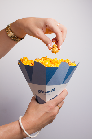
Garrett Popcorn Shops Cones (Student Project)


Designer: Jennifer Mulvihill
Project Type: Student Project
School: Chicago Portfolio School
Course: Packaging
Tutor: Billy Baumann
Location: Chicago, IL
Packaging Contents: Popcorn
Packaging Substrate / Materials: Paper
Printing Process: Digital Printing

The Garrett Popcorn Shops packaging and brand refresh was designed to be Instagram worthy. Along with a color and logo update, the polygonal cone shaped packaging aims to be festive and unique with gold interiors. Garrett Popcorn Shops caters to many corporate and wedding events and the idea was to have packaging that stood out on the table/shelves and got people talking. The top can fold together to have an easily resealable package. The wrist handle also makes the cone convenient for traveling as many people stop at the Garrett Popcorn Shops in airports all over the world. These design choices reinforce how special the popcorn is for the loyal fans everywhere who love this Chicago brand.

Read more

Bebelac Campaign Design (Student Project)


Designer: Atakan Akçalı
Project Type: Student Project
School: Bahçeşehir University
Course: Graduation Project-I
Tutor: Fatoş Adiloğlu, İpek Torun, Burak Tamer, Güven Çatak, Tanzer Ercanpolat
Location: Istanbul, Turkey
Packaging Contents: Baby Food
Packaging Substrate / Materials: Paper, Glass

This is a project done in the constructs of a re-positioning campaign for a well-known baby food brand called Bebelac. As a result of my research I aimed to portray naturalness in parallel to what the consumers expect and what the current brand identity lacked. I constructed concepts and visual concepts separately for different mediums. For the brand identity I chose the concept trust, which I visualised with the concept roof. For the general campaign concept which I designed a magazine ad, packaging design and a short TV commercial I developed the concept dearest to go with the visual concept animals and their nature. Whilst designing the project I focused on the expectations of my target audience of the chosen brand which is classified as B1 and B2.

I designed each animal colour specific to the flavour to create a contrast. The idea of each animal choice was identified by each ingredient as a bear would eat fruit, a monkey bananas, and a rabbit carrots. The visual method of a sketchy unfinished look was decided to give the brand a lightness; cohesive to the transparent packaging and the feeling of an organic brand, that focuses on the product itself.

I also designed a secondary packaging with a promotional item according to each packaging with the idea that the product is so natural that even animals are after it. Therefore a toy would help the meal experience and also promote a more fun and creative brand.

In the video we witness a scene where the feeding process has finished, and an almost finished Bebelac jar of baby food is placed on the kitchen counter. After the cost is clear, two of the playful Bebelac animals appear in pursuit of the leftover food. The idea was that animals only consume what is natural and therefore are after Bebelac which is an all-organic brand.

Read more

Monday, January 2, 2017

sow.pharm (Student Project)


Designer: Zach Pater
Project Type: Student Project
School: UW-Stout
Course: Product and Packaging Graphics
Tutor: Nagesh Shinde
Location: United States
Packaging Contents: Sesame Seed Capsules, Flax Seed Capsules, Chia Seed Capsules
Packaging Substrate / Materials: Metal Capsule Container, Cardstock, Veggie Capsules
Printing Process: Laserjet Printing

sow.pharm uses organic seeds as an all around healthier alternative to pharmaceutical drugs. The natural benefits found in these seeds can be used to reduce and relieve common everyday ailments such as migraines, joint inflammation, and muscle relief.

The sow.pharm package contains 16 capsules of seeds, planting instructions for each specific seed, and a vessel for the beginning stages of germination for the plant before transferring to an outdoor environment. sow.pharm’s goal is to eliminate the use of pharmaceutical drug use for common ailments and to present an initiative to start growing your own sow.pharm!

Read more

PlantAid (Student Project)


Designer: Choi Hye Jung
Photographer: Kyu Yeon Kim
Project Type: Student Project
School: Hongik University
Course: Design Studio (4)
Tutor: Hyunkyoung Park
Location: Seoul, Korea
Packaging Contents: Plant food, Bark, Gravel, every product for plant
Packaging Substrate / Materials: Paper, Plastic
Printing Process: Digital printing

PLANTAID is a plant first aid brand that pursues a healthy life with healthy plants. In these days, plants are friends who comforts and heals people. I wanted to work on packaging of supplement for plants from the thought that I would like to help when such a thankful friend is sick.

Brand naming,PLANTAID is a compound word of plant and first aid. PLANTAID has two meanings. One is cure for plants, and the other is cure by plants. We make plants healthy and plants make people healthy. I wanted to use the symbol and color that reminded me of first aid kit and medicine to deliver the brand.

Growth supplements, main products, have flower, foliage plants, succulent product line. Each package is designed with botanical arts of the product plant and sub colors, which makes easy to understand the product. Also, PLANTAID has pill type plant food, bark, gravel soil and everything needed for a healthy life with healthy plants.

Read more

Cuckoo, The Coffee Shop (Student Project)


Designer: Vasiliki Lafka
Project Type: Student Project
School: Middlesex University
Course: Bachelor's Degree - Main Project
Location: Athens, Greece
Packaging Contents: Coffee
Packaging Substrate / Materials: Paper, Aluminium

A new coffee brand based on the cuckoo clock.

This is the final and main project of my B.A. degree. The general idea of this project is to design the logotype, the branding, the packaging and a series of advertisements and applications for the promotion of a company, a service or a product itself.

I chose to create a "fictional" coffee brand with the title name Cuckoo, the coffee shop. The terminology is based on the well-known cuckoo clock and works as a reminding factor of the morning wake-up call, just like a cup of coffee. The design of the logo was based on both the cuckoo bird and the coffee seed.

What's unique about this project is the inspiration of the coffee packages. I designed four different patterns which were derived from traditional objects that are associated with countries from South America and Africa, otherwise known as the bean belt. The Colombian package is based on a clay plate, the Ethiopian one on a carrying head basket, the Mexican on a traditional Aztec fabric and the Brazilian on a leather basket. They can also be identified by their color palette as well as the patterns and the elements in every single package are dominated by a single color typography. The combination of colors, patterns and the smell of the fresh roasted coffee make customers feel like the are making a small journey to the roots of every country.

Read more

T-shirt Eco-Packaging


Designer: Shao-Hua Hsu
Project Type: Student Project
School: HTW Berlin
Course: Short-term Project, Packaging Design
Tutor: Birgit Severin
Location: Germany
Packaging Contents: T-Shirts
Packaging Substrate / Materials: Palm leaves

T-shirt Eco-Packaging is a 100% bio and eco-friendly packaging made of palm leaves. During this 5 days project I had the opportunity to develop my packaging idea in collaboration with Berlin-based company Leef.

What's Unique?
The palm leaves I used to create the packaging are handpicked leaves from Areca palm tree, which is commonly grown in Asia. Once carefully washed and dried, the palm leaves are stable and solid enough to make into the form I wanted. The final design has the shape of an unsealed cylinder and is 100% ecological as well as compostable. The curving form from the top creates an opening of the packaging and the circle on the body makes the layout and color of the T-shirt visible. In addition, the packaging is very light and handy.

Read more

Wednesday, December 28, 2016

Reflets de France (Student Project)


Designer: Maxime Genier
Project Type: Student Project
School: Lim'Art
Course: BTS Design Graphique
Location: France
Packaging Contents: Food
Packaging Substrate / Materials: Paper

Reflets de France’s products are issued from the French culinary heritage. But what would this heritage be without growers, men and women, young and less young, working every day to spread our land around the world. The promise is: "Behind every product, a Man, a Land"

Read more

Tuesday, December 27, 2016

Cereal Planet (Student Project)


Designer: Mihyun Sim
Project Type: Student Project
School: Konkuk university
Location: Seoul, Korea

This package design project started as a branding idea of‘'Cereal Planet' - a cereal cafe where you can get all kinds of cereals from all over the world. The main concept was to sell cereals in one-meal size package to make it easier to try many flavours without difficulty- which was later used as a design module. While searching for cereal cafe references I found an image of a counter with cereals stacked behind it. I wanted to use this idea in a way that could accentuate the concept of the brand. Using partition and composition, when the hexagon shaped boxes are stacked together, it reveals the hidden shape of stars so that the whole wall the boxes are stacked at could be seen as a cosmos with black stars shining.

Read more

Monday, December 26, 2016

Thinky (Student Project)


Designer: Jisu Hwang
Project Type: Student Project
School: Hongik University
Course: DESIGN STUDIO (4)
Tutor: Hyunkyoung Park
Location: Seoul, Korea
Packaging Contents: Children instructional tool
Packaging Substrate / Materials: Paper
Printing Process: Digital printing, Silk screen printing

‘Thinky’ is a brand of educational toys to develop children’s thinking ability. Unlike existing compulsory programs, Thinky helps to develop thinking ability naturally through games and plays. In this program, children encounter various types of problems, and they find out solutions through interesting activity themselves. In this process, children’s brain will be constantly stimulated, and thinking ability will be developed naturally and effectively.

In developing the brand, package, and promotional tools of these properties, I took the idea of ‘thinking’, which is the core of children’s education, as a motif. This motif has been expanded and branded 'Thinky' in the sense of 'imaginative and thoughtful child'. In addition, in order to take advantage of the characteristics of this product, I came out with BI and package design that can be visually appealing to children. This will increase the interest of children in learning and also will improve their learning more effectively. Furthermore, I have developed various characters for such purpose, for children to interact naturally with the characters.

Read more

Tuesday, December 20, 2016

150 Years National Archaeological Museum (Student Project)


Designer: Konstantina Vatavali
Project Type: Student Project
School: TEI of Athens
Course: Packaging
Location: Athens, Greece
Packaging Substrate / Materials: paper, cord
Printing Process: Digital printing

The aim of this project was the study and the design of a series of packages for different gifts - products, for the Greek market, as a promotional tool and commercial affirmation of the National Archaeological Museum. This project was carried out in the course of Packaging, at Technological Educational Institute of Athens.

My logo was mainly influenced by the neoclassical building of the Museum. I was inspired from the Neoclassicism, whose characteristics are the connection with the past and the integration in the European context and even the simplicity, stability, symmetry and linear decorations, issues that I tried to transmit into my logo. The colors, that were used in the packages and other applications, were chosen from the main textures and shades prevailing in the museum. Ιn addition to the logo and the museum's information, the secondary graphic element that I used, is a texture that after processing has the appearance of marble, as in the museum is the characteristic material that prevails.

For the other applications beyond my packages, I chose to design some abstract illustrations, from some well-known artefacts of the museum. Each of these represents a typical season and collection. My goal was to make a minimal design, in order to combine properly with my logo and my packages. The illustrations were inspired by elaborate decorative elements and works that characterise the art of the Ancient Greek Culture and located exclusively in the Archaeological Museum.

Read more

A Wes Anderson Film (Student Project)


Designer: Konstantina Vatavali
Project Type: Student Project
School: TEI of Athens
Course: Graphic design
Location: Athens, Greece
Packaging Substrate / Materials: Wood, paper, plastic

This project discusses the DVD’s special edition of Wes Anderson’s film, Grand Budapest Hotel, in the range of packaging lesson, during my studies on the Erasmus program.

The main purpose of this packaging is the best possible promotion of the film. The package consists of a wooden box. Except of the DVD, it also contains some badges, a calendar, postcards, bookmarks, coasters and a book with information about the movie.

This is a movie that describes the life story of Ms. Moustafa, who started working at the inter-war period, as a bellboy, at the luxury hotel «Grand Budapest», in which is now the owner of. Doses of black humor and a color palette that gives a detailed worked, aesthetic and atmospheric style that brings us close to Rococo.

Read more