Showing posts with label Russia. Show all posts

Thursday, January 12, 2017

Ochakovskiy Winter Limited Edition


Creative Agency: DDVB
Project Type: Produced, Commercial Work
Packaging Content: Beer
Location: Moscow, Russia

The Snowman, perhaps the most famous symbol of the winter season.

It's not just a great excuse to have fun with family or friends, but also an opportunity to show imagination and feel to the real creators. Snowmen can wear a funny hat or it can be wrapped with a warm scarf, broom sticks as the hands and of course to make it perfect, we need to add in a nose-carrot.

Read more

Tuesday, January 10, 2017

New Year's Greetings Generator


Creative Agency: LINII Group
Project Type: Produced, Commercial Work
Client: Prime Star
Location: Moscow, Russia
Packaging Contents: Coffee and tea
Packaging Substrate / Materials: Paper, carton
Printing Process: Digital printing

Special series of coffee package for famous and quite popular russian fast food cafe network called "PRIME STAR". This brand for young people, always use ironical and joyful visual and verbal language.

What's Unique?
We made first in the world practice combination of carton cup and holder, and they work together this unique way. Together this is "Generator of New Year's Greetings".

Read more

Microme (Concept)


Creative Agency: Funky Business® Branding Agency
Creative Director: Mikhail Ankudinov
Art-director: Ilya Tumaikin
Designer: Sergey Ryadovoy
3D, retouch: Konstantin Simonov
Project manager: Anna Raskova
Project Type: Concept
Location: Russia, Yekaterinburg
Packaging Contents: Cosmetics

Branding agency Funky Business® created new brand line concept of premium cosmetics.

Microme Cosmetics are innovative solution in the field of molecular makeup. Natural ingredients and the latest scientific developments allowed to create safe and effective solution for rejuvenating and skin protection. Product line consists of three well-developed positions helping to get a full range of skin care products. Skin Protect — protection, Skin Care — Care, Skin Control — constant care.

The main objective was to reflect company's innovative approach to their products, natural ingredients, but not to make it in trivial way. We decided to look deeper and explore the basic ingredients of cosmetics under the microscope because its molecular properties give such effect. On the molecular level each object forms incredible patterns, so these patterns make up basis of packaging ideas.

As a result, the decision was to use a tactile pattern formed by main ingredient of the product. High-quality paper and special printing technology made it possible not only to see but also feel the contents of the box.

Read more

Monday, January 9, 2017

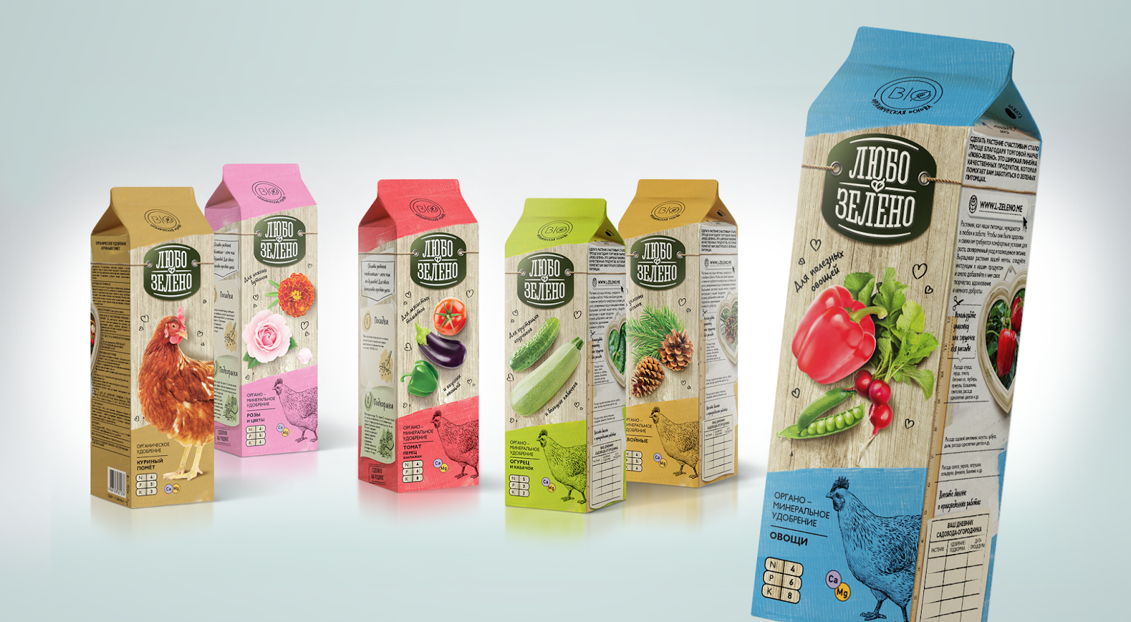
Lybo-Zeleno (Lovely Green)


Creative Agency: Brand Brothers
Project Type: Commercial Work
Client: Rusagrohim
Packaging Content: Plant care and fertilizers
Location: Moscow, Russia

Lubo-Zeleno (Lovely Green) – a simple way to make your plants happy.

A new brand of plant care and fertilizers by BRAND BROTHERS is targeted to amateur gardeners. Many of them care about their plants like about pets, treat them as live creatures. But they are not always experienced enough in their choice of a “right” product for plant care and a way to use it. It is essential to help them with advice, make them feel confident about their choice and to let them be sure that their plants will look healthy and happy. To deliver the promise we tell the story of a very warm relationship between a gardener and its plant. All the brand attributes help us doing this, including the brand name, the photo of a favorite “plant-pet” in a frame, the hand-written signs and marks. A Pure-pack form-factor is an untypical solution for fertilizers category which is expected to be more convenient for merchandisers and customers. Also it let us to offer consumers the added value. When the pack is empty – a gardener can use it as a container for seedling. Special cutting marks and a ruler help to define the necessary height of a container for different kinds of plants. The table called “gardener’s calendar” suggests making marks about seeding and nourishing. The additional function of the packaging is valuable to a customer and helps to reduce the unnecessary refuse.

Read more

Wednesday, January 4, 2017

Alexandrov Collection


Designer: grand buro
Project Type: Produced, Commercial Work
Packaging Content: Georgian red wine
Location: Russia

Georgia is one of the oldest wine regions in the world. The fertile valleys of the South Caucasus house the source of the world's first cultivated grapevines and neolithic wine production, from over 8,000 years ago.

Read more

Thursday, December 22, 2016

Arkhangelskaya Garlic and Pepper


Creative Agency: Uniqa Creative Engineering
Project Type: Produced, Commercial Work
Client: JSC Synergy
Location: Moscow, Russia
Packaging Contents: Alcohol
Packaging Substrate / Materials: Glass, paper

Uniqa Creative Engineering, brand design studio based in Moscow, worked together with Synergy company to create exquisite packaging design for the new product – “Arkhangelskaya Garlic and Pepper”, – part of “Arkhangelskaya Northern Aging” brand.

“Arkhangelskaya Garlic and Pepper” is produced by the oldest and the most northern vodka distillery in Russia – S.U.Vitte production plant located in the city of Arkhangelsk – the capital of Russian Pomorye area. The plant boasts the unique technology of blend maturation in century old pot-stills and low-temperature treatment of the blend components. All natural ingredients ensure the bold and spicy taste of the drink. Each bottle has a real garlic clove inside it, which underlines the original product flavor and works like an eye-catcher.

Overall packaging design takes over from “Arkhangelskaya Northern Aging”: copper foil on heavy wine paper, detailed pot-still illustration and complex font lay-out that triggers consumers to study the label. Main distinctions include the fresh and royal green color of the label and garlic and pepper etched illustration placed on the wide neck label.

“Arkhangelskaya Garlic and Pepper” tincture falls into low-premium price segment and its release is meant to strengthen “Arkhangelskaya” brand presence on the shelf and represent the brand in the new category.

Read more

Beaujolais Nouveau


Creative Agency: ShumiLoveDesign
Creative Director: Valerii Shumilov
Project Type: Produced, Commercial Work
Location: Moldova, Russia
Packaging Contents: Wine
Packaging Substrate / Materials: Glass, Paper

Lightness, bliss, taste of life – these were the concepts that had to be communicated through the packaging design for the new line of French wines with a distinct regional character. Since Beaujolais wines are known for their light taste compared to other traditional French wines, the agency’s specialists had to reflect this peculiarity through the visual aspect of the new product.

The overall style for the packaging can be described as bright, juicy and light at the same time. Thanks to the use of bright pastel shades on a white field, the label looks airy, light, playful and slightly giddily. The styling of color spots as flower drawings creates a feeling of summer bliss and lifts the mood even upon a quick glance on the label. The product’s name is framed by said color spots, emphasizing the accent, while the use of special font types amplifies the light and easy feel of the product.

Read more

Tuesday, December 20, 2016

Mulled Wine (Concept)


Designers: Julia Zhdanova, Vadim Briksin
Project Type: Concept
Location: Moscow, Russia
Packaging Contents: Wine
Packaging Substrate / Materials: Paper

We created a label for mulled wine that we wanted to move away from the traditional "Christmas style" card. This approach helps to extend the seasonality of the design.

Read more

Sunday, December 18, 2016

Dishwasher Tabs


Creative Agency: BrandLab Moscow
Communications Manager: Anna Aksyonenko
Project Type: Produced, Commercial Work
Client: OPPO
Location: Moscow, Russia
Packaging Contents: Dishwasher tabs
Packaging Substrate / Materials: Paper
Printing Process: Offset Printing

OPPO is an innovative Russian product, which has all chances to become a serious rival for global brands on the shelf. Before it appeared on the market there were almost no local affordable analogues. However, an economic crisis and international sanctions opened this perspective niche for Russian producer.

OPPO is a real ecological ambassador, it contains no phosphates, SAS, chlorine, fragrances or coloring agents used by many home care goods manufacturers. Developed in cooperation with German technologists and ecologists, the original OPPO formula guarantees the highest level of safety and environmental protection.

The name of the brand, offered by the client, is an acronym for two benefits - OPtimal safety and POsitive result. Brand platform, logo, packaging design, corporate icons and visual communications are designed by BrandLab agency.

The atmosphere of natural purity and dishwashing excellence are reflected in brand`s design, full of air, light and confident calmness. The central subject of saucers and a cup is related to the logo, which reminds a dishwasher power button and the original circular shape of tab.

The gem of the brand is OPPO`s special series for gentle washing of kid’s dishes, which got the original «baby» pattern.

Read more

Thursday, December 15, 2016

Velkopopovicky Kozel Limited edition - Ocente nase pivovarske umeni


Creative Agency: Viewpoint
Project Type: Produced, Commercial Work
Packaging Content: Beer
Location: Russia

In 2016 brand Velkopopovicky Kozel has launched a new campaign about Czech brewing, dedicated soulful and qualitative approach to the process of brewing.

Viewpoint branding agency was tasked to create design for limited edition cans of Velkopopovicky Kozel Svetly, reflecting the key qualities of the brand: hospitality, naturalness, quality and Czech origin.

As a result, there was the design, conveying sincere atmosphere of the Czech Velke Popovice village, homeland of Kozel beer, where brewing process is doing with love and proficiency. This fact is illustrated by the series of small pictures placed on the sides of cans and supported by comments in Czech language.

Carrying out this campaign allowed to reach record level of sales, significantly improve customer loyalty and achieve the most ambitious results.

Read more

Barrister Gin


Creative Agency: Runway Branding
Project Type: Produced, Commercial Work
Client: Barrister Spirits ltd, UK.
Location: Moscow, Russia
Packaging Contents: Gin

The branding agency has developed the design concept for a new gin trademark owned by Barrister Spirits ltd, UK. After the name for a new brand was discussed in the famous Baker street in London, it was decided to use “Barrister” as the best way to communicate the true gin nature - AS COLD AS STEEL. The design concept is based on two aspects of the product.

The first aspect: barrister is a high-level category of British lawyers who are in a privileged position and enjoy special financial benefits.

The second aspect comprises the peculiar, separate distillation features of Barrister gin composition. In order to emphasize the taste and aroma of herbs in the Barrister’s formula, the aromatic spirits are first produced from each ingredient separately, and then blended according to the classic English recipe: juniper berry, fresh lemon peel, coriander, cinnamon, caraway, anise and cardamom.

Therefore, the Barrister gin displays the two aspects mentioned above, with the overall vintage style, aristocratic spirit, snobbery in its positive sense, pharmacy-like accuracy and English preciseness. The new gin trademark was developed at the request of Ladoga Group – one of the major distributors of foreign spirits.

Read more

Berezka Lab


Creative Agency: Ohmybrand
Project Type: Produced, Commercial Work
Packaging Content: Cosmetics
Location: Russia

«Berezka Lab» - cosmetics with Russian roots
The branding studio Ohmybrand has developed a new brand of organic cosmetics "Berezka Lab". This project beautifully combines minimalism and Russian spirit in the formula as well as in the design of the line.

Berezka Lab is a unique product on the Russian cosmetics market. Simple and natural ingredients and honest recipes create an understandable product with excellent action, because Berezka Lab knows the peculiarities of the Russian climate and will help to preserve the skin beauty not only in the harsh Russian winter, but also during the hot summer.

The minimalist packaging creates an elegant framing and does not distract attention from the product itself. The typography on the tubes looks unmistakably like patterns on the birch bark. Modesty and refinement of the design solution allows the cosmetics Berezka Lab to look wonderful in any home and makes it a great gift for people with taste.
Read more

Tuesday, December 13, 2016

Livadiiskaya Loza


Creative Agency: ShumiLoveDesign
Creative Director: Valerii Shumilov
Project Type: Produced, Commercial Work
Location: Moldova, Russia
Packaging Contents: Wine
Packaging Substrate / Materials: Glass, Paper

While working on this project the agency’s specialists were tasked to create a visual for the product, which would correspond to the spirit and traditions of the classic Old World wines. The bottle had to look worthily and restrained on the product shelf, attracting the type of consumer that would usually prefer classic European wines.

The presented solution for this line of wines fully corresponds to the task set by the client. The larger part of the label represents a clear white field that harbors a few strict graphic elements, technical information, trademark name and logo, and the wine variety. In this perspective the label fully corresponds to the visual traditions of classic French wines. However, the opposite element in the overall composition is the painting in the upper part of the label. Its manner of execution and vivid colors introduce a contrast to the lower part. Thanks to this opposition of two distinct elements, the label looks strict, and at the same time, fresh and bright – attracting the consumer’s attention and emphasizing the role of European winemaking traditions in these wines.

Read more

Friday, December 9, 2016

Shadows born in good farming


Creative Agency: GORDOST
Project Type: Produced, Commercial Work
Client: The restaurant "Gryadka"
Location: Yekaterinburg, Russian Federation
Packaging Contents: Meat and poultry
Packaging Substrate / Materials: Plastic, paper
Printing Process: Digital printing

Objective
The restaurant "Gryadka" decided to launch home delivery of organic meat products. The objective was designing the packaging for different kinds of meat come from farms which use principles of ecological purity and natural farming.

Idea
The packaging design was created to stand out among the mass of the products and mark originality and uniqueness of "Gryadka" meat and poultry. The packaging indicates the product was made by the named farmers who care about cattle and poultry raising and they do it their best way which positively affects the quality and genuineness of the product.

Solution
The main idea of the design rejects foodstyling and direct demonstration of meat. Instead of this the type of product is represented by the shadow of the animal, formed by farmer’s hands and fingers. You can find a variety of farm animals appearing in the shadows. Also, the image of the farmer’s hands is associated with the painstaking labor on the farm. Pencil graphics, individual labeling of the product’s weight and manufacturing date also embody unique way of the production of meat. Shadows that the farmer creates with his own hands serve as a metaphor of respect for the fostered animal. On the reverse of packaging we put images of farmers, who speak about principles of their work and life values. We have also depicted maps of the production area, indicating farms to enhance the product loyalty.

Read more

Thursday, December 8, 2016

Marquise Rêver


Creative Agency: Dochery
Designer: Darya Surkova
Illustrator: Olya Tkachenko
Copywriter: Sergey Dolgopolov
3D Visualisator: Pavel Gubin
Creative Director: Alina Rukosueva
Project Type: Produced, Commercial Work
Client: Folk
Location: Saint-Petersburg, Russia
Packaging Contents: Alcohol
Packaging Substrate / Materials: Paper
Printing Process: Flexography

A man will say: " The truth is in wine"

" Well, not quite so simple" , a woman will reply, smiling, holding a glass of champagne.

It's hard to imagine a perfect girls' party or a bachelorette get-together without a bottle of sparkling champagne. No wonder: this drink is ideally compatible with chocolate and desserts, and as Lois Pasteur, a great microbiologist put it: Champagne is the healthiest alcoholic drink.

The champagne brand Marquise Rever has been created for the Baltic market (Estonie, Lettonie, Lituanie) and, consequently, for the Baltic women. Being aware of the fact, that every woman is unique, we have come to the conclusion, that they all have one thing in common: they all are expecting a miracle to happen. And this expectation is not based on light-mindedness. It is pure and sincere. In order to express the miraculous spirit, we made up a fairy-tale about a beautiful Marquise routinely walking in her family's estate park, she was blessed by her luck. Marquise met that rare Bluebird. The Bluebird gave her a wonderful gift of a magic feather, which could help her to become a fairy any time.

Read more

Monday, December 5, 2016

Jam and Cream


Creative Agency: Panfilov & Yushko Cg
Art Director: Dmitry Panfilov
Designer: Anastasia Savenko, Ivan Orekhovskiy
Photographer: Andrey Fomenko
Project Type: Produced, Commercial Work
Location: Russia, Stavropol
Packaging Contents: Desserts, cakes, biscuits
Packaging Materials: Paper

Located in the historic center of Stavropol, "Jam and Cream", a small local bakery, offers delightful pastries and sweet treats, as well as cozy atmosphere. The vaulted ceilings and the natural texture of the old building's original brickwork give the interior a feeling of unique warmth. The graphic solution of the bakery is very simple and elegant, with the most striking element of the design being the usage of bright yellow color, which is token for Stavropol region and is strongly associated with baking. The logo is the image of two birds cooing on a tree branch. This image embodies the bakery itself - a place where the customers can enjoy themselves while having a cup of coffee, a croissant, and a chat with friends.

Read more

Sunday, December 4, 2016

Magnetic Star (Concept)


Designer: Seoev Alexey
Project Type: Concept
Location: Rostov-on-Don, Russia
Packaging Contents: Metallic primer
Packaging Materials: Metal, paper

The packaging for the metal primer containing particles of iron. This solution is applied on various surfaces to provide them with magnetic properties.

The design of the label has been inspired by the styling of the album cover of a band playing heavy metal music. The visual game is based on the tune in the names of musical genre and solution for application to walls. The legend of the brand reveals the concept of the product: "Each string craves to the depths of its steel core for rough guitar riffs, unrelenting drive, and crowds of enthusiastic fans. However, those metal threads, which have experienced tension on the legendary electric guitars, are the heroes of the scene and, being exhausted of the frantic pace, crave for something completely different. They imagine their last chord as the apocalyptic heat of a melting furnace, decomposing them into atoms to give another life in the metal primer Magnetic Star. The coating has a strong craving for creativity." Heavy metal is still alive!

Read more

Thursday, December 1, 2016

Beaujolais


Creative Agency: Shumi Love Design
Creative Director: Valerii Shumilov
Project Type: Produced, Commercial Work
Location: Moldova, Russia
Packaging Contents: Wine
Packaging Materials: Glass, Paper

The visual aspect of this product had to communicate its light and pleasant character, as well as create a contrast to the more traditional and strict design common for French wines. That is why the agency’s specialists have focused on developing a light, colorful and pleasant design, which would drive one’s appetite for new impressions.

The light character of French Beaujolais can be felt even at a quick glance on the label developed by the agency. Light, aerial color spots, stylized as watercolor elements, flow through the plain white field, creating the feeling of freedom and ease. The stylized bike image gives birth to thoughts about a light romantic drive through the French countryside. The choice of font types emphasizes the spirit of carelessness and positivity, which is associated with this type of wines.

Read more

Taiga Vodka


Creative Agency: UPRISE
Creative directors: Alexey Astakhov, Alexander Orlov
Project Type: Produced, Commercial Work
Client: APU
Location: Mongolia
Packaging Contents: Vodka

Branding agency UPRISE has completed a new project for Mongolian APU companies - the development of brand of vodka "Taiga".

In Mongolia, as in Russia, winter, spring, summer and autumn are brightly expressed, there are the own paints in every season, the own emotions and feelings. It is proved that consumer taste preferences and expectations also vary throughout the year.

The project idea is to create original vodka brand, which consists of four assortment positions, each of which corresponds to a particular time of year. Four unique recipes have been developed, consisting of 100% of natural Mongolian ingredients: warming is for the harsh winter, invigorating - for a long windy spring, refreshing and light - for a hot summer, a rich and relaxing - for warm autumn. We have sought to convey the mood of each SKU in the design, to talk about exclusive natural products. Bottle is a wide shtof with a thick bottom, it looks impressive and thoroughly. The colours of labels are muted, pastel, they complete the colour of the drink. The contrast logo block is located on a separate label; it is clearly visible on the shelf and brings together the entire line. The main ingredients of the recipe are shown at the bottom of the label, and on top of the illustration, you can follow the transformation of nature - landscape with the image of a Horidol Saridag mountain range changes, blossoming with the freshness of spring, pouring with the ripeness of summer, turning into bright saturated colours in autumn and coving by the silvery snow in winter. The textured matte surface, selective varnish and embossment, adds an element of volume.

"Taiga" vodka arrived in the retail network in June 2016, on the eve of the national holiday of Naadam. According to the words of manufacturer, the consumers liked the idea of four different flavours of each season.

At the moment the sales are increasing for the autumn and winter positions, although the "summer" taste is sold well in summer.
Read more

Wednesday, November 30, 2016

FM Shower Gel Package (Concept)


Designer: Pashnin Aleksei
Project Type: Concept
Location: Moscow, Russia
Packaging Contents: Shower gel

Do you like to sing in shower? If your answer is "yes", this shower gel package is exactly what you need. Curt Cobain, Michael Jackson and Tupac Shakur will help you to reveal your talent. And sponge top part of package will serve you as an additional convenience while washing. Throw away diffidence and feel yourself like a superstar! But be careful, because your neighbours might knock on your door not to take your autograph!

Read more