Showing posts with label Spain. Show all posts

Tuesday, January 17, 2017

G Gourmet Label


Creative Agency: Load Comunicación
G Gourmet Label Creative Director: Alberto Jaspe
Project Type: Produced, Commercial Work
Client: G Gourmet
Location: Salamanca, Spain
Packaging Contents: Iberian Ham Products
Packaging Substrate / Materials: Plastic - Polypropylene

Labels created for the brand G Gourmet, plastic material 200 g. gloss and matte print.

What's Unique?
The label has been created to be placed on the product without any type of adhesive. We have tried to simulate the labels of hotels "Do not disturb"

Read more

Monday, January 16, 2017

Pago Cativo


Creative Agency: Brandsummit
Designer: Alex Monzó
Project Type: Produced, Commercial Work
Client: Vinos de Terruños
Location: Spain
Packaging Contents: Wine
Packaging Substrate / Materials: Paper
Printing Process: Digital and blind embossing

Simplicity and meaning define the image of Pago Cativo, a Spanish wine with two presentations: White O Forte and Red O Cotiño. Its iconic design plays with the product's name. "Cativo" means "small" in Galician, which is the region of the wine, but also "captive", so that's why one of the most emblematic elements of the prison was taken as the central image of this wine. Finally, the design was stamped on white and orange labels to differentiate each type of wine and highlight the glass' color of each bottle. The paper used was Cotone Bianco Ultra WS de Manter.

Read more

Sunday, January 15, 2017

El Cantizal Extra Virgin Olive Oil


Art Director: Alice Pesenti
Project Type: Produced, Commercial Work
Location: Spain

El Cantizal is a Spanish premium olive oil. It's centennial olive trees are located in the heart of Andalusia, based in a unique microclimate which allows the company to obtain exclusive olive oils of extraordinary quality.

The objective was to create an image that could express the warm and powerful energy of Andalucía, and also to create a unique brand that stands out from its competitors.

Read more

Wednesday, January 11, 2017

The Dalton Brothers


Designer: Ingrid Picanyol
Project Type: Produced, Commercial Work
Client: Josep Maria Ribé from Callebaut
Location: Barcelona, Spain
Packaging Contents: Chocolate grageas
Packaging Substrate / Materials: Paper and metal tubes
Printing Process: Offset

The pastry chef Josep Ma Ribe and his constant experimentation with chocolate grageas, has transformed this classical product into a product with endless combinations of heart, covering and finish.

Coinciding with the 70th anniversary of the comic ‘Lucky Luke', the renowned Callebaut chef pays tribute to this versatile sweet that has taken over the candy shop’s windows from all over the world. For that, he has been inspired by the four members of The Dalton Brothers, characterized by their gradually height, which is inversely proportional to their age, wickedness and intelligence.

Read more

Pepejo el labrador


Creative Agency: [rowelt]
Project Type: Produced, Commercial Work
Client: Pepeno el labrador
Location: El Raal, Murcia, Spain
Packaging Contents: Canned vegetables and jams
Packaging Substrate / Materials: Glass and plastic
Printing Process: Digital printing

Packaging design, website renewal and product photography for Pepejo el Labrador, artisan canning factory in El Raal, Murcia.

In addition to looking for a label that could be easily adapted to any new reference, the objective was to highlight the ingredients used for preserves, all natural and without preservatives or additives.

Read more

Monday, January 9, 2017

Estribor Baby Cosmetics


Designer: Mdbenito
Project Type: Produced, Commercial Work
Client: Estribor
Location: Spain
Packaging Contents: Cosmetics
Packaging Substrate / Materials: Plastic

Completion of the project in its entirety, choice of naming, logo design and packaging design.

"Estribor" is a brand of baby cosmetics, so it has been used a color and a design very appropriate for it. The target audience is moms and dads, so a paper boat was the best way to make a call to the past, to childhood, to beautiful memories. They are several products for the care of the babies, which differ by their stamping, always with the sky blue and white as the main colors.

Read more

Thursday, January 5, 2017

The Money-box Of Time (Concept)


Creative Agency: Sigaris
Project Type: Concept
Location: A Coruña, Spain
Packaging Contents: Time
Packaging Substrate / Materials: Metal, Polyester, Paper, Sticker
Printing Process: Printing

Money-box of time, Sigaris New Year's Eve Sigaris New Year's Eve present
If you had an hour or a half an hour free, what would you do?

We asked this question to a group of people and their answers were doing things by themselves, a brief time alone. So this Christmas we decide to give our friends and clients the gift of time. A time set apart just for them. We sent them a money-box with instructions, a can opener to open it and a suggestion to keep saving time along 2017 for themselves.

“The money-box of time isn't to save money but to set apart time to do what you want. We have managed to save a lot during 2016, and we're going to reinvest it. We share our savings with you: a good time, five hours and some ideas to invest in yourself.

Take your time out of the money-box to spend and remember to keep saving to become the best investor of time. Happy New Year 2017”

Read more

Absolut Pantone


Creative Agency: Txaber
Project Type: Concept
Packaging Content: Vodka
Location: Spain

The range of Absolut products has a clear relationship with color. Almost all its varieties, especially the fruit flavors, can be directly related to a color. For this project I used the same concept as for a previous one “Beer colors”, in which the color of the product is the basis of the design. For this, the characteristic design of the Pantone labels is used creating a direct relationship between the product and its color.

In this case the game between Absolut + Pantone greatly enhances the design concept. The bottle wears Pantone and the message is very direct. In each design the color is the representative of the flavor and at the bottom is placed the name of the flavor and its corresponding pantone reference.

In the images can be seen different varieties, such as Absolut Cherrys, Absolut Pears, Absolut Raspberri… As well as a hypothetical case of a copper colored bottle and the last case with the color of the year 2017.

Read more

Tuesday, January 3, 2017

Falken. The Sea Men (and Women) Beer (Concept)


Design director: Guillermo Alcaire
Project Type: Concept
Location: Spain
Packaging Contents: Beer

A beer distilled with sea water made in the french coast. With three reference: Pale, Lager and Stout, each one with your own personalities but brothers.

Read more

DipMates Snacks


Designer: Mara Rodríguez
Project Type: Produced, Commercial Work
Client: Nosh'em Group
Location: Gijón, Spain
Packaging Contents: Snacks
Packaging Substrate / Materials: Plastic

Branding & Packaging design for Dipmates, a new fun snack brand based in USA.

The DipMates pack is an orchestra in trio format. Alternating between the fast and slow, the dip-as-you-go pretzel treat is a fast paced way to get sweet and salty on the double. Their characters are the main element of the design giving it a funny appearance, and they will change every season, giving a dynamic feeling to the brand.

We use bright colors and as less elements as possible in order to stand out on the supermarket. We couldn’t resist the pop of color that turns any pretzel into a divine treat for the young at heart.

Read more

Monday, December 26, 2016

Winter Wonderland


Creative Agency: Mokalache.Design
Project Type: Produced, Commercial Work
Client: Muse Chocolate Concept
Location: Spain
Packaging Contents: Chocolate
Packaging Substrate / Materials: Paper, Plexi, Gold leaf, Vinyl

The winter chirstmas collection is a golden dream. This time with standing decorative items so it gives any home an instant christmasy feel !

Read more

Wednesday, December 21, 2016

Flamberge Limited-Edition Cognac


Designer: Den Dodson
Project Type: Produced, Commercial Work
Location: Madrigal, Spain

The result is a rich amber Cognac delivering a spicy aroma and notes of nutmeg, bitter orange, peppermint leaf, saffron, and licorice, with a honeyed finish. Complex and powerful, yet balanced and elegant, it is a fitting tribute to Fillioux’s predecessors and ancestors alike, and another feather in the cap of Fillioux’s distinguished 50-year career. Only 250 barrels were made, each holding 250 liters.

Read more

Tuesday, December 20, 2016

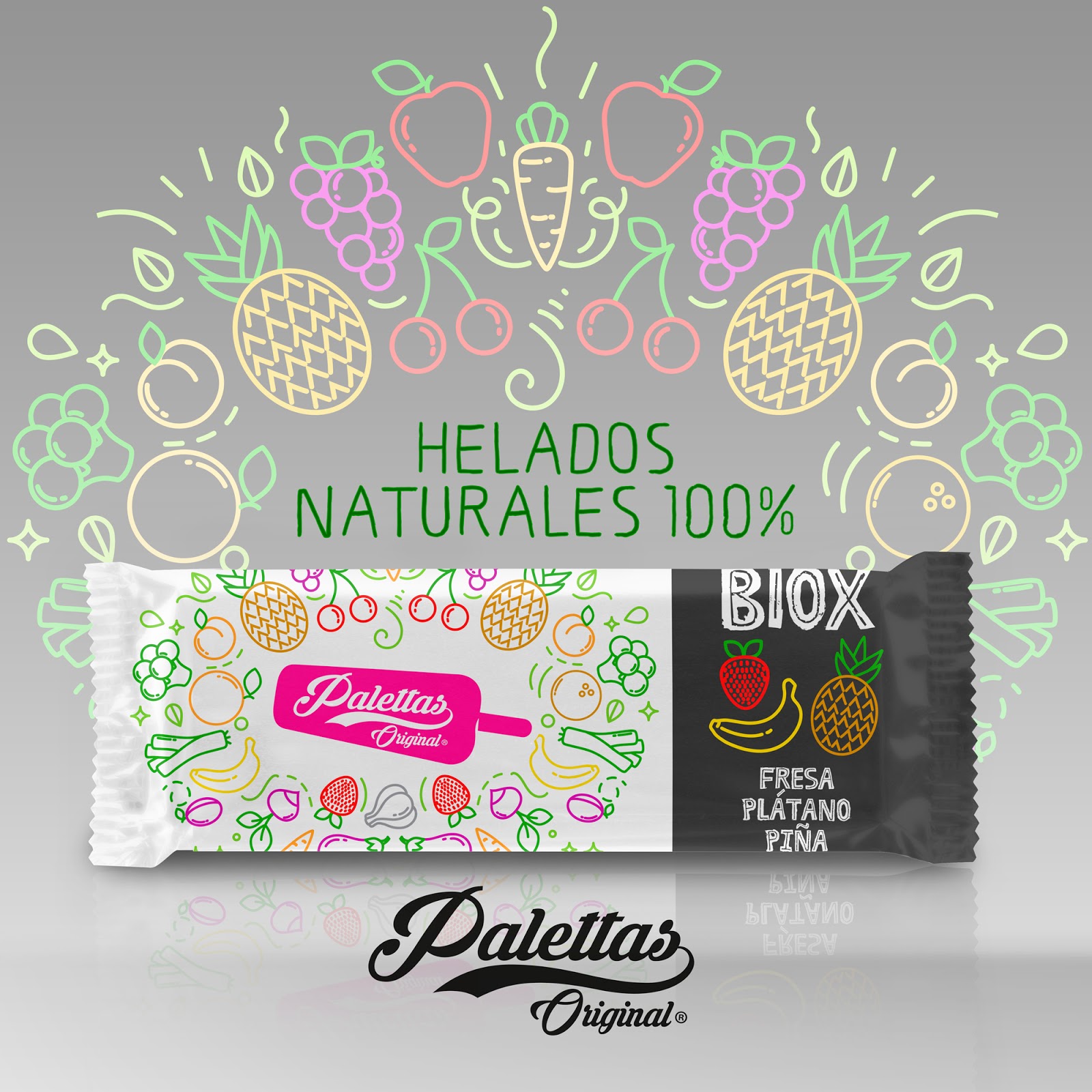
Palettes Ice Creams 2.0


Xreative & designer: Hugo Zapata
Project Type: Produced, Commercial Work
Client: Nordwik ice creams
Location: Sevilla, Spain
Packaging Contents: Ice creams
Packaging Substrate / Materials: Film, carton
Printing Process: Offset, stamping

Fun range of 100% natural fruit ice cream.

Company founded in 1950 in Spain. It stands out for a harvest of all the fruit and vegetables for its products of artisan form. Classic and ecological flavors.

What's Unique?
Fun icons for some bio products using icons and direct inks.

Read more

Sunday, December 18, 2016

Blue Wine By Aluxor


Creative Agency: Hugo Zapata
Project Type: Produced, Commercial Work
Client: Aluxor
Location: Seville, Spain
Packaging Contents: Wine
Packaging Substrate / Materials: Paper
Printing Process: Stamping, direct inks

Special bluish wine Aluxor. Fresh, aromatic and completely blue. Its composition is natural starting from a complex process of natural pigments present in grape skin. You get a fresh, Mediterranean and unique wine.

Its label represents that freshness and light of the Mediterranean

Read more

Wednesday, December 14, 2016

Strangest Christmas


Designer: Mo Kalache
Project Type: Produced, Commercial Work
Client: Muse Chocolate Concept
Location: Spain
Packaging Contents: Chocolate
Packaging Substrate / Materials: Paper
Printing Process: Digital Printing

Dive into the Strangest Christmas ever! Illustration, pattern design and packaging design for "Muse Chocolate Concept" , a series of unexpected holiday gifts for chocolate lovers.

What's Unique?
Unusual, Hand drawn, Illustrated patterns with unexpected colour combinations.

Read more

Monday, December 12, 2016

Abeeja (Concept)


Designer: Andrés Guerrero
Project Type: Concept
Packaging Content: Honey
Location: Spain

Sky is the limit
Abeeja is a personal project for a small local producer who would love to take their honey as far as possible. The worker bees fly to collect pollen from the flowers along the length and breadth of the lemon fields of Murcia. With this pollen they make honey whose flavor has slight taste of lemon.

The idea behind the packaging, take your product to the limit, begins with the name of the brand that seeks to break borders by linking the words 'bee'.

Through a simple die cut on the label, the packaging can display its wings, showing the iconic image of a bee, a great way of taking advantage of the reduced resources of the client and allows its product to stand above the others. Flying, of course.

Read more

Wednesday, December 7, 2016

Lunar Calendar Wine


Designer: Javier Garduño Estudio de Diseño
Project Type: Produced, Commercial Work
Client: Kiko Calvo
Location: Toro, Zamora. Spain
Packaging Contents: Wine
Packaging Substrate / Materials: Glass, Paper, Wood
Printing Process: Silk screen printing, digital printing

Red wine elaborated by the wine expert Kiko Calvo. A Magnum bottle (1,5 l.) has the 2017 lunar calendar printed in silk-screen process. On the neck there’s a collar that can be moved to set the date and attached to it there’s a stick that can be moved up and down to set the month. An original idea you can keep as decoration once you’ve drunk the wine.

Read more

I'm a Nut


Designer: Mara Rodríguez
Project Type: Produced, Commercial Work
Client: I'M A NUT, INC.
Location: Gijón, Asturias. Spain
Packaging Contents: Nuts
Packaging Substrate / Materials: Plastic

About the brand:
I’m a Nut growers and distributors have been committed to cultivating and exporting premium grade nuts in bulk quantities. As specialty purveyors and connoisseurs, we know nuts from up close. From crop to shop, every nut leaves the plant perfectly groomed and ready for a showdown. (or chow down) Not all nuts are created equal. We know because we monitor the fields and pay attention to detail every step of the way. At I’m a Nut, we like to think of our family business as a tournament of sorts. At our farms, participants stand taller, sturdier and perfectly balanced. Lightly salted or untouched and pure, nuts step up to the challenge of being packaged with the best. Every selection is handpicked and packaged with love.Take good care of our family and treat yours to something tasty, healthy and absolutely nutty. It’ s an experience you want to be part of.

About the design:
The logo is a smart and classic composition made with mixture of a handmade typography and a sans serif font.

The main part of the design is the vintage typography composition with classic ornaments that gives a high quality appearance to the packaging, and we mix it with bright and sature colors in order to make it stand out on the supermarket and give it a modern touch. Also we show a natural photography of the product so the consumer could now what is he going to find inside the pack.

Let loose. Get nuts.!

Read more

Turrón Rebranding


Designer: Sabina Alcaraz
Project Type: Produced, Commercial Work
Client: Turrones Alcaraz Sirvent
Location: Xixona, Spain
Packaging Contents: Turrón and sweets
Packaging Materials: Paper

Turrones y Dulces Alcaraz Sirvent is a tradicional brand of Turrón that elaborates typical sweets of Jijona, a small city in Spain.

Sabina Alcaraz has redesigned the brand and all the products packaging.

In order to achieve that, she wanted to get in to the world of the traditional and typical of the land that gives rise to all products, Jijona. The prints are the protagonists in these Turrón bars. Extracted from cloaks and skirts of the typical costumes,mainly used in Jijona's traditional dance,these drawings dress and deck the nougat out of the conventional design of the sector.

“We wanted to differentiate ourselves within the nougat sector of Jijona and Alicante with a current label design that brakes with already established in most brands”.

Read more

Tuesday, December 6, 2016

Choco & Co Special Edition


Designer: Isabel de Peque
Project Type: Commercial Work
Packaging Content: Chocolate
Location: Madrid, Spain

Packaging, Naming & Branding Special edition of chocolate bars collection for a coffee and chocolate company based in Madrid, New York, Paris, and London. In this edition the different kinds of chocolate had to show a typical material used in each city.

Read more