Showing posts with label USA. Show all posts

Tuesday, January 17, 2017

BASIC Holiday Gift 2016


Creative Agency: BASIC
Project Type: Produced, Commercial Work
Location: San Diego, CA - USA
Packaging Contents: Hand-Poured Soy Candles, Hot Chocolate Container, Two-Piece custom Candle Container, Letterpressed Holiday Card
Printing Process: Ebony Card with Black Gloss Foil, Duplexed with handwritten script and personal greeting on the back, Glass Printed Candle with letterpressed box

Every holiday season, our team comes together to create a custom handcrafted gift to honor our friends and partners who continue to inspire us and drive us forward into the new year. This year, we created a series of hand-poured candles and a gourmet blend of hot cocoa to bring in the New Year.

Our candles were hand-poured, in-house, using an all natural black soy wax infused with a blend of cedarwood, patchouli, black pepper, and pimento berry essential oils. We poured each candle inside a frosted glass with a custom matte black foil print. Then placed each candle inside a telescoping two-piece box, wrapped in a classic black linen with white foil print.

Our gourmet hot cocoa blend, was packaged inside of a custom matte black tin with white foil print, alongside a custom BASIC mug, and a nib of Godiva Liquor, to keep cozy through the holiday season.

Each care package contained a black-on-black holiday card with a black gloss foil, duplexed with handwritten script on the front and a personalized greeting on the back.

Read more

Monday, January 16, 2017

Fresh Thyme Organic Premium Spice Range


Creative Agency: The Creative Pack
Creative Director: Danielle Beal
Designers: Heather Storie, Paola Ip, Corey Czer, Emma Tung, Mark Whyte
Project Manager: Fern Serna
Project Type: Produced, Commercial Work
Client: Fresh Thyme
Location: United States
Packaging Contents: Spices
Packaging Substrate / Materials: Glass
Printing Process: Web to Print

Fresh Thyme is a Midwest grocery food retailer that launched its private label in 2015 with now over 900 SKUs with new innovative products rolling out in stores each month. Fresh Thyme products have become the #1 brand in its stores proving the authenticity and quality of Fresh Thyme as a brand as well as its impactful unique farm inspired design. As part of their private label, Fresh Thyme asked us to design its organic premium spice range.

Read more

Thursday, January 12, 2017

Almay Cosmetics (Student Project)


Designer: Brittany Scannicchio
Project Type: Student Project
School: Chicago Portfolio School
Course: Design
Tutor: Katie Sprenkle
Location: Chicago, USA
Packaging Contents: Makeup
Packaging Substrate / Materials: Paper
Printing Process: Digital Printing

Almay Cosmetics is a hypoallergenic makeup brand dedicated to providing customers cosmetics with safe and natural ingredients. The goal of this redesign was to showcase Almay’s use of gentle and non-irritating ingredients that work for all complexions. Dynamic geo-patterns were used to represent the unique attributes of each woman’s skin as well as the color-coded shade system to position Almay as an all-inclusive brand.

Read more

Flight Cards


Designer: Fonzie Cuaycong
Project Type: Produced, Commercial Work
Client: Flight Cards
Location: Brooklyn, New York
Packaging Contents: A Deck of Cards
Packaging Substrate / Materials: Air-Linen Finished Cards, Satin Finished Box
Printing Process: 4C Printing

It was always hard to separate "His Airness from his shoes. From the very first pair of Black and Red 1's, these sneakers have represented the evolution of elevation, and told the story of a player who never kept his feet on the ground.

This deck of cards is a tribute to the greatest basketball player–and the greatest sneaker legacy–of all time.

Each suit has a curated selection of Jordans featuring, arguably, the most important sneakers of Jordans legacy–the first thirteen. These thirteen silhouettes were the sneakers that propelled him to fame, and were designed and worn during the beginning and final games with the Chicago Bulls. The Jordan model relates to the rank of the card: ace is the Jordan 1, 2 is the Jordan 2, 3 is the Jordan 3, etc.

The design features my own personal illustrative style, while still giving tribute to the shoes and the traditional complexity of playing card design. Each suit icon resonate the details of specific Jordan soles. The card designs use details from Mike's decorated past on the court, on television, and in Chicago.

In the deck, the ace and number cards have a consistent design with interchanging sneakers, while the jack, queen, and king each have a separate design. This is similar to how hierarchy is created in traditional playing cards, by using a visually-specific design for face cards and number cards.

Read more

Theo Chocolate (Student Project)


Designer: Caitlin Mee
Project Type: Student Project
School: Chicago Portfolio School
Course: Packaging
Tutor: Billy Baumann
Location: United States
Packaging Contents: Chocolate
Packaging Substrate / Materials: Paper
Printing Process: Digital printing

As the first organic and Fair Trade chocolate factory in the United States, Theo Chocolate continues to share their passion of delicious chocolate and making the world a better place one chocolate bar at a time.

Challenge
Create a new packaging for Theo Chocolate bars that represents the care that goes into each bar from sourcing beans to packaging.

Solution
A biodegradable packaging inspired by fabric designs from the cocoa source countries allowing the consumer to see the chocolate. The final packaging shows the transparency of Theo Chocolate's process from sourcing to packaging.

Read more

Wednesday, January 11, 2017

Game of Stranger


Creative Agency: Stranger & Stranger
Project Type: Produced, Commercial Work
Packaging content: Board game
Location: USA

Lust and death. The ideal companions to any of our liquor brands for a perfect night in.

Read more

Néboa


Creative Agency: Senyor Estudi
Photographer: Marc Roca
Project Type: Produced, Commercial Work
Client: Walkyrie Wines
Location: San Francisco, CA, USA
Packaging Contents: Wine
Printing Process: offset

Water, in an infinity of nuances, portrays the Galician landscape and sculpts the popular imagination. Mist —Néboa, in one of its expressions— gives its name to this wine that is bright and mysterious at the same time.

Read more

EatPastry Packaging Redesign


Creative Agency: Freelo Design
Copy Writer: Jeanine Fritz, Jessie Williams
Brand Positioning: Adam Spriggs
Project Type: Produced, Commercial Work
Client: EatPastry
Location: United States
Packaging Contents: Cookie Dough
Packaging Substrate / Materials: Plastic
Printing Process: Color Dyed Plastic + Digital labels

Out in California, EatPastry makes delicious, vegan cookie dough. They asked Freelo Design to help them redesign their packaging so that they could have a better presence on shelf by bringing more of the "wow" factor to their product.

The client wanted a clear concise design to help reflect what they’re all about: veganism, happiness, and deliciousness. They also wanted to maintain their quirkiness while still coming across as a genuine brand. We knew that bright colors would ultimately help consumers quickly understand what variety they are buying, and it also inspires to collect them and buy them all! The challenge was to design something that would appeal to kids and also their mothers, since they’re typically the final decision makers on purchases.

Bright color and monster mouths? we knew it was going to make these cookies shine! And let the mouths speak. Inspired by their previous branding's website, the concept of a cookie monster made a lot of sense and helped bringing the branding full circle. Instead of showing the monsters, we preferred showing only their mouths, suggesting there’s so much more to discover. Adding delicious illustrations of the cookies also catches the eye and inspires impulse buyers.

After only 12 months on shelf, we are proud to say that sales were increased by 20%.

Read more

Tuesday, January 10, 2017

Stealth For Gentlemen (Student Project)


Designer: Sydney Noland
Project Type: Student Project
School: Ball State University
Course: Visual Communications
Tutor: Sam Minor
Location: Muncie, United States
Packaging Contents: Men's Underwear
Packaging Substrate / Materials: Paper
Printing Process: Foil Stamping

Stealth was a project that focused on the concept of package design, and learning how to make numerous support pieces work together as one. The company was designed to attract a male audience, selling high-end underwear, socks, and t-shirts through an online store. The support pieces created for this project included a business card, two different sized mailing boxes, a postcard, and a gift card.

Simplicity was a key concept to Stealth’s brand. The brand’s minimalism with a hint of foiling was essential in order to give Stealth a sleek and luxurious appearance. The black foil on black card stock added to the brand’s concept, in which the word “stealth” is defined as being cautious and surreptitious action or movement.

Read more

PAK’D


Creative Agency: Anthem
Project Type: Produced, Commercial Work
Packaging Contents: Food
Location: New York, USA

PAK’D WITH EXCITEMENT!
The popularity of on-demand food and ingredient delivery sites, like seamless and Blue Apron, has signaled a shift in the way consumers approach mealtime. Time crunched consumers turn to these services for convenience, however often at the expense of nutrition. Pak'd was born from a passion to provide kids with well-balanced school lunch meals. The Chicago start-up makes lunch easy for busy families by delivering fresh and nutritious lunches directly to doorstops.

Anthem partnered with Pak’d to develop custom structural packaging for their official launch in 2016. First and foremost, functionality of the packaging was of key importance in order to cater to lunches that are fully customized. The packaging also needed to reflect the brand personality and add excitement to kids lunch experience.

Anthem audited e-commerce channels, grocery stores and reviewed trends to identify key design opportunities for Pak’d. Anthem then ideated a range of structural design solutions that were modular, distinctive and designed to survive the ‘lunch journey’ from backpack to school lunchroom. The team conducted a customized Insight Workshop to test prototypes with parents and kids, and gain insights to optimize the packaging design.

Research found that the structural design for Pak’d has great potential to become the next buzz-worthy lunch item, with real kid-appeal! The modular packaging format allows for lunches to be created and assembled quickly by parents, and gets kids excited to expand the variety of foods they will eat.

Read more

Monday, January 9, 2017

Jenny Lee Swirl Bread


Creative Agency: Hampton Hargreaves
Project Type: Produced, Commercial Work
Client: 5 Generation Bakers
Location: Pittsburgh, PA, USA
Packaging Contents: Bread
Packaging Substrate / Materials: Plastic
Printing Process: Flexography

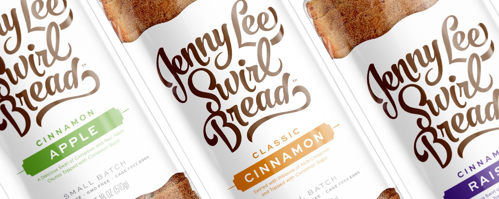
Jenny Lee Swirl Bread has been a Pittsburgh favorite since 1941, but the brand's image wasn't keeping up with its competitors. Hampton Hargreaves developed a new identity and packaging system to revitalize the product line and create a design that would resonate with new audiences — all while maintaining a solid connection to the brand's storied past.

HH preserved Jenny Lee's original hand drawn script concept, but brought the mark into the 21st century. The forms were completely reworked to give them more presence and movement — suggestive of the bread’s rich cinnamon swirls — while simultaneously maintaining readability.

The new mark provided the anchor for a complete redesign of Jenny Lee's packaging. By using a simplified layout, generous white space and a restrained color palette, the brand is once again the hero. The new design also improved flavor recognition by stripping away unnecessary noise.

From flavor descriptions to call-outs, every inch of the bag was reworked to better communicate the Jenny Lee's quality and history. Typography reminiscent of the early 1900s gives the design a nostalgic feel. A nod to the past can also be found on the bag's tail which features the Jenny Lee silhouette.

HH also improved the package's shelf performance by adding a printed bottom, ensuring brand visibility at all times. The dramatic redesign gave Jenny Lee a fresh look and the functionality needed to attract new generations of cinnamon bread fans.

Read more

Sunday, January 8, 2017

California Olive Ranch


Creative Agency: Design Womb
Creative Director: Nicole LaFave
Photography: Kimberly Hasslebrink
Project Type: Produced, Commercial Work
Client: California Olive Ranch
Location: San Francisco, CA / Chicago, IL
Packaging Contents: Olive Oil
Packaging Substrate / Materials: Glass, Paper, Aluminum

California Olive Ranch is the #1 brand of domestically produced extra virgin olive oil in the United States. The San Francisco Bay Area brand challenged us with seeing their redesign through on the brand’s identity and packaging design. In addition we delivered a library of brand assets which include a custom branded tagline graphic, flavor iconography, and packaging labels for an array of new products.

The new packaging design feels fresh, Californian, and is somewhat rooted back to the original labels to avoid confusion with loyal customers. To achieve this we designed a modernized interpretation of the rancher icon for the logo and carried over the existing color palette with subtle updates that feel vibrant and welcoming. The strategic use of a secondary color palette and special effects such as a gold foil, metallic ink, embossing, and premium papers helps draw a line between different product price points and keeps the branding cohesive.

California Olive Ranch's market share rose over 20% within the first 6 months of the new label and packaging launch in early 2016. The olive oil is sold at over 20,000 stores nationwide, including national retailers such as Target, Whole Foods, Costco, Kroger, Mariano's, Meijer, and more. You can also find their sample olive oil in Xela packs served in first class flights on JetBlue Airline.

Read more

Tuesday, January 3, 2017

Cooper's Classic Whiskey


Creative Agency: Pavement
Project Type: Produced, Commercial Work
Client: Cooperstown Distillery
Location: Oakland, CA USA
Packaging Contents: Alcohol
Packaging Substrate / Materials: Glass, paper
Printing Process: Engraving

When Cooperstown Distillery created Cooper’s Classic, it was deemed the finest, smoothest whisky to come from their distinctive line of handcrafted, artisanal spirits. The branding of this whiskey also needed to reflect the company’s deep appreciation for American history and more than a passing admiration for a local boy made good: author James Fenimore Cooper. The name pays homage to the author, while the gold embossed lettering, deep indigo blue background and classic design on each individually numbered bottle speaks to American craftsmanship at its highest levels. This is the debut of a new American classic.

Read more

Garrett Popcorn Shops Cones (Student Project)


Designer: Jennifer Mulvihill
Project Type: Student Project
School: Chicago Portfolio School
Course: Packaging
Tutor: Billy Baumann
Location: Chicago, IL
Packaging Contents: Popcorn
Packaging Substrate / Materials: Paper
Printing Process: Digital Printing

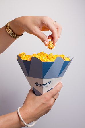
The Garrett Popcorn Shops packaging and brand refresh was designed to be Instagram worthy. Along with a color and logo update, the polygonal cone shaped packaging aims to be festive and unique with gold interiors. Garrett Popcorn Shops caters to many corporate and wedding events and the idea was to have packaging that stood out on the table/shelves and got people talking. The top can fold together to have an easily resealable package. The wrist handle also makes the cone convenient for traveling as many people stop at the Garrett Popcorn Shops in airports all over the world. These design choices reinforce how special the popcorn is for the loyal fans everywhere who love this Chicago brand.

Read more

Jack Daniel's 150th Anniversary Premium Whiskey


Creative Agency: Cue
Creative Director Alan Colvin
Designers: Nick Brue, Matt Erickson
Project Type: Produced, Commercial Work
Client: Brown Forman / Jack Daniels
Location: United States
Packaging Contents: Spirits, Whisky
Packaging Substrate / Materials: Glass Bottle, Paper board box, Foil
Printing Process: Foil Stamping

The year 2016 marked 150 years of the Jack Daniel Distillery, the oldest registered distillery in the United States. To help the distillery mark this milestone, we created an identity used to host this special event and celebrate it on two special editions of Jack Daniel’s Tennessee Whiskey. The identity incorporated familiar looking elements, refined to celebrate an historic milestone. The identity was designed as a system to work in configurations appropriate for events, advertising, products and more.

As part of the celebration, we designed a bottle for a super premium Tennessee Whiskey matured in some of the most special barrel houses at The Distillery. The box cradling the bottle commemorates the history of The Distillery, and tells the story of the whiskey matured in barrel houses on Coy Hill.

Read more

Monday, January 2, 2017

sow.pharm (Student Project)


Designer: Zach Pater
Project Type: Student Project
School: UW-Stout
Course: Product and Packaging Graphics
Tutor: Nagesh Shinde
Location: United States
Packaging Contents: Sesame Seed Capsules, Flax Seed Capsules, Chia Seed Capsules
Packaging Substrate / Materials: Metal Capsule Container, Cardstock, Veggie Capsules
Printing Process: Laserjet Printing

sow.pharm uses organic seeds as an all around healthier alternative to pharmaceutical drugs. The natural benefits found in these seeds can be used to reduce and relieve common everyday ailments such as migraines, joint inflammation, and muscle relief.

The sow.pharm package contains 16 capsules of seeds, planting instructions for each specific seed, and a vessel for the beginning stages of germination for the plant before transferring to an outdoor environment. sow.pharm’s goal is to eliminate the use of pharmaceutical drug use for common ailments and to present an initiative to start growing your own sow.pharm!

Read more

Friday, December 23, 2016

Lord Jones


Creative Agency: Werner Design Werks
Project Type: Produced, Commercial Work
Client: Lord Jones
Location: Saint Paul, Minnesota, United States
Packaging Contents: Cannabis-infused chocolates and lotions

For Your Royal Highness
Lord Jones manufactures and distributes the world’s finest cannabis-infused products. Lord Jones confections are made by hand in small batches from single origin Ecuadorian dark chocolate, imported natural European fruit essences, and pure California-grown cannabis extract. Lord Jones Pain & Wellness formula topicals have been developed by a veteran team of personal care experts to deliver full-spectrum whole plant medicine that provides relief from pain, inflammation and a variety of skin conditions.

Read more

Tuesday, December 20, 2016

Iberícos


Designer: Pablo Herrador
Project Type: Produced, Commercial Work
Client: Iberícos
Location: USA
Packaging Contents: Murcianas Donuts
Packaging Substrate / Materials: Sealed foil bag

Packaging design for a typical Spanish product and Murciano to give a greater prestige to the product and to be able to market it abroad. An elegant touch of the design enhances the handcrafted characteristics of the donuts, which is made in a traditional and handmade way, are exported to the United States to bring the taste of Spain everywhere.


Sunday, December 18, 2016

Pendleton Directors' Reserve


Creative Agency: Cue
Creative Director: Alan Colvin
Designer: Matt Erickson
Project Type: Produced, Commercial Work
Client: Hood River Distillers
Location: United States
Packaging Contents: Spirits, Whisky
Packaging Substrate / Materials: Glass Bottle, Paper board box, Leather bottle wrap
Printing Process: ACL Screenprinting, Blind Emboss, Foil Stamp

Directors' Reserve embodies the lore and legacy of the Pendleton Round-Up, an iconic symbol of rodeo heritage synonymous with the brand. Aged for twenty years, the liquid inside speaks to the same heritage, a whisky showcased in a bottle wrapped in a leather sleeve with tooling crafted by third-generation saddle maker Randy Severe. The special box hosts encases the bottle accompanied by the story of special whiskey with a special heritage.

Read more

Break the Mold Limited Edition Chocolates


Creative Agency: Jess Glebe Design
Copywriter: Caitlin Riley, C.R. Copywriting
Project Type: Produced, Promotional Client Holiday Gift
Location: United States
Packaging Contents: Chocolates
Packaging Substrate / Materials: Paper box, Paper Wrap, Wax Seal
Printing Process: Foil stamping and Digital

2016 was a great year for Jess Glebe Design and C.R. Copywriting. It was our first full year working full-time for ourselves and doing what we love. We wanted to celebrate our successes and the successes of our clients with a year-end "Thank You" to them — as we could not have "broken the design mold" without them.

What good is a "Thank You" without the gift of chocolate to accompany it, right? What's even better? Homemade chocolate in a fancy package...that's what! That is why we put a little extra TLC into our holiday/"thank you" gifts this year.

After carefully preparing countless batches of sea-salted caramels bathed in dark chocolate and pairing them with equally delightful dark chocolate coffee truffles, we set out to package these goodies in a gift box that would do them justice. Thus, we placed our decadent treats in a quaint little box, wrapped it in ultra-smooth Neenah® SLIDE black paper (for a super-rich, smooth-to-the-touch feel), and printed the design in rose gold foil. We then placed the uncoated square centerpiece design onto the front panel, showcasing raised glossy black ink and rose gold foil.

To complete the package, we melted and stamped the Limited Edition wax seals onto the box, along with handwritten elements and our signatures. The inside of each box included a handwritten note to each recipient...and delicious homemade chocolates, of course!

Read more