Showing posts with label Global. Show all posts

Monday, December 5, 2016

Jameson Whiskey – The Deconstructed Series


Creative Agency: Pond Design
Illustrator: Greg Coulton
Project Type: Produced, Commercial Work
Client: Jameson Whiskey, Irish Distillers Pernod Ricard, Dublin, Ireland
Location: Product: World Wide
Pond Design Location: Stockholm, Sweden
Packaging Contents: Spirits / Whiskey

A Super Premium Travel Retail Exclusive with focus on taste.

The idea behind the Deconstructed Series is to showcase the richness of expressions that are created through pulling Jameson Original’s components apart - (Pot Still Whiskey, Grain Whiskey, Oak contribution) - and then reconstructing and amplifying them. The design uses rich illustrations and refined details to capture the taste of each whiskey.

The ship on the original Jameson Crest is an important design element for the Jameson brand. Using the idea of a ship as a focal point, three unique ships symbolize the different blends’ unique personalities and express the taste of the whiskey while maintaining references to the Jameson world.

Jameson BOLD is illustrated with a ship with a strong and rebellious attitude capturing the intense taste of the whiskey.

The ship that illustrates Jameson ROUND is plump and chubby. It balances carefully on the tip of a rock to symbolize the well-balanced character of the whiskey.

The Jameson LIVELY ship is shaped almost like an air-balloon. It’s a ship that at any given moments will start floating in the air - symbolizing the lightness and crispiness of the whiskey.

Each blend has its own unique colour and illustrative details. The design uses original illustrations made by Greg Coulton, a renowned Irish illustrator, beautifully capturing each blends’ personality in a unique and captivating narrative, intensely detailed, multi-layered and crafted. The deconstruction idea is strengthened through the use of secondary packaging The idea is to merchandise the packaging in such a manner that the Jameson Logo is reconstructed and the words make a complete sentence.

Read more

Wednesday, November 23, 2016

Estée Lauder - Crème de la Mer


Designed by Estee Lauder design team
Manufacturer: MW Luxury Packaging
Project Type: Produced, Commercial Work
Client: Estee Lauder
Location: Global
Packaging Contents: Cosmetics

Earlier this year, MW Luxury Packaging worked with Estée Lauder to produce an exclusive Victoria Beckham make-up case. Now MW and Estée Lauder have teamed up again, to create a luxury bento-style gift box for their world-renowned Crème de la Mer products.

With an extremely tight deadline and global delivery requirements to take into account, this project was a serious challenge for the MW team – but one they were only too happy to take on.

This gorgeous box was constructed using 9mm MDF, coated with high-gloss lacquer and stamped with a foil La Mer logo. Sitting flush with the rest of the box and held by hidden magnets, the elegant lid lifts away to reveal a neat pastel interior.

The lid is lined with peach PU and stamped with the logo; the base fitment is composed of custom-built partitions and covered in the same PU as the lid. Here, the deluxe La Mer products nestle in place, arranged for maximum aesthetic appeal.

Read more

Monday, November 21, 2016

MV Limited Edition Christmas Gift


Designer: Jessica Marie
Manufacturer: MW Luxury Packaging
Project Type: Produced, Commercial Work
Client: n/a
Location: Global
Packaging Contents: Candle

Looking back at the past twelve months, it’s clear that 2016 has been an excellent year for everyone at MW Luxury Packaging.

MW have worked on a top secret Victoria Beckham/Estée Lauder campaign, manufacturing a black leather make-up case with fine gold detailing and a touch-activated mirror. They’ve created a limited edition carry case for the Sonos PLAY 1: Blue Note speakers, drawing on the years of experience to craft something truly evocative and timeless. They’ve won industry awards for their work, walking away from the Starpack Awards 2016 with bronze and silver trophies.

Now that the Christmas season has rolled around, MW have decided to celebrate the year’s successes by setting their sights on something a little different. “With the nights getting longer, the days getting crisper and the festive season on our doorstep, the team has come together to create a unique Christmas present for our clients and subscribers.”

MW’s gift of choice? A luxury scented candle housed in a characteristically elegant, hand assembled MW pack.

Made using a rigid grey board substructure, this multi-faceted triangular pack is cased in a protective sleeve, bearing pristine spot UV varnish to evoke the beautiful designs within. Take the pack out and you’ll find it wrapped in matt black soft touch paper, double foiled with a bespoke Christmas design. On the exterior, gold holly leaves and mistletoe nestle against black, behind a delicate silver robin.

Slip open the case using the black grosgrain ribbon and you’ll be met with the scent of mulled wine, winter spices and Christmas evenings by the fireside. Here sits MW elegant little candle, resting against a white interior patterned with gold foil images of handpicked ingredients.

This candle was made to be placed on a darkened windowsill or above a crackling fire. Once it’s been lit, you can sit back with a glass of mulled wine and a classic Christmas film; the gorgeous perfume infusion of seasonal fruits and spices will turn the coldest of nights into a warm and cosy festive escape.

“We created this candle and its matching pack because we love getting the opportunity to show off our expertise in the development and manufacturing of a complex, luxury pack. Ultimately, it’s the MW take on Christmas indulgence, and we can’t wait to share it with you. That’s why we’ve made a handful of our candles available to a few lucky followers.”

To be in with a chance of winning one of MW Luxury Packaging 300 limited edition Christmas candle gifts, follow them on LinkedIn and subscribe to the monthly MW newsletter.

“We’ll be picking our lucky winners on Monday 9th December, just in time to send out our candles and get them warming your home for December 25th.”


Read more

Thursday, November 10, 2016

Panasonic Men’s Grooming - ARC precision Shaving


Creative Agency: Anthem
Project Type: Produced, Commercial Work
Client: Panasonic
Location: Global

PANASONIC MEN’S GROOMING: ELEVATED TECHNOLOGY
Anthem redesigned the packaging for Panasonic’s Men’s Grooming line to reflect the quality of the technology and experience of the products. The elevated look-and-feel takes the products to a much more premium space, gaining the brand prime position with high-end retail partners.

Using consumer-focused design strategy, Anthem took inspiration from the aesthetics of the luxury category to highlight the excellence of the products and their core benefit.

The new design system won Silver at the 2016 Creativity International Print & Packaging Design Awards.

Read more

Wednesday, October 5, 2016

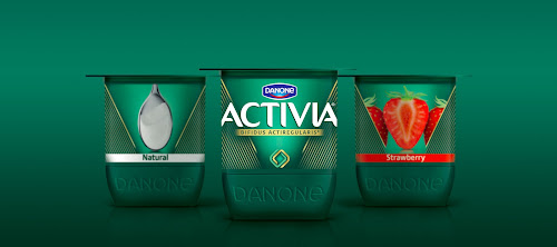
Activia Global Brand Re-launch


Creative Agency: FutureBrand
Project Type: Produced, Commercial Work
Packaging Content: Yoghurt
Location: Global

Danone partners with FutureBrand for Activia global brand re-launch

Founded in 1987 and now present in more than 70 countries worldwide, Activia yoghurt is one of the French multi-national food company’s crown jewels - with more than 300 pots sold every second.

In order to stay ahead of the market and further strengthen and premiumise the brand’s core digestive health proposition, FutureBrand was asked to create a new on- and off-pack universe.

The resulting design and visual identity introduces a new era for the Activia brand, reinforcing on-shelf impact and portfolio navigation with a clear brand architecture that leaves little doubt as to the role and specificity of each product range.

The core of the redesign is a new brand icon, made up of two interlocking shapes, that communicate both efficacy and inner-balance. While a refresh of the brand’s iconic green alongside new structural elements, bespoke logotype and a bold, new photographic style communicate the highest level of food health expertise that lies at the heart of the brand.

“We adopted a design vernacular that feels precise, controlled and refined – a language more commonly found in premium skincare than the dairy aisle. The overall effect? A top to bottom premiumisation that will ensure the brand occupies a more expert and credible place for consumers both today and tomorrow” says Marie-Thérèse Cassidy, Consumer Executive Creative Director at FutureBrand.

Activia and FutureBrand successfully tested the new visual system amongst 15,000 consumers in 7 key markets (United States, UK, France, Spain, Germany, Brazil & Russia).

The global relaunch will be implemented from September 2016, initially in 35 countries.

“We are always proud and excited about working with Danone both within France and worldwide and especially so when we get the chance to help deliver on the ambition of a true power brand like Activia”. - Suzanne Stahlie, Managing Director, FutureBrand.

Read more

Tuesday, October 4, 2016

Lil-lets


Creative Agency: BrandOpus
Creative Director: Paul Taylor
Design Director: Kate Jones
Client: Mary Young
Project Type: Produced, Commercial Work
Client: Lil-lets
Location: United Kingdom/ South Africa/ Middle East
Packaging Contents: Feminine Hygiene Products

Lil-Lets has unveiled a bold new brand identity and pack design, designed by incumbent agency partner, BrandOpus.

Following a strategic review of the brand, Lil-Lets, the leading non-applicator tampon brand in the UK and South Africa, has moved away from its ‘discreet’ positioning to a bolder and more refreshing approach to sanitary protection.

The new design celebrates Lil-Lets’ new brand personality and superior products, which are designed by women, for women.

Lil-Lets patented SmartFit™ tampon technology expands all the way round for comfort and protection against leaks. It is cleverly designed to help women carry on with life as normal and comfortably as possible, and has female insight at its core.

BrandOpus focused the redesign on reaffirming Lil-Lets’ strong sense of intuition, trust and understanding – embracing modern women and female connection, with the use of bright, strong colours and confident pack designs that don’t shy away on shelf.

“Modern women are real, strong and brilliant and we designed an identity that speaks to them.” says Kate Jones, Design Director, BrandOpus “Women shouldn’t feel the need to hide the fact they have periods. They’re part of life and what’s important to women now is that such a trusted brand recognises who they are and what their needs may be.”

Lil-Lets’ marketing director Mary Young said: “The launch of the redesigned Lil-Lets range sees Lil-Lets move towards a unified global brand that brings a contemporary approach as tampon experts and continues to have women at the heart of our marketing strategy”.

The new identity and packaging will be rolling out from September this year across the UK and South Africa, with a view to later rollout in the Middle East. It will be supported by an above-the-line campaign in the UK from October 2016.

Read more

Wednesday, September 14, 2016

London Calling - Estee Lauder & Victoria Beckham make up line


Manufacturer: MW Luxury Packaging
Project Type: Produced, Commercial Work
Client: Estee Lauder & Victoria Beckham
Location: UK
Packaging Contents: Global markets

After many months of secrecy, MW Luxury Packaging is delighted to unveil their luxury pack for this limited edition make-up case. The Victoria Beckham Collection Daylight Edition was created by Estée Lauder in collaboration with the fashion designer and singer Victoria Beckham.

MW’s beautifully understated pack was crafted using an MDF substructure. A protective black tertiary carton houses the make-up case, which slips out to reveal an elegant black and gold design. The exterior is covered in padded black PU leather, embossed with fine lines in a subtle evocation of the compacts within. Electroplated gold frames run around the edges of the case, and a matching gold clasp offers another nod to the make-up casing inside. Give the clasp a gentle press, and the case opens up smoothly.

Inside lie eight exclusive Victoria Beckham-Estée Lauder products, nestling snugly in a black ultra suede EVA fitment. Opposite, the lid plays host to a bespoke touch-activated LED mirror, making this case the perfect addition to a luxury event or weekend break. With only 400 produced for sale worldwide, every case also features a bespoke electroplated gold plaque, numbered between 001 and 400.

Read more