Tuesday, June 29, 2010

One Village Coffee


Designed by Able, United States.
Over the past 9 months we have spent a lot of time with the employees, roaster, and fans of One Village Coffee. One of our goals was to package the sentiments of "a village" into a customer experience. The bag was printed in white + two colors with a matte finish and gloss trapping over the logo. Because the budget didn't allow for more than one type of bag, a different label with a customized icon is used to identify each type of coffee.

Read more

Monday, June 28, 2010

Metromint


This is the latest innovation from Metromint – available in July. A tall and slender custom PET bottle with an over-sized metallic pressure-sensitive label and a field of vibrantly colored pink dots conveys its unique flavor profile - a ripe mix of berries. The typography treatment expresses the simplicity and purity of its contents.
The designers at Soma Beverage Company develop the mint water formula and the packaging. The founder, Rio Miura, is Japanese and a jewelry designer by trade. She has designed each of the seven varieties.

Metromint is the pioneer of the mint water category. Goodberrymint is an all-natural, refreshing combination of 100% real mint and mixed berries combined with purified water. It features a rich blend of berries including acai, blueberries, blackberries, pomegranates and raspberries. The essence of the fruit is infused into the water to deliver a cool, refreshing beverage.

Zero-calorie Metromint contains no artificial colors, flavors or sweeteners and real mint as its fundamental ingredient. The mint helps deliver great taste and the natural health benefits of mint, which is known to aid in digestion, instantly freshen breath, and provide a relaxing and revitalizing effect.
Goodberrymint will now not be available until August 15.
Read more

1300 on Fillmore


We were challenged with developing a specialty foods packaging system for 1300 on Fillmore that would become an extension of the restaurant experience. Differentiating enough to drive sales and awareness of Chef Lawrence, as well as traffic to the restaurant, the packaging brings him to the forefront, while focusing on the artisanal nature of his craft and paying homage to where it all happens—1300 on Fillmore.
Designed by Landor.
via the dieline
Read more

Sunday, June 27, 2010

Airborne (Student Work)


Designed by Staci Paul, a graphic design student at the University of Wisconsin-Stout who will be graduating in December 2010 with a Bachelor of Fine Arts Degree in Graphic Design and a Minor in Digital Photography.
Airborne is an effervescent immunity supplement taken to boost immunity. The aim of the new identity system and bottle shape is to reflect the bubbly, effervescent qualities of the product itself as well as the feeling consumers gain when taking the supplement. A new tagline "happiness is airborne" is utilized to reflect the idea that happiness can spread just as germs do, so spread the happiness of Airborne. Happy comments from customers are printed on the backs of the packaging. The bottles are complete with a peel-back nutrition label to eliminate the need for a box, and the caps are magnetic and containing cheery sayings to hang on the fridge and further enforce the idea of spreading happiness.

Read more

Bangers & Mash (Student Work)


Designed by Alexis Killam, recently graduate from the Alberta College of Art + Design, Canada.
A specialty dog food store for the dogs who can't stomach the store bought brand name pet foods. Recipes cooked up in the store and sold in the style of a bakery. A higher sophistication for a man's best friend.

Read more

S:t Eriks


Designed by Entire, Sweden.
The brewery was born on Kungsholmen in Stockholm in the 1870s and became
the brewery that pushed the development forward in its time.
It then moved to Åsögatan in Stockholm, but has been dormant since 1959.
Without loosing its characteristic soul and origin, the brand was relaunched
with an entire new design and a unique bottle in March 2010.

Read more

Taquiña Modernized


Designed by Pierini Partners, Argentina.

Pierini Partners modernizes Taquiña, a Cochabambino feeling.
Starting from a strong and personal structure, provided by the previous label, the agency led by the well-known Argentinean designer, Adrián Pierini, had achieved his purpose of a renewed image of this popular Bolivian beer.
Mixing tradition and visual impact with a careful polish of the resources and a layout cleaning, the new graphic looks for keeping linked to the aspirational values of the brand.

Read more

Friday, June 25, 2010

Heinz Pure NZ


Designed by Acorn Brand Design, Australia.
The Heinz Pure New Zealand range was created to launch a range of premium vegetables that embody the product's origin and authenticity. It was also important to create an offering of quality, unadulterated by genetic modification. The packaging is authentic, honest, transparent, environmentally sensitive with a sense of humour.

The back of pack also features a 'webcode' and directions to a website that allows the consumer to find out exactly where the products are grown, which farmer grew it and a photo & bio of the farmer. The website is www.purenzvegies.com and to check it out, use this code 89082B - We think its pretty cool! It is also the first transparent bio degradable packaging in the Australian frozen category.
Read more

Martin Berasategui


Range of frozen products designed by Enric Aguilera for Martin Berasategui, a restaurant in San Sebastián, Spain which is owned by none other than Martin Berasategui. The restaurant was voted 29th best in the world in Restaurant (magazine) Top 50 2008.
Read more
Thursday, June 24, 2010

Odelia Rapsolje


Designed by Panorama Design, Norway.

Rapeseed oil Odelia from Østfold bags "Award for Design Excellence" by the Norwegian Design Council.

Odelia rapeseed oil is emerging as a complete product range with a nice bottle and balanced utilization of graphic effects , said the jury.
Norwegian Design allow further stressed that , ' The unique bottle shape differs rapeseed crude from the Southern European olive oils that dominate the market , making Odelia visible on store shelves. The amount of information and content gives confidence in the electoral situation when the customer should consider a new and unknown product. Odelia canola oil is an innovative initiative in every way. "

Read more

Ginja d' Óbidos


Designed by NT.GJ, Portugal.
Ginja d' Óbidos is a very traditional cherry liquor from the west of Portugal.
This is a concept for a premium liquor. This liquor is made exclusively from Óbidos cherries, a place in Portugal known of its fruits and for the medieval castle.
The design of the bottle is elegant, feminine and the graphics are very simple and modern. The simplicity of the design contrasts with the complexity of the product itself.

The liquor contains cherries inside and that makes a very interesting visual effect. Although this is a drink you can also eat it, as it contains cherries that gives a different and interesting experience to the user.
The predominant color is gold that coupled with strong red represents a high quality product.
Read more

Fabrice (Student Work)


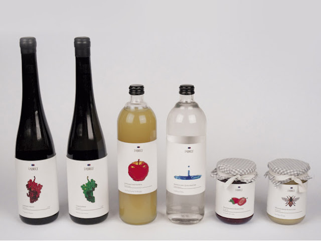
Nadja Al-Khatib created a range of packaging that can house either 2 or 6 macaroons, small or bigger cakes and all kinds of breads that the fictitious Café-Bistro "Fabrice" offers for her graphic design diploma in Vienna.
Read more

Wednesday, June 23, 2010

Gelati Sky


Designed by Truly Deeply (formerly Storm Design Brand DNA), Australia.
Gelati Sky is a boutique, premium gelati range. The story of Gelati Sky has a strong personality driven by Gelati Sky founder Paul Scalisi’s memories of growing up in Rome, eating gelati – ‘a world where every moment seemed frozen in an amazing sensory assault and every cloud in the sky made you feel it was about to rain gelato’. We were looking for something that was strikingly unique, represented his story and would create conversation. The communication platform of ‘it’s what dreams taste like’ was derived out of the brand strategy definition for Gelati Sky conducted by Brand DNA.

The goal was to express these feelings through the package and the tastes through the flavors. The concept that we came up with was born out of these ideas. We combined the imagery of Italy with objects that looked like the flavor to create a unique, organic and scrumptious shape for each flavor. The packaging looks like it is part of memories and dreams from Italy.

Gelati Sky started as a boutique Gelati range servicing restaurants and specialist food shops. The packaging was the strongest step to building a brand consumer could connect with. As small ultra premium brand, the package needed to take on a more delicate personality than the bigger, more established companies. The package needed to not only reflect the personality and story but also to look different while still maintaining premium feel. The taste of the Gelati is simply amazing and we knew that if we developed a rich, beautiful label, one that would get buyers and customers excited it would be very successful.
Read more

Caipirinha Ice


Designed by Entire in association with Team farfar.

Lingonvecka


Designed by Renée Voltaire, Sweden.
I have always thought that food is important , but what we use on the body actually affect us just as much as what we eat . Lingonberry Week towels , panty liners and tampons are made from 100 % cotton...

For me it was obvious that the products were manufactured without perfumes , plastics , chemicals or other dark and in 100 % organic cotton which is not klorblekts . And to make everyone a bit happier so I gave the series name Lingonberry Week and upholstered products in colorful packaging.

Stoll & Stoll


Designed by 095design, Brazil.
Stoll Alimentos is a frozen food Industry located in the city of Curitiba - Brazil. We developed the ID and the package line. Each illustration represents the principal ingredients of the specific meal and the main concept was to break the line of the usual frozen food packages, bringing colors and a friendly style for the segment.

Read more

Buffy's Bakery


Designed by BLOW, Hong Kong.
We have created the name and packaging design for a new product of Buffy's Bakery. Souffy Snow is a souffle-like cake that need to be kept in the fridge. Different labels will be used for different flavor.
Read more

Tuesday, June 22, 2010

Post Wine


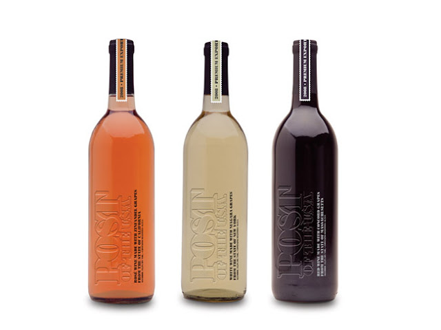
Designed by Vitor Saleh, United States.
A line of export quality wines from grapes grown in specific regions in the United States, packaged in an clean and stylish design.

Nestlé Ninho World’s Cup 2010


Developed by PANDE Design
Solutions
, the new packaging for Leite Ninho, milk’s brand owned by Nestlé Brasil, it is a limited edition for celebrate the World’s Cup 2010. The packaging reproduces shirts from the Brazilian Soccer Team in five different versions, one for each year that Brazil won the competition. The logo from CBF (Brazilian Federation of Soccer), the shirt’s design and the logo of Ninho change due to the year illustrated in the packaging, relating the evolution of the brand to the evolution of Brazilian Soccer Team.
Read more

Monday, June 21, 2010

Sexy Gourmet Food


Debbie Marks, a graphic designer recently turned Gourmet food entrepreneur, and her partners are just about to launch their new Salad Dressings at the Fancy Food Show in NYC next week. It will certainly turn more than a few heads around with their unique names and packaging.

Sexy Undressings
Our completely unique Sexy Undressings are just about ready to go. Undressings are available in 3 fantastic flavors that you will have to try to believe. Sweet Soya Vinaigrette, Pomegranate Balsamic Vinaigrette & White Balsamic Vinaigrette. It's time to reveal your inner salad.

Read more

Friday, June 18, 2010

neoPic


Talking designed a new packaging for neoPic (relieves mosquitoes itch).
Read more

Dream Ball


Concept by Unplug Design, Korea.

With Fifa World Cup 2010 kicking off, maybe we should spend some time thinking of the less fortunate children in the world. Sharing little joys like kicking a ball around would mean a great deal to their lives.
If children take off the paper from an aid box by following the patterns on it, and assemble those parts with the attached instruction, they can get a football. We can apply those patterns on any type of boxes - a square type, a cylinder type.
Now, when children get a cylinder type aid box filled with supply, they can move it by rolling that box.

Read more

Thursday, June 17, 2010

I Like...


Designed by Vgrafiks Design + Branding, Philippines.
I like is our ideal brand of a ready-to-drink smoothie. I like promises nothing but the pure goodness of a fruit smoothie that is simply meant to be enjoyed, without false claims and complicated extras. I like's simple design and the childlike color scheme appeal to people who want to have a good time and nothing else. Small, adorable illustrations come with descriptions of things that we like and enjoy. We designed and developed its brand identity, brand name, brand illustrations, brand positioning and the overall packaging design configuration.

Read more

Liberation Fairtrade Nuts


Designed by Lee Newham while working at P&W Design Consultants.
Our brief was to not be too worthy. So we made them fun with the nuts being made into little characters with protest boards proudly displaying their flavours. The characters had life beyond pack appearing on the Stationery and other promotional material showing different messages about Liberation and Fairtrade.

Arrigoni Valtaleggio


Designed by CB'a Design Solutions, France.
Arrigoni Valtaleggio, historic producer of Italian cheese, wished to increase its awareness and to enhance the high quality of its products. CB'a Milan redefined the brand's positioning, and implemented a new image both on and off packaging.

CB’a Milan and Arrigoni Valtaleggio worked together on the resurfacing of the brand’s values: Independance, Respect and Passion.
The new logotype, associated to the tagline “Simply passion", is supported by a pure and efficient graphic style, which highlights the history and tradition of the Lombardy region, through a collection of black & white pictures.
CB’a Milan implemented the new brand look & feel on several materials: packaging design, corporate identity, website and company profile.