Monday, October 31, 2016

Vegetarian Butcher (Concept)


Designer: Laura Voet
Project Type: Concept
Location: Netherlands
Packaging Contents: Vegetarian products

The Vegetarian Butcher asked young designers to improve their packaging design. The goal of the Vegetarian Butcher is to get close to the taste and characteristics of real meat, also in their packaging design.

In the existing logo of the Vegetarian Butcher, the woman is wearing an orange striped apron. I used the stripes of the apron as inspiration and translated it into the design of the packaging. I added the color green into the serie. Green is the color of nature and refers to the origin of the product: vegetable. The green color creates contrast with the meat so that the colors of the product looks better. I also added an illustration to the packaging to show the costumer where the product is made from. This because not all consumers are familiar with lupine.

The vacuum packaging is transparent, simple but decisive. I'm inspired by the method of a real butcher. I wanted to stay close to the source and the authentic look and link to 'butcher'. Besides that, the consumers wants to see what they are buying, especially if you want vegetarian products compete with real meat products.

Read more

T2 Tea Core Range


Designed by T2 Tea in house design
Designer: Christopher Stanko
Project Type: Produced, Commercial Work
Packaging Content: Tea
Location: Melbourne, Australia

Sip-worthy tea boxes and packs from T2 tea to inspire your next cuppa.

At T2, we’re about reinventing and reimagining the humble tea leaf, and sharing our teas with anyone who’ll listen.

We’re inspired by the people we meet, and the far-flung places we visit. We get a kick out of taking ancient tea rituals and reimagining them, bringing them to a modern tea table. Every cup we brew is a chance to make tea more enjoyable, more accessible and more experimental; it’s our opportunity to connect, understand and share with the world our love for a better cup of tea, everyday.

Read more

Fruits du Labeur Beer


Creative Agency: Brevity
Printer: Firecracker Press
Studio Photography: Suede Media
Environmental Photography: Nicholas Coulter
Project Type: Produced, Commercial Work
Client: Saint Louis Hop Shop / Modern Brewery
Location: St. Louis, MO, U.S.A.
Packaging Contents: Beer
Packaging Materials: Glass, Paper, Hang Tag

Fruits du Labeur is the first of many collaboration brews between The Saint Louis Hop Shop & Modern Brewery, both based in St. Louis, MO. The bottle shop and brewery, respectively, worked with local design firm Brevity, to develop a custom package for this limited release. As the beer is a Belgian style, aged in french wine barrels, the product name is displayed in custom hand-lettering inspired by historic Belgian type specimen and features subtle accents similar to traditional wine labels.

Each bottle (200, 750ml) was hand-labeled, tagged, and dipped, making the beer taste just that much more rewarding on release day.


Read more

Craft Wine


Creative Agency: Just Design
Creative Coordinator (Origin Wine): Caroline Le Roux
Project Type: Produced, Commercial Work
Client: Origin Wine
Location: Stellenbosch, South Africa
Packaging Contents: Wine
Packaging Materials: Glass

Innovative wine packaging to appeal to a consumer new to the wine category.

What's Unique?
500ml crown cap beer bottle for Organic wine.


Hajnal Palinka


Creative Agency: Graphasel Design Studio
Project Type: Produced, Commercial Work
Client: Harmatrázó Pálinkafőzde
Location: Budapest, Hungary
Packaging Contents: Alcohol
Packaging Materials: Glass

HAJNAL is Hungarian dawn – sunrise, the way home after a crazy night, the moment when today meets tomorrow, the ones who are finally going to bed meet the early birds on the street. The rooster‘s crowing is an early morning sound-pattern of Hungarian landscapes, the voice that brings the Sun up. We chose him as a symbol for traditional Hungarian fruit brandy Harmatrázó Pálinka, whose name means ‘dew-drop shaker’. The colors of the five kinds of pálinka (grape, raspberry, apple, peach and apricot) return as the colors of the Sun, meanwhile the shape of the Sun is the subject of an optical illusion shown by the transparent liquid’s distortion effect.

Read more

Gioinos Wine


Creative Agency: Artware
Photographer: Achilleas Savopoulos
Project Type: Produced, Commercial Work
Client: Tsikrikonis Winery
Location: Kavala, Greece
Packaging Contents: Wine
Packaging Materials: Bottle, Glass

Gioinos (Earth and Wine ~ Γή-οινος), a label in harmony with nature.

The brand of Tsikrikoni’s Winery wine Gioinos consists of six different labels. Artware proceeded to refresh the image of the brand by redesigning its labels.

The basic image of each label is the outline of a -different for each label- tree from Mount Paggaion, which is connected to the characteristics of the respective variety. The descriptive text for each product is discretely placed in the design, while each label is distinct by a different colour which accompanies the gustatory character of the particular wine.

Read more

Happy Break


Creative Agency: UP creative studio
Product Producer: Taurinas
Designer: Rūta Gurčinienė
Illustrator: André Mario Santos Barbosa
Project coordinator: Dalia Dzvonkienė
Project Type: Produced, Commercial Work
Client: Taurinas
Location: Lithuania
Packaging Contents: Soft drinks
Packaging Materials: Plastic, Aluminium, Paper

HAPPY BREAK soft drinks line for school students. Designed by UP creative studio in order to encourage children to choose the healthier product.

To achieve friendly contact with school students developing graffiti style details for logotype and auxiliary graphic details.

To attract children attention selected and developed hand-painted characters from the children`s world who spend leisure time actively and happily (i.e. healthier) surrounded by soft drink ingredients.

Bright background symbolizing health, cleanliness, purity in order to emphasize healthy composition based on natural juices free of any harmful additives.

Read more

Sibaritus Gourmet Ready Food (Student Project)


Designers: Pablo Calzado, Mario Montull & María López
Project Type: Student Project
School: Elisava Escola de Disenny
Tutor: Enric Aguilera
Course: Master Packaging Elisava 2015
Location: Spain

Development of a range of premium frozen meat. Clever usage and combination of beautiful shots of the raw meat together with the packaging sleeve which shows the end product styled to perfection.

Read more

Sunday, October 30, 2016

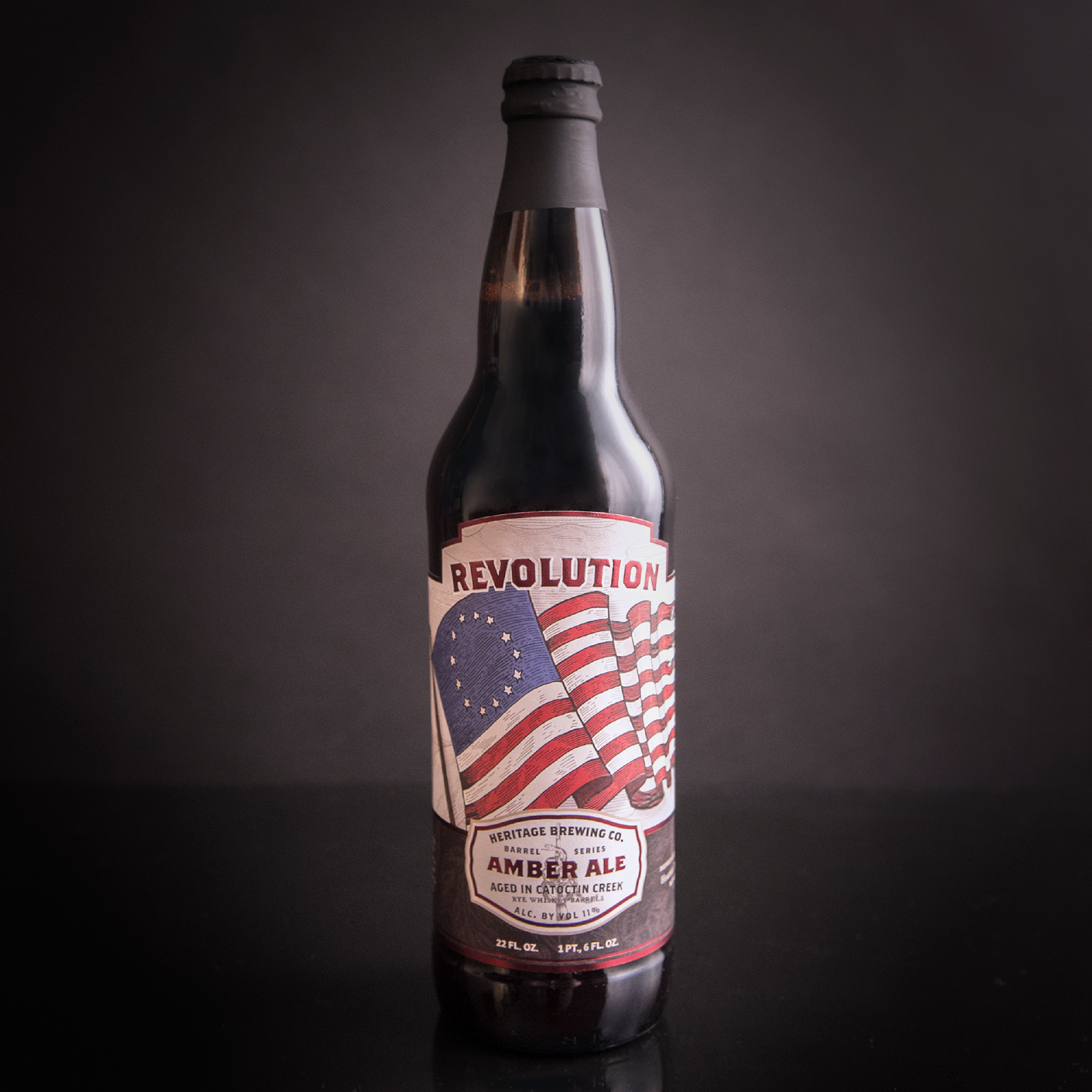
Heritage Brewing Barrels Series Revolution


Creative Agency: Pig Iron
Project Type: Produced, Commercial Work
Packaging Content: Beer
Location: Manassas, VA, USA

Revolution is the second release for 2016 with Heritage Brewing Co in their Barrel Series. This beer was originally available in 750 mL packaging which has since been updated to fit a 22 oz format with new illustration to match the King's Mountain packaging. The label features embossed elements and hot foil metallic dark red foil.

Read more

Clorox Redesign (Student Project)


Creative Agency: Haeshin Jo
Project Type: Student Project
School: Art Center College of Design
Course: Packaging 02
Tutor: Ania Borysiewicz
Location: California, United States
Packaging Contents: Household products

The redesign of Clorox aims to change a dull cleaning routine to a playful experience for younger audience by providing elevated a modern look that is relevant to millennials' current aesthetic. Cleaning is a ritual to most of people which I believe it should be less stressful, intimidating and most importantly fun. Especially, young people are having difficulty with keeping their places hygienic and be motivated cleaning due to lack of time, less experience, intimidated or bored. New Clorox design will help them to be motivated and provide playful experience.

Read more

Superb Herb


Creative Agency: Dow Design Ltd
Creative Director: Donna McCort
Designer: Brendon O'Dwyer
Account Director: Rebecca Hamer
Client Marketing Manager: Brigitte Hannett
Pack Photography: Jamie Pettigrew
Project Type: Produced, Commercial Work
Client: Superb Herb
Location: Auckland, New Zealand
Packaging Contents: Fresh Herbs
Packaging Materials: Plastic & Card

Superb Herb - A cut above.
It was all in the name for us. As they say, the name really did say it all. But Superb Herb was hiding its name under a bushel. And green on green is no way to command attention for what is a superb product, so they took our sage advice not to be another green washed brand. The results have been nothing short of spectacular. Blossoming across supermarkets like well-watered herbs in a hothouse, the new look Superb Herb has increased distribution for this innovative fifteen year old business. But more importantly, it has made them the natural, everyday addition to everybody's shopping trolley.

Read more

Cheap Beer


Creative Agency: Aga Nowak
Project Type: Produced, Commercial Work
Location: Warsaw, Poland
Packaging Contents: Beer
Packaging Materials: Aluminium

Those five designs were create for cheap beer brief.

The main problem to resolve was to combine between habits of clients and contemporary design.

My role was to mixed very simple and highly suggestive images with legible and visible typography.

I'm sure that I've done my work very well because one of the design were produced in a high circulation and it's actually available on the shelves of polish stores.

Read more

SPELTA Bread


Creative Agency: étiquette
Photographer: Benas Navanglauskas, Andrius Penkauskas
Photography: Styling Valerija Žilėnienė, Gintarė Ribikauskaitė
Art direction & design: Valerija Žilėnienė, Gintarė Ribikauskaitė, Irmantas Savulionis, Algirdas Orantas
Project Type: Produced, Commercial Work
Client: UAB Vilniaus Duona
Location: Vilnius, Lithuania
Packaging Contents: Bread
Packaging Materials: Plastic

TASK:
Packaging for a new SPELTA bread, based on existing Toste product family. Spelt is an ancient kind of wheat, which is now gaining popularity as a healthier alternative. The product is unique to the market. Strong shelf impact is mandatory.

SITUATION:
In Lithuania, new bread products are often presented in a very traditional way, with no clear target audience.

SOLUTION:
Unexpected design with lots of text. A trendy graphic approach, not yet used in Lithuanian bread packaging. For paper-like effect, matted varnish finish was used.

Read more

Vitako Melted Cheese Redesign


Studio: Ohmybrand
Project Type: Produced, Commercial Work
Client: Vitako
Location: Russia

Redesign of the packaging for the melted cheese Vitako
Different varieties of Vitako cheese have been on the Russian market for a long time, people know them. However, because of the current design of the package, this product has not been perceived as tasty and high quality cheese. Having studied the category and the history of the brand, Ohmybrand decided to maintain continuity but at the same time to make the package brighter, more appetizing and easier to notice on the shelf.
New packaging shows the future breakfast that looks delicious and varied. And if you put several packages in a line, it has a look of an endless sandwich, which stands out well on a shelf of a noisy supermarket. An appetizing food group demonstrates some options for a delicious breakfast with Vitako. A quick breakfast doesn’t need to be boring! You can add ham, herbs or something of your own choice to the cheese – and let the breakfast be delightful!

Read more

Marston's Beers Rebrand


Creative Agency: Butcher and Gundersen
Project Type: Produced, Commercial Work
Client: Marston's Brewery
Location: UK
Packaging Contents: Beer
Packaging Materials: Glass, Aluminium

Marston’s beers are a range of six beers brewed in Burton-on-Trent in Staffordshire, the spiritual home of UK brewing.

Using four ingredients; water, malt, hops and yeast each beer has its own unique colour, taste and aroma characteristics and ‘back story’ from the brewer's 180 year old history. In same cases products have been renamed but all liquids are to the same recipe.

The portfolio is presented in a variety of formats; bottle, can, draft cask or draft keg.

Read more

Bazar Coffee


Creative Agency: Sunshine and Sausages
Art Director: Lennard Freij
Copywriter: Paul van Vliet
Designer: Elmar Hamelink
Photographer: Michiel Meewis
Project Type: Produced, Commercial Work
Client: Bazar Coffee
Location: The Netherlands
Packaging Contents: Coffee

Wanna talk about it over a cup? BAZAR Coffee is the first Dutch hospitality brand to credibly claim its role as your ultimate conversation starter.

BAZAR Coffee needed an entirely new brand identity in order to revitalize its role in mainstream outlets all across the Netherlands. Competition was looming, while bar and restaurant owners seemed increasingly shifting towards brands with a spirited story and with credible relevance in connection to their consumers.

Yet as a product that nor intrinsically nor in terms of history offered tools for strong storytelling, BAZAR needed to shift its focus from itself to its consumer. The all new BAZAR Coffee identity is the first coffee brand to firmly claim its role as your ultimate conversation starter.

All design choices made, revolve around the creative concept that shaped the brand’s new and lighthearted identity. The overall impression and composition is peaceful, minimalistic and balanced. Chosen colors are earthly, modern and subtle. Fonts and materials are, again, about facilitating rather than asking for attention themselves. This scheme of design choices has been executed throughout all the brand’s identity carriers. From the logo (a coffee cup and a speech cloud in one), to packaging (staging product explanation, titles and numbers as actual design elements). From crockery (only reveiling the brand’s logo inside the cup) to website design (with photography staging consumers, pictured in right in the act of talking, as a center piece - while depicting product shots as a piece of art). From a brochure to side products’s packaging (milk, sugar, cookies, take-away cups).

BAZAR’s new appearance helped to put a halt to the brand’s churn and attract new hospitality outlets across the country.

Read more

Clayridge Honey (Student Project)


Designer: Caro Bueren
Project Type: Student Project
Location: Dortmund, Germany
Packaging Contents: Honey
Packaging Materials: Wood

Clayridge Honey is a small, family owned bee-keeping business based in NSW, Australia. They attach great importance to using only the best ingredients, so that all of their current products reach high quality standards and are completely natural. Through their 100 percent pure, raw and fresh goods, Clayridge Honey sets itself apart from the ones you can buy at the supermarket. The rebranding targets to enhance the companies appearance and to appreciate the fresh and natural products. It should reflect the high quality and implicate a obvious recognition value.

Read more

Las Maletas


Creative Agency: YG Design
Project Type: Produced, Commercial Work
Client: Grupo Peñaflor
Location: Mendoza, Argentina
Packaging Contents: Wine


Enotria and Santa Ana launched these products jointly. The purpose: to introduce a range of wines that reflect Argentina’s best when it comes to wine regions and emblematic grape varieties. The concept is based on the idea of touring Argentina. We show a character that travels across the best valleys in each region. He carries a suitcase that fulfills a specific purpose in each particular setting. The final product had to communicate the idea of travelling in a simple and straightforward way.

Read more

Dalmatian Wines (Concept)


Designer: Nina Romic
Project Type: Concept
Location: Zagreb, Croatia
Packaging Contents: Wine
Packaging Materials: Glass, Paper

Illustrations were made using watercolors and ink. Motive of a donkey is repeated on them, as a symbol of Dalmatia. Dalmatian donkey is a trademark of the entire region, a symbol of perseverance and endurance. And it is the perseverance and endurance necessary to produce quality wine from Dalmatia. Also, once the donkey for vinedresser was a faithful helper in the work related to the delivery of materials for the maintenance of the vineyard and the delivery of the harvested grapes to the tavern owner.

Read more

Shakinu Hawaiian Made Whiskey (Student Project)


Creative Agency: Eric Collier
Photographer: Bill Wikrent
Project Type: Student Project
School: University of Wisconsin - Stout
Course: Product and Packaging Design
Tutor: Nagesh Shinde
Location: Menomonie, Wisconsin, United States
Packaging Contents: Flavored Whiskey
Packaging Materials: Glass Bottle, Cork, Burlap, Ink

Whiskey on the beach never felt better than it does with a cold bottle of SHAKINU. This Hawaiian Made Whiskey is a three flavor series, featuring LEHUA HONEY, PINEAPPLE LUAU and COCONUT PALM. Each accentuates around a native specialty of the Hawaiian Islands. All three flavors will leave any drinker with an authentic taste of Aloha that will have you coming back to SHAKINU time and time again.

Eric Collier, Senior Graphic Design student at UW-Stout, created this mock-brand in hopes of developing a Whiskey that reverberated that “hang loose” aura that is so alive within Hawaiian culture. Inspired by tiki heads, and Polynesian tribal art, an iconic “Shaka-Man” logo was developed. His nurturing gaze isn’t telling you “I am going to get you drunk”, but rather “Let’s get drunk together”. This was essential to the visual language. While the color palette is rather earth-toned, the saturated splashes of oranges and yellows resonate the perfect amount tropical energy. Any more tropical, and the boldness that Whiskey embodies would be lost.

Each bottle initially comes in a screen-printed burlap sack, enlivening the energy of the product on the shelf. The natural material says “From the Locals” to a drinker, further immersing him/her into the Hawaiian experience that comes with any bottle of SHAKINU. An abstracted graphic representing each flavor is embossed upon the cork wood caps.

Read more

Tippagral


Creative Agency: JPM & Associés
Project Type: Produced, Commercial Work
Client: Tippagral
Location: Talant, France
Packaging Contents: Cheese
Packaging Materials: Plastic

Tippagral, French subsidiary of the Irish company Tipperary, that transforms over 1 million liters of milk a day, offers Cheddar cheese, Swiss cheese, mozzarella ...

JPM & Associés team was in charge of the creation of the packaging line: consulting, graphic design, packaging design...

Objective:
To build a strong and differentiating image, in order to reach and convince professionals in a marketplace where Cheddars are legion ... and sometimes multiple origin!

Result :
Successful launch and strong sales in the European market!

Read more

Friday, October 28, 2016

Tetra Pak discovers the gold in the golden years

Tetra Pak invited Packaging of the World to their headquarters site in Denton, Texas. 

Where is the gold you may ask, and how we as packaging designers or manufacturers can go for the gold? Stay tuned for more deets.

With a market presence in more than 170 countries, Tetra Pak is the world leader in liquid food processing and packaging solutions. As an industry leader, Tetra Pak frequently conducts research studies and extends media invitation to all around the world to attend product launches and whitepaper reports. This autumn, we are honored to be invited by Tetra Pak again, to their headquarters in Denton, USA for the exclusive launch of the latest edition of Tetra Pak's consumer generation whitepaper series focusing on seniors.

Read more

Shikoku Traditional Autumn Festival


Designer: Yuta Takahashi
Collaboration: Calligrapher Mami
Photographer: Yuta Takahashi
Project Type: Produced, Commercial Work
Client: Kamitemma Taikodai
Location: Japan

We carried out visual design for a traditional festival in Shikoku, Japan.

We carried out visual design for a traditional festival in Shikoku, Japan. During this traditional Autumn festival, a crowd of over 100 people carry an gold ornamented "taikodai" weighing around 2 tons through the streets of the town. 2016 marked a special year for the ceremony as for the first time in 20 years the taiko drum, believed to house the spirit of the festival, was to be replaced. We were therefore commissioned to make a design in keeping with this auspicious occasion.

We therefore set about analyzing the materials necessary to construct the drum, paying particular attention to the rivets which would be essential for the drum's structure. The riveting, with determines the sound of the drum, was carried out with great care, and under close supervision. Our graphic design used the same number of rivets as an actual taiko drum, 150, in order to create a piece with an identity befitting of the ceremony.

For the calligraphy, we borrowed the energy and passion of young calligraphy artist, Mami, whose work has been celebrated both in Japan and abroad. This new collaboration proved fruitful, and Mami's bold yet delicate characters can be seen in several features.

Imabari towels are a luxury gift item produced in the region which have become a byword for high-grade towels. Made using premium supima cotton, the highest grade of high-grade American cottons, the towels are bleached using a natural method involving yeast, which earns them an ecological mark. Using traditional Japanese "kiribako" paulownia boxes, we created a novel, minimalist packaging design that synthesizes tradition and innovation.

We maintained a balance between craftsmanship, traditional culture and modernity, aiming to innovate on traditional Japanese culture using modern design.

Read more

Thursday, October 27, 2016

Define The Difference


Creative Agency: Ogilvy & Mather Bangkok
Creative Director: Puripong Limwanatipong
Project Type: Produced, Commercial Work
Location: Bangkok, Thailand

Noble Development is a leading property developer in Thailand, well-known for its unique take on architecture. Ogilvy & Mather Bangkok were briefed to create gift sets to represent Noble's uncompromising approach in consistently applying its "be different" design philosophy over 20 projects and 25 years. Each of the 8 gift set designs they created were inspired by one of Noble's condominiums. A prominent architectural design cue of the building - whether its architectonics, the interior design, or even the unique interplay of light and dark on tiling - was translated into unique designs for edible snacks and food. The Limited Edition Gift Set, be it chocolate, a stack of crackers, pasta, sugar cube, candy, granola bar or cookies, acts as a reminder that even the most familiar objects can be seen in a different light.

Read more

Royal Essence - L'oeuvre du temps


Creative Agency: CD DESIGN
Designer: Céline Delcourt
Project Type: Produced, Commercial Work
Location: Cognac, France

ROYAL ESSENCE, a creation with the CD DESIGN signature
Royale Essence, representing French luxury at its purist and most emblematic, was born of the meeting between four entrepreneurs from complementary specialist trades, and sharing the same passion for the universe of fine spirits and luxury.

Object steeped in emotion and technicality, ROYALE ESSENCE was recently unveiled at LUXE PACK Monaco 2015 on the ORIMONO stand, accompanied by its creative designer, Céline Delcourt.

Luxury packaging designer and founder of the CD DESIGN creative workshop, Céline Delcourt is a massive fan of all things luxury. In a spirit of permanent exchange with her colleagues and technical partners, she works on securing the future of luxury brands by favouring design full of meaning and emotion, and built upon creativity and innovation.

Read more