Wednesday, January 18, 2017

rhoeco


Creative Agency: wedesign
Client: rhoeco
Project Type: Produced, Commercial Work
Packaging Content: Tea leaves
Location: Athens, Greece

Rhoeco is a word formation inspired by the Greek word ‘ροή’ [rhoē] -meaning flow-, ecology [eco] and cooperation [co]

Rhoeco is a team of young professionals, ecology enthusiasts and herb lovers, who research, experiment, analyse and finally find decent and experienced producers to become our suppliers.

Read more

Tuesday, January 17, 2017

Porto Special Edition (Concept)


Creative Agency: Noem9 Studio
Project Type: Concept
Location: London, UK
Packaging Contents: Wine
Packaging Substrate / Materials: Glass Bottle
Printing Process: Screen printing

Porto is a city in northwest Portugal known for its stately bridges and port wine production. Its name comes from the Portuguese Porto which means port.

The project shows a visual representation of the city and its streets. It is the graphic synthesis of the city of Porto. The different designs are inspired by specific "azulejos" found around the streets of Porto. The real street/avenue name is on the front of each bottle alongside with the GPS coordinates (in case you want to admire the original art).

The main four colors used to differentiate the bottles were selected from the city coat of arms, plus the shades of blue that are used in the traditional "azulejos".

Read more

The Fairytale Collection


Creative Agency: Bessermachen designstudio
Project Type: Produced, Commercial Work
Client: Konnerup
Location: Denmark / Copenhagen
Packaging Contents: Chocolate
Packaging Substrate / Materials: paper

What do Bessermachen Design Studio and Hans Christian Andersen have in common? The short answer is that we both share a passion for a great story. A great story told in words, pictures and graphics. A great story interpreted in 9 wonderful, fairy-tale bars of chocolate.

The goal
Bessermachen’s goal was to reinterpret the Hans Christian universe, giving it a totally new slant in design and chocolate. But we wanted more than that, because we wanted to make it up to date and relevant. Not because we wished in any way to interfere with a unique piece of cultural history, but because the fairy tales are just as meaningful and relevant today as when they were written. Hans Christian Andersen’s fairy tales are all about betrayal, greed, overweening ambition and love. When looked at through contemporary eyes, these themes still captivate and fascinate us.

The inspiration
We drew our inspiration for both the design and the chocolate from the fairy tales, which have so much to offer. In many respects, they represent an open book when it comes to understanding the very essence of Denmark. So this was a natural starting point when it came to merging design tradition with excellent ingredients.

The seduction
But Bessermachen also wanted to be seductive, obviously via a highly expressive packaging design. We wanted to create a premium look to match the premium chocolate, which Konnerup represents. What’s more, to put the finishing touch to this ultimate experience, the illustration on each bar of chocolate was based on a Hans Christian Andersen paper-cut, interpreted by Niels Ditlev. You see, once upon a time there was a wise man, who said: “Just living is not enough. One must have sunshine, freedom and a little flower.” Not to mention a little piece of chocolate.

Read more

Gift Card Holder


Designer: Andrew Zo
Project Type: Concept
Location: Vancouver, Canada
Packaging Contents: Gift Card
Packaging Substrate / Materials: Card Stock

The gift card holder was developed out of the need to make gift-card-giving more presentable. The design displays the card in a swift pop up motion, creating a delightful experience. It features a 2-piece construction as well as a lock mechanism that keeps the card shut.

Read more

Rosso Dei Fauri


Designer: Stefano Bracci
Project Type: Produced, Commercial Work
Client: Tenuta I Fauri
Location: Chieti, Italy
Packaging Contents: Wine
Packaging Substrate / Materials: Paper
Printing Process: Typography printing

Restyling label of Montepulciano d'Abruzzo DOC Rosso of Fauri.

The vineyard takes its name from St. Cecilia, Protectress of the music. The family Tenuta I Fauri pursued for a lifetime two passions: wine and the piano.
Read more

G Gourmet Label


Creative Agency: Load Comunicación
G Gourmet Label Creative Director: Alberto Jaspe
Project Type: Produced, Commercial Work
Client: G Gourmet
Location: Salamanca, Spain
Packaging Contents: Iberian Ham Products
Packaging Substrate / Materials: Plastic - Polypropylene

Labels created for the brand G Gourmet, plastic material 200 g. gloss and matte print.

What's Unique?
The label has been created to be placed on the product without any type of adhesive. We have tried to simulate the labels of hotels "Do not disturb"

Read more

BASIC Holiday Gift 2016


Creative Agency: BASIC
Project Type: Produced, Commercial Work
Location: San Diego, CA - USA
Packaging Contents: Hand-Poured Soy Candles, Hot Chocolate Container, Two-Piece custom Candle Container, Letterpressed Holiday Card
Printing Process: Ebony Card with Black Gloss Foil, Duplexed with handwritten script and personal greeting on the back, Glass Printed Candle with letterpressed box

Every holiday season, our team comes together to create a custom handcrafted gift to honor our friends and partners who continue to inspire us and drive us forward into the new year. This year, we created a series of hand-poured candles and a gourmet blend of hot cocoa to bring in the New Year.

Our candles were hand-poured, in-house, using an all natural black soy wax infused with a blend of cedarwood, patchouli, black pepper, and pimento berry essential oils. We poured each candle inside a frosted glass with a custom matte black foil print. Then placed each candle inside a telescoping two-piece box, wrapped in a classic black linen with white foil print.

Our gourmet hot cocoa blend, was packaged inside of a custom matte black tin with white foil print, alongside a custom BASIC mug, and a nib of Godiva Liquor, to keep cozy through the holiday season.

Each care package contained a black-on-black holiday card with a black gloss foil, duplexed with handwritten script on the front and a personalized greeting on the back.

Read more

Dates Power Drink


Designer: Muamer Prosic
Project Type: Concept
Location: Bosnia & Herzegovina
Packaging Contents: Dates drink with milk
Packaging Substrate / Materials: Glossy Plastic
Printing Process: Flexography

Concept design of Arabica coffee packaging. With this being such a unique and exclusive product, it was necessary for the design to exude such a tone. Ideal for supliments based on 100% natural ingredients.

Read more

Swedish Brewing Co


Designer: Mattias Lundin
Project Type: Produced, Commercial Work
Packaging Content: Beer
Location: Gothenburg, Sweden

Playful branding and packaging for a Swedish craft beer company based in Stockholm. Now available at Systembolaget.

Read more

Monday, January 16, 2017

Pago Cativo


Creative Agency: Brandsummit
Designer: Alex Monzó
Project Type: Produced, Commercial Work
Client: Vinos de Terruños
Location: Spain
Packaging Contents: Wine
Packaging Substrate / Materials: Paper
Printing Process: Digital and blind embossing

Simplicity and meaning define the image of Pago Cativo, a Spanish wine with two presentations: White O Forte and Red O Cotiño. Its iconic design plays with the product's name. "Cativo" means "small" in Galician, which is the region of the wine, but also "captive", so that's why one of the most emblematic elements of the prison was taken as the central image of this wine. Finally, the design was stamped on white and orange labels to differentiate each type of wine and highlight the glass' color of each bottle. The paper used was Cotone Bianco Ultra WS de Manter.

Read more

USG Boral


Creative Agency: SGK
Creative Director Spencer Ball
Strategy Phil Hwang, Ben Chong
Designers Tay Chin Thiam, Edam Ho, Steven Soh
Client Management Anne Kernahan
Project Type: Produced, Commercial Work
Client: USG Boral
Location: Singapore
Packaging Contents: Building products and construction materials

The formation of USG Boral brought together an enormous portfolio of products for the construction industry, both commercial and consumer.

This called for a global pack design with the flexibility to work across a vast array of products and multiple languages.

Our approach was based on the concept of ‘smart pragmatism’. The design was kept as simple as possible, to ensure every product is clearly identifiable by colour and name alone. Often in environments such as poorly lit warehouses and hardware stores. We developed the system in Korean, Mandarin and English typography to ensure product names would work in any language. A vivid palette of colours was created to bring vibrancy to a traditionally industrial category.

Read more

Fresh Thyme Organic Premium Spice Range


Creative Agency: The Creative Pack
Creative Director: Danielle Beal
Designers: Heather Storie, Paola Ip, Corey Czer, Emma Tung, Mark Whyte
Project Manager: Fern Serna
Project Type: Produced, Commercial Work
Client: Fresh Thyme
Location: United States
Packaging Contents: Spices
Packaging Substrate / Materials: Glass
Printing Process: Web to Print

Fresh Thyme is a Midwest grocery food retailer that launched its private label in 2015 with now over 900 SKUs with new innovative products rolling out in stores each month. Fresh Thyme products have become the #1 brand in its stores proving the authenticity and quality of Fresh Thyme as a brand as well as its impactful unique farm inspired design. As part of their private label, Fresh Thyme asked us to design its organic premium spice range.

Read more

Quintessence (Student Project)


Designer: Camille Chassagne & Léa Marque
Project Type: Student Project
School: ECV
Location: France
Packaging Contents: Luxury honey
Packaging Substrate / Materials: Cardboard & bottle
Printing Process: Foil stamping

Honey is present in each religion, each country, it is universal since antiquity and it has many symbolic. There is the symbolic of the sun, described by this quote :

«Symbole solaire par excellence, comme quintessence végétale de la lumière exaltée dans les fleurs».

Honey has many reflects, it’s a precious essence, like a unique jewel or a gemstone. Honey becomes a product of an inestimable quality thanks to every species that compose the production chain (vegetable, animal and human) and mostly thanks to the achievement of the bees. So our concept is all about unique jewel, light, reflects etc.. Our brand philosophy is « Each country owns an inestimable honey, his own jewel »

About the name, we choose « quintessence ». Quintessence means « the essence of a thing in its purest and most concentrated form ». This name matches our concept perfectly. It’s also « In ancient and medieval philosophy, the fifth and highest essence after the four elements of earth, air, fire, and water, though to be the substance of the heavenly bodies and latent in all things.

Our packaging is an interlocking of the three parts of the key system to the production of honey and its balance. These three parts (so these two parts and the bottle) represent the vegetal, the animal and the human. Interlocking echoes to the structure of the honey bees' hive. These tree elements, parts cannot work independently to create honey. So as we just told you, the square is an important element. We make our packaging around the bottle to have like a window, to see the light through the jar of honey. First the customer, take the principal pack of his holster. Then he opens the packaging like a revisited jewelry box and discovered the honey bottle. We wanted a packaging with a touch of wonder. For the cap, it’s allude to the hive but in more abstract way.

Read more

Crystalline


Creative Agency: Anthem Singapore
Creative Director: Spencer Ball
Designer: Steven Soh
Client Management: Anne Kernahan, Mia Susanto, Edmund Chia
Project Type: Produced, Commercial Work
Client: PT Orang Tua, Indonesia
Location: Indonesia
Packaging Contents: Mineral Water
Packaging Substrate / Materials: Plastic

For its first venture into a highly competitive category, Orang Tua requested Anthem to create a new brand and packaging for premium mineral water.

In a heavily commoditised and competitive market, visual differentiation is essential. Using the source of water as inspiration, Anthem created a visual story for both the label and the bottle structure. The rugged peaks and cool waters of Central Indonesia were illustrated to reflect pristine water, punctuated with a signature butterfly, symbolising the life-giving properties of nature.

The structure, designed in harmony with the label, echoes the water's mirror image as a canvas on which the story unfolds.

Read more

VOYAGES Extraordinaires Perfume (Concept)


Creative Agency: SOERENTIBOR Gbr
Project Type: Concept
Location: Hamburg, Germany
Packaging Contents: Perfume
Packaging Substrate / Materials: Paper, Glas, Aluminium

This concept is for those who love traveling. Each fragrance is dedicated to a particular city.

The flacon is inspired by a typical flask or travel bottle.

Read more

Montevista


Creative Agency: Biles Hendry
Project Type: Produced, Commercial Work
Packaging Contents: Wine
Location: UK

Changing the view. Boutinot wine Montevista receives an original new look courtesy of Biles Hendry.

Leading UK wine maker and importer Boutinot asked Biles Hendry to rebrand their Montevista range, a selection of Chilean wines comprising a Sauvignon Blanc, Chardonnay, Rosé Sauvignon Blanc, Merlot, Cabernet Sauvignon, and a Carmenère.

The name literally means ‘mountain view’ and the brief was to reinvigorate the range, adding personality and capturing the spirit of Chile.

Anthony Biles, Principal and Creative Director commented: ‘Clichés can create very engaging communication, provided you reinvest in them and make them your own. We didn’t want to avoid the obvious here; the name created an expectation to see a mountain, however we created a twist. In Chile, we concluded that the best view of the Andes is reserved for the majestic condor and for the condor alone. Our label design endeavours to capture this.’
At first glance the name Montevista leads you to seeing a mist covered mountain. As the bottle rotates and more or the background is revealed on the integrated back label, the condor appears and the mountain becomes a detail of the condor’s outstretched wing. The design is a trompe l’oeil: at once the dramatic view of a mountain as seen by a condor, and the condor itself.


The new labels appeared on the Montevista wines in December and are available throughout the UK in wine specialists, restaurants and through online stores, retailing at around £7.

Read more

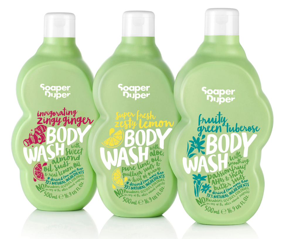
Soaper Duper


Creative Agency: B&B studio
Project Type: Produced, Commercial Work
Packaging Content: Bath and body
Location: UK

B&B studio creates green packaging for Soaper Duper which launched exclusively in Liberty
Soaper Duper, a new clean and green bath and body range founded by Marcia Kilgore – the entrepreneur behind Bliss Spa, Fit Flop and Soap & Glory – has launched in Liberty with environmentally friendly packaging by B&B studio.

The range uses the best naturally derived ingredients and is free from parabens, sulphates, phthalates, mineral oil and colourants, amongst others, as well as avoiding any ingredients that can cause ocean contamination. In a category more usually associated with style over substance, the Soaper Duper brand, product and packaging takes a unique approach, finding beauty within its commitment to naturalness, goodness and doing good.

Going green
A key requirement from the outset was to make the packaging as environmentally friendly as possible, so that it would live up to the brand positioning and design. B&B embraced this challenge and collaborated with the client and suppliers to develop packaging using high levels of recycled plastics, rather than virgin materials.

During the design process, a number of bottle colours were explored, but apple green, which had been used from the beginning, won through. The green reflects the products’ natural credentials and provides an ideal canvas for the vibrant graphics to communicate to the consumer. The Soaper Duper green is a bespoke colour and B&B worked with the suppliers to align the colour when printed across various print processes with the green of the physical packaging.

Good for the environment
The green HDPE bottles are made from 100 per cent post-consumer recycled plastic (PCR). Most of this material is made up from recycled milk bottles and recycled green bottle tops, which give the plastic a green tint.

Tubes have a maximum of 55 per cent recycled plastic content because any higher and the tube starts to crinkle and is harder to squeeze. Whilst the jars are currently virgin PP, they are currently all on test in PIR with the intention of phasing in PIR as soon as possible.

Graham Hawkins, Production Director, B&B studio, says: “This approach to packaging design leads to fewer plastics being sent to landfill, helps to support the recycling infrastructure and uses less energy, producing a lower carbon footprint than using virgin plastics. “As Soaper Duper is a natural and ethical brand, the packaging needed to reflect this. It leads the way with the growing trend in personal care for natural brands to reduce their impact on the environment and for ethical brands which enable consumers to give a little back by buying into them.”

The Soaper Duper range starts at £6.00 rrp. The brand supports Water Aid and Clean the World to bring soap and water to communities that need it.


Acai Pop (Concept)


Designer: Kelsey Layne
Project Type: Concept
Location: London
Packaging Contents: Acai Bowl
Packaging Substrate / Materials: Plastic
Printing Process: Digital printing

Acai Pop was created for those, who like myself are always on the move whilst constantly striving to find the perfect work life balance without neglecting nutrition or health. With the Acai Pop tag line 'Add a pop of colour to brighten an early morning' in mind, the design reflects the vibrancy of each ingredient.

The hand drawn logo uses elements from the illustration of the Acai berries to create its form, whilst also looking as though it will pop itself.

Read more

Melatta


Creative Agency: scd
Project Type: Produced, Commercial Work
Client: Melatta
Location: Bogotá / Colombia
Packaging Contents: Jams
Packaging Substrate / Materials: Glass Jars
Printing Process: Labels in Digital Printing

Melatta is a small company in Bogotá. They produce delicious jams with new and exotic flavors. They wanted to show the content of the jar and to have a clean and joyful design.


Read more

Arabica Coffee (Concept)


Designer: Muamer Prosic
Project Type: Concept
Location: Bosnia & Herzegovina
Packaging Contents: Coffee
Packaging Substrate / Materials: Glossy Plastic
Printing Process: Flexography

Concept design of Arabica coffee packaging. With this being such a unique and exclusive product, it was necessary for the design to exude such a tone.

Read more

TAITA 40 (Student Project)


Designers: Karen Cedeño & Edwin Bowen
Project Type: Student Project
School: Escuela Superior Politécnica del Litoral (ESPOL)
Course: Final Degree Project
Tutor: Jefferson Romero M.A.
Location: Guayaquil, Ecuador
Packaging Contents: Playing Cards + Accessories
Packaging Substrate / Materials: Paper, Wood
Printing Process: Digital Print, Laser Cutting

“Cuarenta, more Ecuadorian than ever”
TAITA 40 is a set of playing cards and accessories for the traditional Ecuadorian game “Cuarenta”, inspired by the iconography and characters of the Huancavilca and Inca cultures, the last ancestral villages belonging to the coast and high land mountain regions of Ecuador during the time of Spanish conquest.

The color palette and packaging designs of the “Cacique” and “Inca” lines give the product a classic and traditional image. The wooden packaging preserves adequately the playing cards and its accessories, while the flexible lid allows to manipulate the items without any difficulty. The laser cutting technique in the wood besides the flexibility of the material, leaves an odor trace in the packaging, turning it into a characteristic element of the product.

As a final result we obtain an object that carries culture and traditions that pays tribute to the elements that have formed the identity of our country.

Read more

Necla İlac Herbal Tea


Creative Agency: Creas Creative
Project Type: Produced, Commercial Work
Client: Necla İlaç
Location: izmir, Turkey
Packaging Contents: Herbal tea
Packaging Substrate / Materials: Paper
Printing Process: Offset printing

Necla İlac is a new company in Turkey. It's brand is Süs. Necla İlac produces herbal tea. We aim that the design is strong and pure. Therefore, we use black background in design. We use metallic gray for some fonts. After all, our customer is very satisfied.

Read more

Nuts 'n Nuts | Blackcurrant, Natural Mix and Spicy Mix


Creative Agency: Friends Creative Shop
Project Type: Produced, Commercial Work
Client: Nuts 'n Nuts
Location: Athens, Greece
Packaging Contents: Nuts
Packaging Substrate / Materials: Plastic

The pouches are designed to highlight the authenticity and high quality from the cultivation to the final product

Read more

Sunday, January 15, 2017

El Cantizal Extra Virgin Olive Oil


Art Director: Alice Pesenti
Project Type: Produced, Commercial Work
Location: Spain

El Cantizal is a Spanish premium olive oil. It's centennial olive trees are located in the heart of Andalusia, based in a unique microclimate which allows the company to obtain exclusive olive oils of extraordinary quality.

The objective was to create an image that could express the warm and powerful energy of Andalucía, and also to create a unique brand that stands out from its competitors.

Read more

The Lucky Packet From Hometown


Creative Agency: One & One Design
Project Type: Produced, Commercial Work
Packaging Content: Red packet, money
Location: China

"Red Packet from Home" is a large-scale theme creative activity organized by Art Cool Special Planning Group. Thirty-four designers were invited to carry out design and creation around the country's 34 provinces and cities.

Invited by the cool arts, in late 2016 for the home of Jilin, a red envelope design called "The Lucky Packet From Hometown" was created.

On winter mornings, we will often see this unique natural landscape, and especially in Jilin Rime most charm, magnificent picturesque. In this red packet, the same beautiful landscape is recreated using special printing effects.


Read more