Monday, May 31, 2010

CD Bakery (Student Work)


The CD Bakery is a brand new concept specifically designed to convert an ordinary set of CD cases into a piece of remarkable office supplies that also acts as an aesthetically delightful display. The CD cases are made in wood, each case contains a pocket to hold the CD booklets. The colorful papers allow the user to easily store and identify them. Initially inspired by Muji with its simple clean design, this package focuses on functionality and has carefully eliminated any excess decorations. This eco-friendly design solution may gradually reduce the amount of plastic compact disc cases.

Designed by York/Sheridan design student, May Tsui.
Read more

Sunday, May 30, 2010

Latin America Knorr Soups


The awarded Brazilian design house, Casa Rex, has redesigned Knorr Soups core range for Latin America. The new packaging design breaks the pattern commonly seen in industrialised products, by depicting the use of natural ingredients.

After studying the market, Casa Rex observed that the ingredients on packs were nearly always portrayed as being perfect and without any defects. This was not in keeping with market trends and consumer behavior; the current tendency is towards natural foods with people becoming increasingly concerned about their health and well being.
Read more

Wednesday, May 26, 2010

Kowa Coffee


Range of imported coffees and teas, unique and highly selected. "We traveled all over the world, exotic travel, and selected coffee and tea plantations in wonderful places."

Designed by Series Nemo, Spain.
Read more

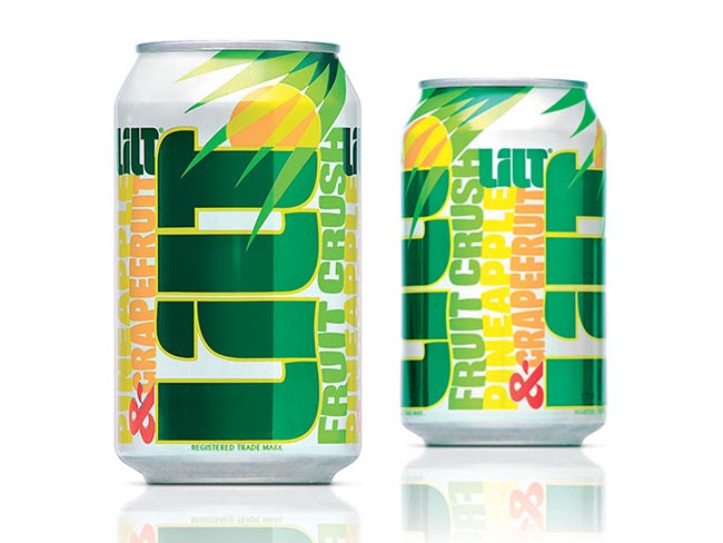
Lilt


Since Lilt is the original fruit crush, we literally crushed the design and type on the pack to evoke Caribbean dreams, Tortola, anyone?

Designed by Turner Duckworth.

Scratch My Back


Designed by Marc Bessant, United kingdom.
Limited to 500 copies worldwide, this multi-format box set of Peter Gabriel's new album 'scratch my back' is available exclusively through petergabriel.com

Designed at Real World by Marc Bessant, this 'scratch my back Collector's Edition' is presented in a rigid, full colour and gloss laminated lift off lid box.

Read more

Tuesday, May 25, 2010

Backyard Vineyards


The winery is located just outside of metro Vancouver, BC, Canada, hence the name and the illustration! Brandever always has amazing concepts behind their work, and I am so pleased to have participated in one of them.

Illustration by Fabien Barral. Designed by Brandever, Canada.
Read more

Quickoven


Quickoven is a vending machine company that serves hot food in less than 90 seconds, around the clock. Since there is no human encounter involved, we decided to personalize the experience of ordering and receiving your meal. We did so by giving the machine and packaging a voice of it’s own, adding a bit of charm and humour to the process.

Designed by Milk, Sweden.
Read more

Monday, May 24, 2010

Oatrageous (Student Work)


The object of this project was to create a new image for an oatmeal in order to better position it in a market for women ages (25-35). Building on the "healthy and delicious" appeal of oatmeal, I utilized images to visually depict the ingredients: milk, fruit and oatmeal. The slight curve in the cup is not only more ergonomic but it also insinuates a thinning waistline. The tin foil covering the top of the cup will differentiate each flavor as each fruit is represented by a different color.

José Luis García Eguiguren's latest academic project at Elisava Escola superior de disseny.
Read more
QUMO Libro


Designed by Alex Strelkov, Russia.

Oracle Organics


Designed by Fenetik Design, Australia.
When we originally sat down with Oracle, the company had been in production for a little over a year, and with products starting to fill local and national grocery store and cafe shelves, they were ready to take a look at strengthening their labels and packaging.
Read more

Friday, May 21, 2010

Clean Genuity


Read more
Pip


The packaging created by Identica has been developed to represent a fresh, honest approach for the premium 100% fruit blends. The range consists of organic juices bottled into a 1 litre offering and launches with three vitamin packed flavours; Cloudy Apple, Cloudy Apple with Cherry and Cloudy Apple with Mango.

Read more
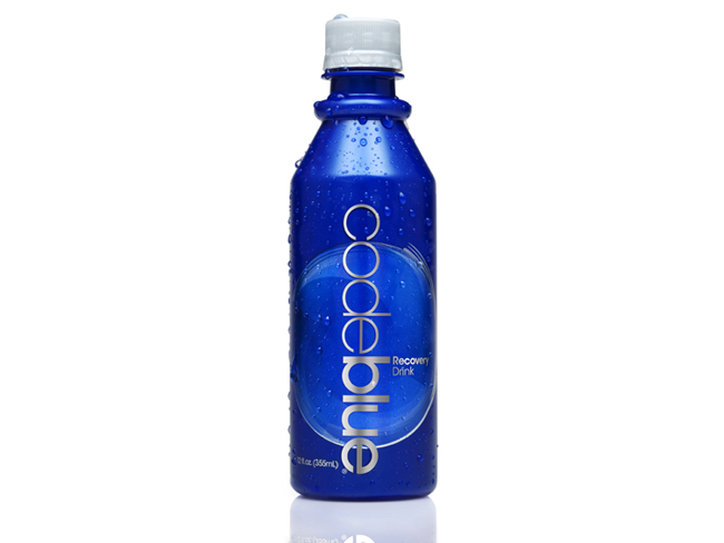
Code Blue Recovery Drink

Code Blue Recovery Drink

Code Blue is the world's first complete recovery drink designed by beverage scientists to revive your body. Code Blue's powerful ingredients allow you to feel better faster by helping the body combat dehydration, replenish vital nutrients and remove harmful toxins.

Read more

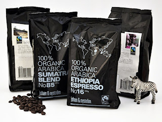
Johan & Nyström

Johan & Nyström

Swedish coffee company Johan & Nyström slow roasts coffee in small batches on two roasting machines from 1956. Not because they are traditionalists, but because they believe that the coffee tastes better. The slow roasting (12-15 minutes) brings out the best in each coffee. They travel the globe in the hunt for the perfect coffee beans for the perfect cup of coffee. Summer has designed two bags for two different coffee blends - a Sumatra blend and an Ethiopian blend.
Designed by Summer, Sweden.
Read more

Wednesday, May 19, 2010

Tang Juice (Student Work)


The highlight for this package designer Diego Aguilar, this totally ahead of the market today offers this segment, giving full emphasis to the flavor and quality of the product, transmitting the sensation of fruit picked straight from the orchard. The black represents color codes exclusivity, treating this as a premium product.

Designed by Diego Aguilar (Student Work).
Read more

Tuesday, May 18, 2010

Gorki


The basic idea in the design of the label for this product, was to create something that will at first reflect on what kind of product is done.
Of the numerous proposals for we selected name "Gorki", as in the Serbian language says bitter, which is fully described in terms of audio our products. As the target group for this type of product quite broad, the main theme is selected leaves, as an element that will be familiar to everyone. Many stylized sheet describes the diversity of content (56 spices), while its color symbolizes the monotony of the whole compound and it is our product. Was used for making semi-transparent label to the impression that the leaves is physically present in the bottle itself.

Designed by Aleksandar Petrovic of Janus.

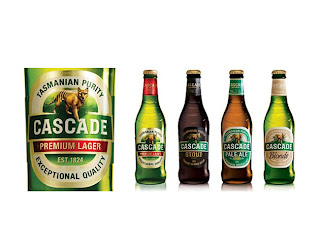
Cascade

Cascade group

Cascade is Foster’s third-largest beer brand and is brewed in Australia’s oldest brewery at the base of Mount Wellington in Tasmania. The Cascade beer portfolio—made up of two premium beers (lager and light) and three craft beers (blonde, pale ale, and stout)—was fragmented and lacked visual consistency. Cascade’s portfolio volume was also dominated by Cascade Premium Light, which was competing in a declining market. On the whole, Cascade had lost relevance in the competitive premium beer category and needed to redefine itself as a more contemporary, unified brand.

Landor’s task was to create a new brand positioning and architecture for Cascade, allowing for the development of a clear master brand strategy that would be implemented across the portfolio. The challenge was to give Cascade a contemporary look and feel and to ensure that the brand continued to embody its uniqueness through all touchpoints. From Landor this required a deep understanding of—and passion for—the Cascade brand and premium beer category combined with a highly creative design strategy and execution.
Read more

Monday, May 17, 2010

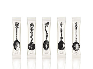
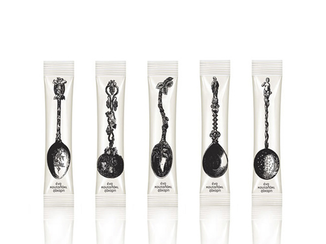
A Teaspoon of Sugar

mouse graphic sugar packaging

Latest work by Mouse Graphics, Greece.
This work is a conscious attempt to literally interpret the pack content: 'One spoonful of sugar' - visually and verbally stated. Straightforward and simple, the pack design obviously invites to a more decorative daily cupper.

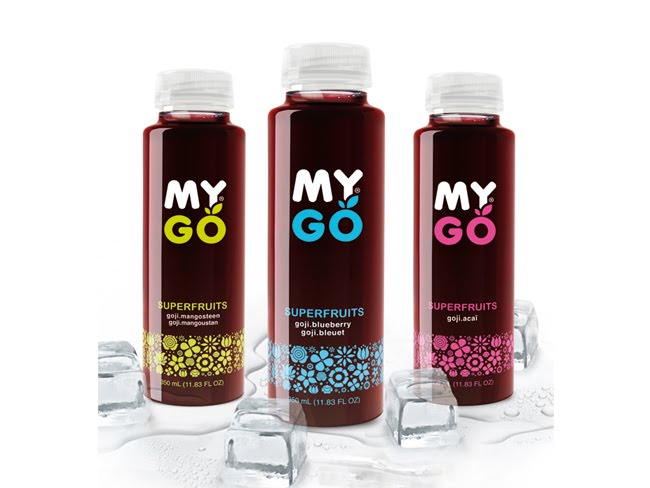
MYGO Super Fruits

MYGO Super Fruits Group Shot

MYGO is a new generation of drink, a super fruit juice, rich in antioxidants. It contains GOJI berry, an ancient Chinese medicinal fruit, often called “ the fruit of happiness”. It is believed to stimulate and boost your fundamental energy. Mygo is also rich in Vitamin C, and is a healthy and effective alternative to current energy drinks.

Read more

Septiembre


Bodegas Trapiche commissioned Tridimage to renew the brand image and packaging of their cool wine September, one of the leaders of the Argentine market. Based on the concept of "Spring night" the flower icon builds colorful patterns in each label.

Designed by Tridimage.
Read more

Sunday, May 16, 2010

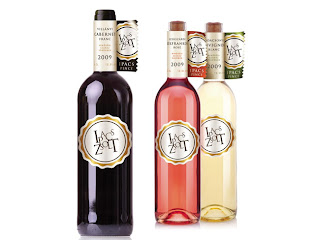
Ipacs Winery

ipacs winery wine bottles

Designed by Café Design, Hungary.
Ipacs Winery is a young, emerging, dynamic developing and already successful winery led by an ambitious owner.

Our task was to design the CI and the packaging for the winery. Neither the package-technology nor the budget of Ipacs can rival with the historic wineries. Thus the designer's goal was to make advantage of the disadvantage. The quite unusual flag-like label was born thanks to this pressure. The label holds all important information so the tag on the bottle could concentrate exclusively on the branding.

Wednesday, May 12, 2010

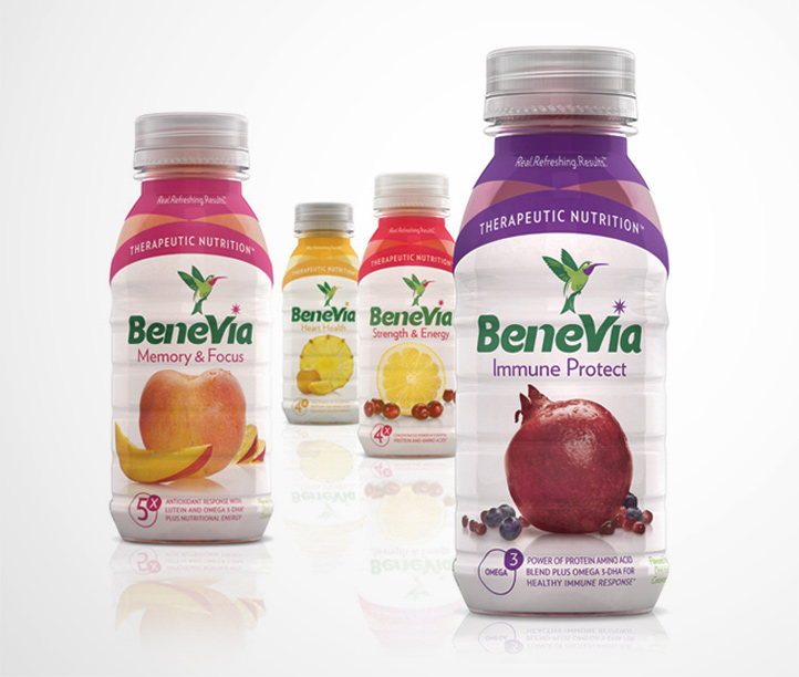
BeneVia

BeneVia Health Drink bottle

BeneVia health drink packaging by Periscope, United States.
Read more

The Bay Tree

Bay Tree Range

Irving have been commissioned by the founders of The Bay Tree to overhaul their complete range of food products. In short their philosophy is that The Bay Tree food products offer a ‘helping hand in the kitchen’. Products such as ready made cooking sauces, pickles and condiments help busy people save time in the kitchen. All of the products are hand made in The Bay Tree kitchens rather than processed in a large factory. The best possible ingredients are used and were possible they are sourced locally – these ingredients are often reflected on the labels. The hands-on, informal and friendly approach of the founders Emma McDonald and Lucie Lewis is reflected in the design of the labels. Irving have been working with the celebrated British illustrator Chris Brown to bring charm, wit and a distinctive personality to the brand.

Designed by Irving & Co, United Kingdom.

Read more

Preece


Australia’s leading illustrators were commissioned to create artworks inspired by the Mitchelton winery in central Victoria for the latest Preece re-branding. The rejuvenation has elevated Preece into the top 50 best selling wine brands in Australia.

Packaging by Frank Aloi, Australia. It is the finalist at the AGDA Awards.