Showing posts with label Asia. Show all posts

Monday, January 16, 2017

USG Boral


Creative Agency: SGK
Creative Director Spencer Ball
Strategy Phil Hwang, Ben Chong
Designers Tay Chin Thiam, Edam Ho, Steven Soh
Client Management Anne Kernahan
Project Type: Produced, Commercial Work
Client: USG Boral
Location: Singapore
Packaging Contents: Building products and construction materials

The formation of USG Boral brought together an enormous portfolio of products for the construction industry, both commercial and consumer.

This called for a global pack design with the flexibility to work across a vast array of products and multiple languages.

Our approach was based on the concept of ‘smart pragmatism’. The design was kept as simple as possible, to ensure every product is clearly identifiable by colour and name alone. Often in environments such as poorly lit warehouses and hardware stores. We developed the system in Korean, Mandarin and English typography to ensure product names would work in any language. A vivid palette of colours was created to bring vibrancy to a traditionally industrial category.

Read more

Crystalline


Creative Agency: Anthem Singapore
Creative Director: Spencer Ball
Designer: Steven Soh
Client Management: Anne Kernahan, Mia Susanto, Edmund Chia
Project Type: Produced, Commercial Work
Client: PT Orang Tua, Indonesia
Location: Indonesia
Packaging Contents: Mineral Water
Packaging Substrate / Materials: Plastic

For its first venture into a highly competitive category, Orang Tua requested Anthem to create a new brand and packaging for premium mineral water.

In a heavily commoditised and competitive market, visual differentiation is essential. Using the source of water as inspiration, Anthem created a visual story for both the label and the bottle structure. The rugged peaks and cool waters of Central Indonesia were illustrated to reflect pristine water, punctuated with a signature butterfly, symbolising the life-giving properties of nature.

The structure, designed in harmony with the label, echoes the water's mirror image as a canvas on which the story unfolds.

Read more

Sunday, January 15, 2017

The Lucky Packet From Hometown


Creative Agency: One & One Design
Project Type: Produced, Commercial Work
Packaging Content: Red packet, money
Location: China

"Red Packet from Home" is a large-scale theme creative activity organized by Art Cool Special Planning Group. Thirty-four designers were invited to carry out design and creation around the country's 34 provinces and cities.

Invited by the cool arts, in late 2016 for the home of Jilin, a red envelope design called "The Lucky Packet From Hometown" was created.

On winter mornings, we will often see this unique natural landscape, and especially in Jilin Rime most charm, magnificent picturesque. In this red packet, the same beautiful landscape is recreated using special printing effects.


Read more

Glaceau Sleepwater


Creative Agency: Schawk
Managing Director: Reiko Nakamura
Design Director: Soichi Yamaguchi
Project Type: Produced, Commercial Work
Client: Coca-Cola
Location: Japan
Packaging Contents: Non-alcoholic Beverage
Packaging Substrate / Materials: Plastic
Printing Process: Flexography

Glaceau is one of key brands of The Coca-Cola Company. Originated from New York City, Glaceau is growing in global market presence.

Targeting the sleep-deprived 20 - 40 year working adults in Japan, The Coca-Cola Company has requested for Schawk Japan to design a label for “Glaceau Sleepwater”, a new product which aims to provide a restful slumber and increased sleep quality.

Glaceau Sleepwater is the first brand in The Coca-Cola Company to be approved under “Foods with Function” by the Consumer Affairs Agency in Japan. The design mission was to preserve Glaceau’s classic style while adhering to regulatory boundaries.

The concept took inspiration from a droplet and crescent moon to symbolise a rising moon in the deep and clear blue night of Japan. On the bottom, regulatory claims were provided on low contrast colours, allowing the product to remain classy, simple, stylish.

Glaceau Sleepwater was launched in May 2016 in-store and online with a variety of promotions in the Japan market.

Read more

Fish Sauce | The Spirit Of Vietnamese Cuisine (Concept)


Creative Agency: RIO Creative
Design Team Leader: Tuan La
Graphic Design: Tuan La, Viet Do, Dzunh Le, Tuan Chelsea
Account & Copywriting: Nguyet Anh
Creative Director: Tung Juno
Project Type: Concept
Location: Hanoi, Vietnam
Packaging Contents: Fish sauce, shrimp paste, bean paste, rice vinegar
Packaging Substrate / Materials: Paper label
Printing Process: Digital printing

Cause images directly impact to the consumer’s consideration and then encourage them to buy, design is one of the powerful weapons for strengthening the attraction of products in the market. Understanding the advantages of eye-catching points, RIO TEAM decided to create those below package series in order to broadcast our traditional culture all over the world. Simple but attractive, every single product embrace the pride of Vietnamese farmers about our food cuisine.

Read more

Thursday, January 12, 2017

XOCOLA Organic Chocolate (Concept)


Designer: Kimmy Lee
Project Type: Concept
Location: Manila, Philippines
Packaging Contents: Chocolate
Packaging Substrate / Materials: Paper
Printing Process: Digital Printing

Born from the desire to create the simplest and purest “bean–to–bar” confectionery, XOCOLA is one of only a handful of micro-batch makers of premium and fair trade chocolates. XOCOLA only uses organic, high–quality ingredients combined with non–roasting techniques to bring out the truest and purest cacao flavours.

Logo
The decision early on was to use a clean, simple, pretty straightforward serif wordmark, the contrast of the thick and thin lines provides a nice balance and boldness to the overall aesthetic, while the pointy termination of the serif hints at the sharp edges of the chocolate bar and box.

Color
Focusing on the aspects of contrast and balance, the yellow is used as an accent colour, lending a bright contrast to the deep-brown chocolate bar while adding a playful pop of colour to the black and white design.

Illustration
The stylized illustration takes its cue from the shape of the cacao fruit and its leaves; keeping it very organic than geometric, with fluid lines for a softer impression; the splatter takes its cue from the irregular shapes of broken cacao nibs/shards.

Read more

Fitkom Vitamin Gummy


Creative Agency: Anthem
Project Type: Produced, Commercial Work
Packaging Contents: Fruit gum candy
Location: Indonesia

Anthem Repositions Fitkom Vitamin Gummy Brand For Indonesian Market
Anthem, a global creative agency that actively connects brands with consumers by amplifying desirability from package design to brand campaign to drive brand performance, has designed a new brand identity and packaging for SoHo Global Health’s Fitkom Vitamin Gummy brand in Indonesia.

Soho Global Health sought to develop a new and ownable set of mascots for its Fitkom Vitamin Gummy brand that would appeal to both children and parents. The new Fitkom Gummy brand has been brought to life beyond packaging, depicting a group of mixed-gender heroic rangers whose story-based mission is to help those in need.

Anthem led the creative conceptualisation process for the development of the mascots, conducting character and product development workshops, introducing suitable storylines and cheerful design elements to highlight the appeal of the brand. This included the design of visual anchors that serve to emphasize the product’s nutritional value and benefits. Anthem also led the structural packaging design and overall graphic design.

“We are really proud of how far we’ve come with Fitkom Gummy. With a single goal in mind, we developed a new set of successful, sustainable mascot characters and a powerful story that can appeal to kids while reassuring moms,” noted Kiki Sembiring, vice president of sales and marketing, SoHo Global Health.

“As a team, we wanted to avoid the common misconception of thinking that we as adults, understand what motivates kids! So we spent a lot of time drawing pictures and interacting with kids, ultimately co-creating these characters as part of an integrated brand strategy on- and off- pack. We’re over the moon with the rangers and the pack designs,” enthused Spencer Ball, creative director at Anthem in Singapore.

Fitkom Gummy is now available in stores and online within Indonesia.


Tuesday, January 10, 2017

Air Plants Lover


Creative Agency: STUDIOBIUM
Project Type: Produced, Commercial Work
Client: GreenLover HKG
Location: Tokyo, Japan
Packaging Contents: Air Plants
Packaging Substrate / Materials: Translucent Plastic
Printing Process: Screen printing

Air Plants Lover is a specialise in selling of the air plants online store.

We designed Logo and packaging to emphasize clarity of the plants. Packagings are made of translucent plastics, to catch a glimpse of the green, It looks like a wet glass with the night dew.

Read more

King's Milk (Student Project)


Designer: Seunghee Baek
Project Type: Student Project
School: Hongik University
Course: Design Studio(4)
Tutor: Hyunkyung Park
Location: Seoul, Republic of Korea
Packaging Contents: Milk, Cheese, Yogurt
Packaging Substrate / Materials: Paper, Glass, Plastic
Printing Process: Digital printing

King's Milk is a brand of milk based on an interesting and unique brand story and symbol.

The country Seolkook—Snow capped mountain. Since The king of Seolkook loved to drink milk so much, his beard turned white. One day, the king heard the story that the people under the mountain are not drinking milk. The king gave his speech. "Drink the milk!”

King's Milk promises to convey the taste of fresh and rich milk that is like drinking with cold, white snow. In addition to the original 100% white milk, we processed milk containing the taste of ingredients such as banana, chocolate, strawberry, fresh yogurt, and cheese.

Read more

Sunday, January 8, 2017

Miko No Yu (Student Project)


Designer: Chiun Hau You
Project Type: Student Project
Class: Package Design I @ Taiwan Tech
Professor: Ting Chien Lin
Technical supports: Jack Liu, Sheu Yong
Packaging Content: Hot spring bath powder
Location: Taipei, Taiwan

Design motivation
To re-design hot spring bath powder packaging to break off from the usual packaging that you can find in the market that are plastic and cheap looking. This is a hot spring powder packaging that can allow users to get the most pure and natural way to enjoy the hot spring.

design concept
Through the different combination of nature materials, creating a simple, natural atmosphere. In the selection of materials, Hau You used stones to represent the natural hot spring landscape, the wooden cap is a symbol of "Japanese bathing items" and by combining the two together it forms a new look and feel.

Read more

The Color Of Confiture


Creative Agency: Latona Marketing Inc.
Project Type: Produced, Commercial Work
Client: Poco a Poco
Location: Shizuoka, Japan
Packaging Contents: Jam (confiture)
Packaging Substrate / Materials: Paper
Printing Process: Screen printing

A package design for handmade high quality jams (confiture), that uses carefully selected materials. The jams comes in more than 20 different varieties.

This multicolored lineup means you can pick jams by color, giving you a new way to enjoy them. It's like choosing the color of nail polish to paint your nails with, and can match your clothes or your mood. Just like a beautiful lineup of colorful nail polish, these jams provide a colorful display for your dining table.

Read more

OMG


Designer: Gadi Adar
Project Type: Produced, Commercial Work
Client: Sacara Cosmetics
Location: Rehovot, Israel
Packaging Contents: Body Lotion and Body mist
Packaging Substrate / Materials: Plastic and Glass
Printing Process: 4 color printing on plastic and digital printing

New line of cosmetics products for young girls, high response in the market.

What's Unique?
New graphic language in the cosmetics stores based on pop art.


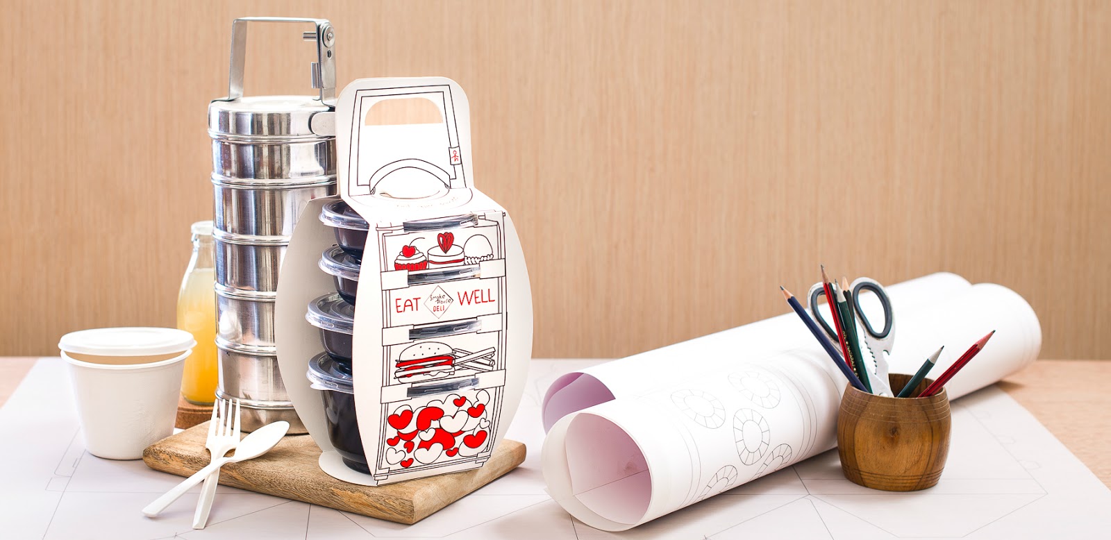
Smoke House Deli Lunch Box Take Away


Creative Agency: Schmancy Pack Private Limited
Project Type: Produced, Commercial Work
Client: Smoke House Deli
Location: Bangalore, India
Packaging Contents: Seafood, Chicken, Rice, Cooked Food, Packed Meal
Packaging Substrate / Materials: Paper, Plastic
Printing Process: Offset Printing

Smoke House Deli is an upmarket restaurant chain in India, located in most of the metro cities. They wanted a unique packaging design that would incorporate their quirky fun vibe. The target audience was mainly corporates.

As kids, Indian families use metal lunch boxes that would have about 3-4 individual compartments stacked one above the other containing individual food items. We wanted to recreate that same nostalgic feeling with our packaging and thus came up with this concept. There are 4 plastic containers that hold a 4 course meal and these are held together with a carrier designed out of paper. The attached image shows the traditional metal lunch box in the background and our product up front. The cutlery and paper napkins would slide in under the handle and these were perfect to take away as well.

What's Unique?
The unique concept and the nostalgia we were able to bring back while keeping the design practical and easy to assemble and use by the customer is what makes this stand out.


Thursday, January 5, 2017

Chairman Mao Red Packet


Designer: Jody Xiong
Project Type: Produced, Commercial Work
Packaging Content: Money
Location: China

Red packet designed by The Nine. Has been almost sold out on Taobao within only a week. Many people are crazy for the interesting design :) Happy new year! : )

Red packet is a special item in which Chinese put not only money, but also good wishes for the ones they love during Chinese New Year. This year, Ekoo invites 34 designers from all over China, and ask each of them to design a special red packet to represent their hometown. I come from Hunan province, so I found Chairman Mao as a source of inspiration.Chairman Mao, being printed on Chinese banknotes, is a representative figure of Hunan Province. The cut-out design of this red packet reveals just exactly Mao’s portrait on the hundred note. By this simply yet smart design, people can easily tell the feature of Hunan.​​​​​​​​​​​​​​

Read more

15 Years of Coffee Excellence, Starbucks Korea


Creative Agency: De Yool Studio
Project Type: Produced, Commercial Work
Packaging Content: Coffee
Awards: iF Design Award, 2016 , IDEA International Design Excellence Awards, 2015
Location: Korea

Design:
The collection was launched in July 2014 to celebrate Starbucks Korea's 15th anniversary.

The typography-centric design was inspired by vintage coffee packaging and advertising, and it tells a story of Starbucks Coffee Korea by numbers – 144,000,000 cups of Americano; 6,500 Partners; 600 stores; 880,000 My Starbucks Rewards Members, etc – along with a dash of coffee-related, engraving-inspired illustrations.

A lot of companies celebrate their 15th anniversaries. But when you say 144,000,000 cups of Americano, it has a whole different feel to it. It becomes palpable and the customers get to feel a sense of participation. It was this emotional interaction with our customers that made this collection very successful.

Result:
The sales from merchandise had grown 1253% from the previous year, which exceeded everybody’s wildest expectations. The promotional giveaways such as the paper cup sleeve and the canvas bag helped boosting the sales of summer beverages. More importantly, our customers found this collection a fun way to understand our shared history, and the reaction – sales-wise as well as fervor-wise – was enormous.

Read more

Kiyoi Product


Creative Agency: Yusuke Taguchi Design
Project Type: Produced, Commercial Work
Client: Kiyoi Inc.
Location: Wakayama, Japan
Packaging Contents: Body wash towels, Cleaning cloth
Packaging Substrate / Materials: Paper
Printing Process: Offset printing

KIYOI 清い = "clean, clear, pure" in Japanese.

A local textile company of Wakayama had kept this base concept to itself. We started to growing the brand that keep cleaning and body-care make your life KIYOI.

Product developments of body wash towel and kitchen cloth more than 100 peaces, from the packaging design to the general art direction, and the interior design planning for the first shop, designed them totally. All products are made in Wakayama, Japan.

For interior design, We designed how to sell the various kinds of material products and it can be displayed together with the product package.

Read more

100 Plus New Year Packaging (Concept)


Creative Agency: MullenLowe Vietnam
Project Type: Concept
Location: Vietnam
Packaging Contents: Isotonic Drink
Packaging Substrate / Materials: Aluminium
Printing Process: Foil printing

The project is to create a premium and unique design for 100 Plus. Inspired by the traditional hanging ornaments and the festive golden color of Tết, the can itself is transformed into the best wishes of the new year, Fu-Lu-Shou (Happiness-Wealth-Luck)

In order to distinguish 100 Plus with the brandmark red and yellow of Cocacola, the can is turned into gold aluminium material, premium, unique and eye catching on display.

The key visual represent the message, that with the opening of each 100 Plus Can, a prosperous and happy new year will come.

Read more

Formosa Medicine Show by The Muddy Basin Ramblers


Creative Agency: Onion Design
Project Type: Produced, Commercial Work
Packaging Content: Music CD
Location: Taiwan

The Muddy Basin Ramblers is a jug band from Taipei, They play music from the turn of the century such as old time Jazz, blues, ragtime. This is also a concept album based on medicine show from the 1920's. so the graphic style is try to authentically represent the period of the history. The physical copy of "Formosa Medicine Show" comes wrapped in a 45-RPM record sleeve, complete with lyrics, in English with translation in Mandarin Chinese, printed on vintage newspaper-style broadsheets.

The Muddy Basin Ramblers - Formosa Medicine Show CD Packaging
Nominated for the 57th Annual Grammy Awards, Best Recording Packaging
Nominated for the Taiwan's Golden Melody Award for best album packaging design
Golden Pin Design Award 2014

Read more

Monday, January 2, 2017

New Bakery Products


Designer: Liang Wenhua
Project Type: Produced, Commercial Work
Packaging Content: Chinese snacks
Location: China

Xin gao dian is a well know Chinese desserts brand.

In order to present the new style without losing the design, we use the pattern of the cake mold as the master visual. The result is a combination of auspicious symbolic festive images presented "into the ancient out of the new" brand image.

Read more

PlantAid (Student Project)


Designer: Choi Hye Jung
Photographer: Kyu Yeon Kim
Project Type: Student Project
School: Hongik University
Course: Design Studio (4)
Tutor: Hyunkyoung Park
Location: Seoul, Korea
Packaging Contents: Plant food, Bark, Gravel, every product for plant
Packaging Substrate / Materials: Paper, Plastic
Printing Process: Digital printing

PLANTAID is a plant first aid brand that pursues a healthy life with healthy plants. In these days, plants are friends who comforts and heals people. I wanted to work on packaging of supplement for plants from the thought that I would like to help when such a thankful friend is sick.

Brand naming,PLANTAID is a compound word of plant and first aid. PLANTAID has two meanings. One is cure for plants, and the other is cure by plants. We make plants healthy and plants make people healthy. I wanted to use the symbol and color that reminded me of first aid kit and medicine to deliver the brand.

Growth supplements, main products, have flower, foliage plants, succulent product line. Each package is designed with botanical arts of the product plant and sub colors, which makes easy to understand the product. Also, PLANTAID has pill type plant food, bark, gravel soil and everything needed for a healthy life with healthy plants.

Read more